Spellbrand Blog
Top 10 Superhero Logos

Looking for a custom logo?
Get a professional, one-of-a-kind logo designed by our award-winning team.
Looking for a custom logo design?
Our professional designers create unique, memorable logos tailored to your brand.
See Our Logo Design Services →As with so many companies, the public doesn’t see the face of most superheroes. Unlike most companies, these masked defenders of the common good cannot put out press releases or embark on marketing campaigns. This means that they are left to explain important facts about themselves in a wordless format through their cartoon character logo. There is a lot to be learned about logo design from these simple, communicative logos superhero logos.
Superman Logo Design
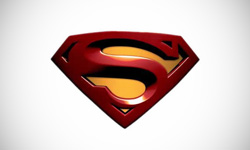
The Superman logo is perhaps the most recognizable of the superhero logos because of its simple, colorful design. However, don’t think that simple in this case means that there was no attention to detail. Although the triangular shape is upside down, it still represents strength, perhaps even more so because it is also the shape of the world’s strongest mineral, the diamond. The shape is also reminiscent of a strong male torso, so when it is placed on the hero’s shirt it emphasizes the muscular physique. The red and yellow are eye-catching and bold, while the bold letters with a serif font portray strength in yet another graphic way. Here is an interesting article about the history of the Superman logo.
Batman Logo Design
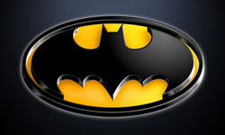
This dark and mysterious superhero has a dark logo with an attention-getting yellow accent. The bat clearly represents the name of this dark hero. Unlike many superheroes, Batman doesn’t have any actual superpowers which is why an inclusive oval shape is a better choice for this logo than a shape hinting at supernatural abilities. Here is an interesting read on the 75-year evolution of the Batman logo.
Wonder Woman Logo Design
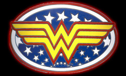
The cleverly entwined double W’s represent the superwoman’s name, but they also form the shape of a bold, flying bird with spread wings. This is appropriate because the woman’s most oft-used superpower is the ability to fly. The shape also works well at the top of Wonder Woman’s shirt. The patriotic motif with red, white, and blue colors combined with stars is patriotic and ties directly into the superheroine’s mascot costume. The round shape is inclusive and appropriate for a gentler, female superhero. If you are interested in finding out more about the complicated history of Wonder Woman, here is a great article.
The Flash Logo Design
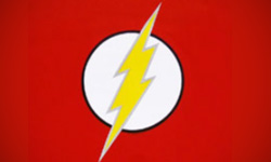
Again we see the red and yellow colors that make such an impact. The Flash’s incredible speed is well represented by these bold choices, while the lightning streak represents the superhero’s incredible speed. The pointy edges of the logo give a hard-edged image that is offset by the circular shape. The circle is a friendly shape, which portrays the community friendly aims of this speedy superhero.
The Green Lantern Logo Design
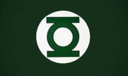
This superhero has a logo in a predictable color—green. The central shape is a stylized lantern. If you look carefully, the lantern inside the outer white circle looks like a bulls-eye. The presence of several circles is inclusive and friendly, a common theme in superhero logos, but it all the more appropriate because the Green Lantern has a ‘power ring’ that is his chief tool. This logo is well recognized because it is so simple, without a lot of distracting detail. Sometimes the most basic logos are the most memorable and timeless.
The Fantastic Four Logo Design
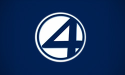
This is the first superhero “family” to catch mainstream attention. The circle is appropriate for a family organization, while the word fantastic and the number four is clearly written, which is different from most superhero logos that prefer to represent the individual in a more graphic sense. However, with four separate characters, this task would be more difficult if not impossible due to the range of personalities and superpowers contained in the group. The logo has seen several different color palettes throughout its forty-plus years, but the current blue color scheme is calming and reflective.
Catwoman Logo Design
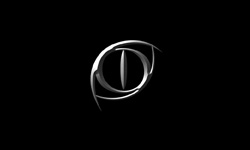
This logo is modern and different from the many other logos, adding the gracefulness of a cat to the best principles of the logo. The circle reigns supreme again, and the color palette is a stark black and silver. The general shape is of a cat’s eye, but the off-center position gives it visual interest. The hard edges are sharp and weapon-like, while the 3-D appearance adds to the chilling nature of the logo. These elements combined make this a graceful yet slightly frightening image to represent this super-heroine.
Daredevil Logo Design
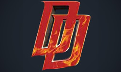
This superhero has a somewhat hellish, frightening appearance which this logo portrays completely. The two entwined ‘D’s are attractive and symmetrical, while the red color and the flames refer to the character’s appearance as well as his hometown: the well known Hell’s Kitchen neighborhood of New York City. The red color is also a color that demands action, which is appropriate for a superhero such as this one who acts impetuously. The thick letters with pointy edges add to the serious and not exactly friendly image.
Punisher Logo Design
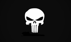
This superhero doesn’t want a friendly image—his mission is to avenge his family members’ death by punishing bad guys and organized criminals everywhere. Everything else is merely a distraction. As such, his logo is hardly a friendly image. The sole image is a stylized skull with elongated teeth that add to the frightening impression. This psychologically disturbed superhero is slightly more frightening than the rest, and the logo shows this key difference clearly.
X-Men Logo Design
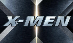
No discussion of superheroes would be complete without a section on the well known X-Men. This crime fighting group can be recognized simply by the ‘X’. The light in the center may represent the light of knowledge, as the group runs an institute for mutants like themselves. The grayscale color palette and relative lack of images make for a simple, memorable logo, while the way the ‘X’ letter is centered so it cannot be entirely seen gives a larger than life image that fits this group of superheroes well.
Every company wants their customers to view them as a superhero, a caring, benevolent presence that solves problems rather than causing them. If this is an especially important value to your company, you may want to consider using a superhero-like logo yourself. Regardless of the type of logo you need, there is a lot to be learned from these logos’ use of shape and color to communicate a message. If you would like to read more about the inspiration behind a lot of these superhero logos, here is an interesting article.

Mash Bonigala
Creative Director & Brand Strategist
With 25+ years of building brands all around the world, Mash brings a keen insight and strategic thought process to the science of brand building. He has created brand strategies and competitive positioning stories that translate into powerful and stunning visual identities for all sizes of companies.
Featured Work
See Our Work in Action
Real brands, real results. Explore how we've helped businesses transform their identity.
Client Love
What Our Clients Say
Don't just take our word for it. Hear from the brands we've worked with.
Ernest Bannister
M.O.R.E
"My experience with the Spell brand team has been nothing short of excellent. From the beginning Mash and team made me feel very comfortable with the design process. I am extremely happy with the results of my design and look forward to working with Spellbrand; exclusively! I have told many family, friends and peers about the great work the Spellbrand team has done in creating my design. Thanks again for all your patience and professionalism; I look forward to working with you in the future."
Josh Amburn
Lakefront Docks and Lifts
"I came into this project expecting to get the best logo for our brand. That’s exactly what I received. The team at SpellBrand used the descriptions of what we do along with a color palette of our site to design three amazing concepts. Once we decided on what worked best for our needs, they worked diligently to perfect the design. Their use of their project management software makes the collaboration painless. Great work team! We’ll see you on the next project! Josh"
Related Services You Might Love
Based on what you just read, here are services that can help you achieve similar results for your brand.
Free Download
Brand Consistency Checklist
A 27-point checklist to audit your brand across every touchpoint. Used by our team on real client projects.
Success! Check your email for the download link.
Instant PDF download. We'll also send branding tips -- unsubscribe anytime.
Keep Reading
Related Articles
Nov 17, 2025
Top 10 Simple Logos (Yet Effective Logos)
Discover the top 10 simple logos (yet effective logos) logos. Expert analysis of iconic logo designs, their history, and what makes them memorable.
Read MoreNov 17, 2025
Top 10 American University & College Logos
Discover the top 10 american university & college logos logos. Expert analysis of iconic logo designs, their history, and what makes them memorable.
Read MoreNov 17, 2025
Top 10 Car Company Logos
Discover the top 10 car company logos logos. Expert analysis of iconic logo designs, their history, and what makes them memorable.
Read More
