Spellbrand Blog
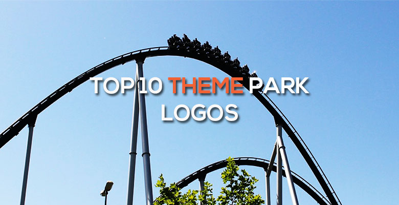
Top 10 Theme Park Logos
Looking for a custom logo?
Get a professional, one-of-a-kind logo designed by our award-winning team.
Looking for a custom logo design?
Our professional designers create unique, memorable logos tailored to your brand.
See Our Logo Design Services →What must a theme park logo design convey? In some cases, family-friendly fun is the desired brand. For others, a sense of technological thrill and superiority are the main message. Whatever the image that the theme park in question wants to convey, these logos are clear and communicative.
Disneyland Logo Design
As the first modern theme park, Disneyland also deserves first mention for their new logo design. The wording was recently redesigned to use a classic font reminiscent of royalty and fairy tales instead of the trademark Disney font. However, Cinderella’s castle is still the main image, although now only the top is shown coming majestically out of the clouds instead of the complete castle. The light blue combined with the tagline below give a dreamlike feeling that suggests this is a place to see fantasies come true.
California Adventure Logo Design
This Disney branded theme park retains elements of the parent brand while also conveying a distinctly Californian image. The trademark font is used for the word is used for the word Disney, which is interesting because it is not even used in the Disneyland logo. ‘California’ is written in a scrolling shape, while the word ‘Adventure’ is written in an eye catching red. The sun is shown setting behind a mountain, a common symbol of strength. If you look closely at the mountain, it is in the shape of a bear, which is the symbol of the Golden State.
SeaWorld Logo Design
An arrow like image in this case connotes movement while also resembling a killer whale, which is the main attraction at this oceanic theme park. The classic, newsy font is slightly rounded to give a friendly feeling while retaining a sense of factuality. The rounded shape cutting through the wording closely resembles the top of the planet, which ties again into the ocean theme. The blue is definitely appropriate for an ocean themed attraction, while the yellow is sunny and adds contrast.
Stratosphere Las Vegas Logo Design
This logo design is appropriate for a very unique theme park located at the top of a skyscraper in Las Vegas. The top of the building is shown in the image, while the name of the park is written in a dynamic, scrawling font that implies danger. The red, white, and blue color scheme is appropriate for an extreme attraction located in one the United States’ most famous cities.
Universal Studios Logo Design
This logo design shows how a theme park can tie seamlessly into a parent brand. The Universal Studios famous Earth logo is shown, with the words ‘Theme Parks’ written below the name. This image appears to be backlit, while the red background adds a sense of danger while creating a bright image. Because this terrestrial image is obviously similar to the original Universal logo while maintaining some uniqueness, this logo design is a success.
Discovery Cove Logo Design
This is a theme park where people can swim with dolphins, a promise that is clearly communicated by the logo design. An image of a dolphin is shown front and center in the logo design, with a person formed from negative space swimming beside it. A wave like design below communicates movement while obviously representing water. The blue color palette ties into the water as well, while promoting a clean and soothing image. The name of the establishment is written in thin, modern lettering that doesn’t detract from the well drawn image.
Nickelodeon Universe Logo Design
This theme park has two key benefits: it is located inside a large and bustling mall, and it is related to the beloved Nickelodeon brand. The familiar orange Nickelodeon logo design is used to tie the theme park into this popular television company, while the word ‘Universe’ is in bold, thick lettering in a slime green that is relevant to the channel as well. Stars and a sun are in the sea of green, tying into the name of the theme park and suggesting an ‘out of this world’ experience for children and their families.
Six Flags Logo Design
The Six Flags logo design is used by theme parks all over the nation, so it is important to have a relevant logo that is also versatile. This may seem like a tall order, but this logo design does the job with ease. The Six Flags for which the company is named are the central image in bright, elementary colors that suggest fun. The triangular shape of the flags is emphasized, including in the triangular flag that is used to dot the I in the first word. The wording this logo is rounded to give a friendly, inviting image, while Bugs Bunny, one of the mascots of the brand, is seen running gleefully toward the image.
Legoland Logo Design
The square, thick writing used in this logo design relates directly to the rectangular shape of the blocks for which this theme park is named. The N is specially designed so that it appear to be a mast, from which a serious, square flag bearing the familiar Lego logo is flown. The black and red compliment this logo beautifully while also drawing in the eye. Below, California is written in an informal font that is appropriate for this laid back state.
Silverwood/Boulder Beach Logo Design
This logo design ties two brands together into one cohesive theme park offering twice the fun. The Silverwood logo is serious and somber, with traditional lettering and not even a hint of an image. However, the youthful orange color hints at the fun that the theme park offers. Below, Boulder Beach, the attached water park, has a splashy font with water lapping at the edges as well as ‘water park’ written in a wave like shape. The use of complimentary colors and two different fonts creates a balanced image that is both bright and inviting without compromising the strength of either image.
As you can see, theme park logos can be attractive and effective while using a variety of shapes and colors to communicate information about the brand. A logo design can say almost anything when it is designed by an experienced logo designer to meet the unique needs of your family.

Mash Bonigala
Creative Director & Brand Strategist
With 25+ years of building brands all around the world, Mash brings a keen insight and strategic thought process to the science of brand building. He has created brand strategies and competitive positioning stories that translate into powerful and stunning visual identities for all sizes of companies.
Featured Work
See Our Work in Action
Real brands, real results. Explore how we've helped businesses transform their identity.
Client Love
What Our Clients Say
Don't just take our word for it. Hear from the brands we've worked with.

Josh Amburn
Lakefront Docks and Lifts
"I came into this project expecting to get the best logo for our brand. That’s exactly what I received. The team at SpellBrand used the descriptions of what we do along with a color palette of our site to design three amazing concepts. Once we decided on what worked best for our needs, they worked diligently to perfect the design. Their use of their project management software makes the collaboration painless. Great work team! We’ll see you on the next project! Josh"

Tom McGee
PD Campus
"We tried several designers to design our logo and could not find the one that fit our company. After a few years of searching for a good branding company, I found Spellbrand through a random search. Spellbrand was sensational! They took the time to listen to our story and created a few designs that spoke to our team and what we do. We've never had a designer do that. We not only received a great logo, but we now have a brand we are all proud to wear! Thank you!"
Related Services You Might Love
Based on what you just read, here are services that can help you achieve similar results for your brand.
Free Download
Brand Consistency Checklist
A 27-point checklist to audit your brand across every touchpoint. Used by our team on real client projects.
Success! Check your email for the download link.
Instant PDF download. We'll also send branding tips -- unsubscribe anytime.
Keep Reading
Related Articles
Nov 17, 2025
Top 10 Simple Logos (Yet Effective Logos)
Discover the top 10 simple logos (yet effective logos) logos. Expert analysis of iconic logo designs, their history, and what makes them memorable.
Read MoreNov 17, 2025
Top 10 American University & College Logos
Discover the top 10 american university & college logos logos. Expert analysis of iconic logo designs, their history, and what makes them memorable.
Read MoreNov 17, 2025
Top 10 Car Company Logos
Discover the top 10 car company logos logos. Expert analysis of iconic logo designs, their history, and what makes them memorable.
Read More