Spellbrand Blog
Top 10 World’s Fair Logos
Looking for a custom logo?
Get a professional, one-of-a-kind logo designed by our award-winning team.
Looking for a custom logo design?
Our professional designers create unique, memorable logos tailored to your brand.
See Our Logo Design Services →World’s Fair logos must be on top of their game. Not only must they appeal to people in their area, but they must also reach out to an international audience. A World’s Fair also must appeal to the governments of other nations, convincing them to spend a significant amount of time and money creating a pavilion or other exhibit for the event. These World’s Fair logos represent more than one hundred years of the genre, making them an interesting look not just at the logo designs of this one event, but an insight into landmark logo designs worldwide throughout the last century.
Expo 2010 Shanghai Logo Design
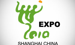
This world’s fair is scheduled to occur this year and has perhaps the best logo design yet. The image of three people with entwined arms hovers above an apparently hand-painted 2010. The orange blob above the image appears to be a balloon, although this logo is so abstract it is difficult to tell. This image is interesting and yet abstract enough to appeal to people of various cultures, while the green and orange colors are youthful and fun.
Expo 98 Lisbon Logo Design
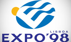
The Lisbon expo logo design featured a blue globe representing the earth with a sun setting on the horizon. An E is inside the globe waving as though a flag, giving a feeling of movement. The gently rounded writing combined with the circular shapes gives a friendly feeling, while the soothing blue and eye-catching yellow create a pleasant contrast.
1964-5 New York World’s Fair Logo Design
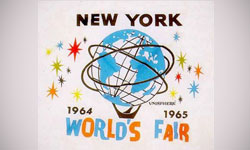
This World’s Fair also used a globe as its primary image, although in this case the orb is surrounded by stars instead of a sun. This gives a feeling of excellence and stardom. The bright colors and slightly uneven writing give a fun, informal feeling that was definitely appropriate during the mid-sixties. The thick, all upper case writing gives a slightly more substantial edge that hints at the legitimacy of the event, clearly implying that this expo is more than fun and games alone.
Expo ’70 Osaka Logo Design
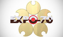
The logo for this world exposition is surprisingly modern considering that the logo is forty years old. The multiple circles create a friendly image again, with circular cut-outs in each one creating interest. The entire logo gleams as though metallic, which was quite a graphic accomplishment with the technology of the time. The gold, red, and black colors are distinctly Asian, referring to the host site of this expo in a subtle yet unmistakable way.
Expo Zaragoza 2008 Logo Design
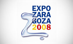
This world exposition, set in Zaragoza, Spain, with the theme of ‘Water and Sustainable Development’. This logo design portrays this perfectly, with a ‘Z’ written in what appears to be water as the primary image. A single water droplet below adds balance. The elementary colors give a fun, informal feeling, while the way they are arranged in a rectangular shape gives an otherwise lighthearted logo a little weight.
Modern Industrial and Decorative Arts Paris 1925 Logo Design
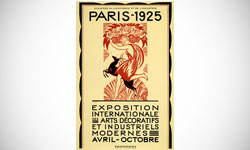
This logo is a great example of logos during the Jazz Age. Due to the limitations in printing that existed at the time, only two colors were used in this logo design, a deep red and black. The image is classical and has Greek image, which was common in art at the time. The woman carrying a basket of flowers definitely is relevant to the art theme of the exposition. The thin yet square writing is simple but adds weight to the image, especially when combined with the square shape in which the writing is arranged.
Expo ‘67 Montreal Logo Design
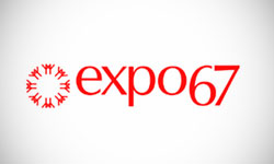
This logo is a good example of the minimalist designs of the sixties. The snowflake is definitely arranged in the shape of an inclusive circle, while the rays coming off the flake appear to be small human figures. Because snow is associated with the area, this image is definitely relative to the area. The lower case letters give an informal feeling that was popular at the time, while the red is bright and eye catching while also a dominant color in the Canadian flag.
Expo ‘92 Seville Logo Design
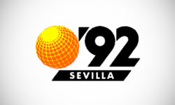
The World Expo held in Seville, Spain had a logo design that was definitely representative of the times. The globe is the main image, tilted slightly to add interest and show off latitude lines, while the youthful orange and sunny yellow are more reminiscent of the sun. This bright and a friendly image are inviting and friendly to a younger, Generation X crowd, which was definitely the ethos of the time in which it was created.
Alaska-Yukon-Pacific Exposition 1910 Logo Design
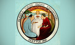
This logo also has the round shape that creates an inclusive feeling, but in a much more old-fashioned setting. This World Exposition logo design shows three women from different lands sharing meals from their own nations. The image of sharing combined with the inclusive shape definitely creates the feeling that this expo involves cultures from all over the globe. The figures and the background are all highly stylized, which likely made printing easier. There is no true color scheme, although earthy colors and a clear sky blue seem to dominate the image.
1933 Chicago World’s Fair Logo Design
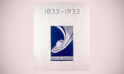
This world’s fair celebrated the century of innovation between 1833 and 1933. The logo shows this, with the years in question named above the logo image. A square shape is used in a calming blue, with a round planet with waves swirling around and then flying off into space. Clearly, there was a feeling at the time that new technologies were affecting not just the planet, but the universe. The wave shows movement in a forward direction, which directly relates to the theme of the logo design.
Clearly, the world’s fair, or world exposition as it would come to be known, inspired many nations to show their best side. The logos all involve images celebrating the Earth, whether the images are of the earth’s many peoples or to the planet itself. While most people now have a global view, when the World’s Fair began this was a revolutionary idea. The world’s fair, and the logos that represent it, had a large hand in changing the world in bringing in our new, more accepting culture and celebrating the diversity that defines our planet.

Mash Bonigala
Creative Director & Brand Strategist
With 25+ years of building brands all around the world, Mash brings a keen insight and strategic thought process to the science of brand building. He has created brand strategies and competitive positioning stories that translate into powerful and stunning visual identities for all sizes of companies.
Featured Work
See Our Work in Action
Real brands, real results. Explore how we've helped businesses transform their identity.
Client Love
What Our Clients Say
Don't just take our word for it. Hear from the brands we've worked with.
Sue Politte
Success In Focus
"Love it! My brand identity and logo helps quickly communicate what I do. I coach very busy business leaders who want to take their organization to the next level and are tired of all the things that are slowing things down or blocking progress. My brand identity needed to grab visual attention and communicate quickly that I help my clients get focus so they gain and build success. My new brand will help my potential clients identify with me. Thank you!!!!"
Ernest Bannister
M.O.R.E
"My experience with the Spell brand team has been nothing short of excellent. From the beginning Mash and team made me feel very comfortable with the design process. I am extremely happy with the results of my design and look forward to working with Spellbrand; exclusively! I have told many family, friends and peers about the great work the Spellbrand team has done in creating my design. Thanks again for all your patience and professionalism; I look forward to working with you in the future."
Related Services You Might Love
Based on what you just read, here are services that can help you achieve similar results for your brand.
Free Download
Brand Consistency Checklist
A 27-point checklist to audit your brand across every touchpoint. Used by our team on real client projects.
Success! Check your email for the download link.
Instant PDF download. We'll also send branding tips -- unsubscribe anytime.
Keep Reading
Related Articles
Nov 17, 2025
Top 10 Simple Logos (Yet Effective Logos)
Discover the top 10 simple logos (yet effective logos) logos. Expert analysis of iconic logo designs, their history, and what makes them memorable.
Read MoreNov 17, 2025
Top 10 American University & College Logos
Discover the top 10 american university & college logos logos. Expert analysis of iconic logo designs, their history, and what makes them memorable.
Read MoreNov 17, 2025
Top 10 Car Company Logos
Discover the top 10 car company logos logos. Expert analysis of iconic logo designs, their history, and what makes them memorable.
Read More

