Capital India Finance: Building Trust Through Modern Financial Branding
Situation: New NBFC Entering Competitive Financial Services Market
Capital India Finance Limited approached Spellbrand with a critical opportunity: to create a brand identity for a new Non-Banking Finance Company (NBFC) that would establish immediate credibility and trust in India’s competitive financial services market. The company needed to position itself as a modern, technology-enabled financial services platform offering diverse solutions—from SME finance and retail finance to home loans and wealth management.
The challenge was significant: financial services brands in India often rely on conservative, traditional imagery that blends together. As a new entrant, Capital India Finance faced the dual challenge of establishing trust (essential for any financial institution) while signaling innovation to appeal to modern businesses and consumers.
The Indian NBFC market is highly competitive, with established players dominating market share. New entrants must overcome skepticism and build credibility quickly. Capital India Finance needed a visual identity that would:
- Communicate trust and stability—essential for any financial institution
- Signal innovation and forward-thinking—to appeal to modern businesses and consumers
- Stand out from competitors—without appearing unprofessional or risky
- Work across diverse touchpoints—from digital platforms to physical signage
- Resonate with multiple audiences—SMEs, retail customers, and corporate clients

Task: Create Distinctive Brand Identity That Builds Trust
The challenge required:
- Establish immediate credibility in competitive financial services market
- Balance trust and innovation in visual identity
- Differentiate from conservative competitors without appearing unprofessional
- Create versatile brand system for diverse audiences and touchpoints
Action: Strategic Brand Development
Market Research and Positioning
We began by analyzing India’s NBFC market, studying competitors, and understanding the expectations of SMEs, retail customers, and corporate clients. The research revealed several key insights:
- Trust through modern design: Indian consumers and businesses increasingly associate modern, professional branding with trustworthy financial institutions
- Digital-first expectations: Modern audiences expect financial services brands to have sophisticated digital presence and technology-enabled solutions
- Visual differentiation: Most NBFCs use conservative, similar visual language—creating an opportunity for distinctive positioning
- Multi-audience appeal: The brand needed to resonate with both traditional business owners and tech-savvy entrepreneurs
Strategic Brandmark Development
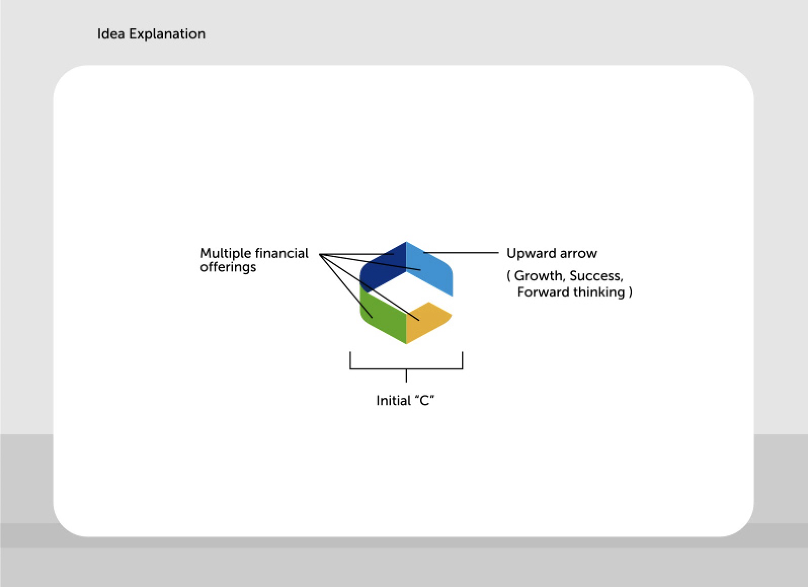
Rather than creating another conservative financial services logo, we developed a sophisticated brandmark system built on geometric principles that communicate:
- Forward momentum: The upward arrow form suggests growth, progress, and forward-thinking financial solutions
- Multiple offerings: The geometric segments represent the diverse financial services—SME finance, retail finance, home loans, wealth management
- Trust and stability: The solid geometric foundation conveys reliability and professionalism
- Modern sophistication: The abstract, non-literal approach positions Capital India Finance as a contemporary, technology-enabled platform
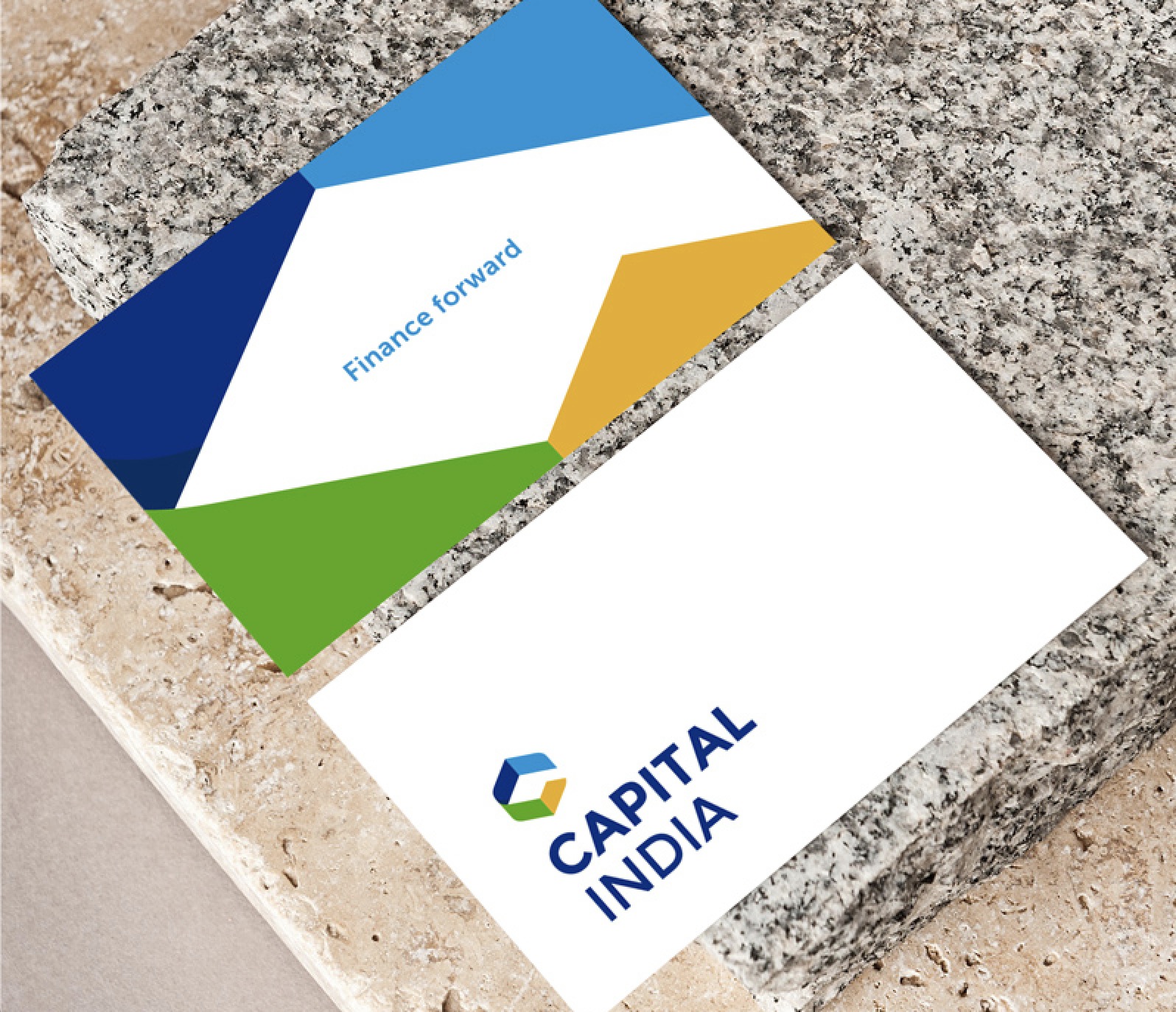
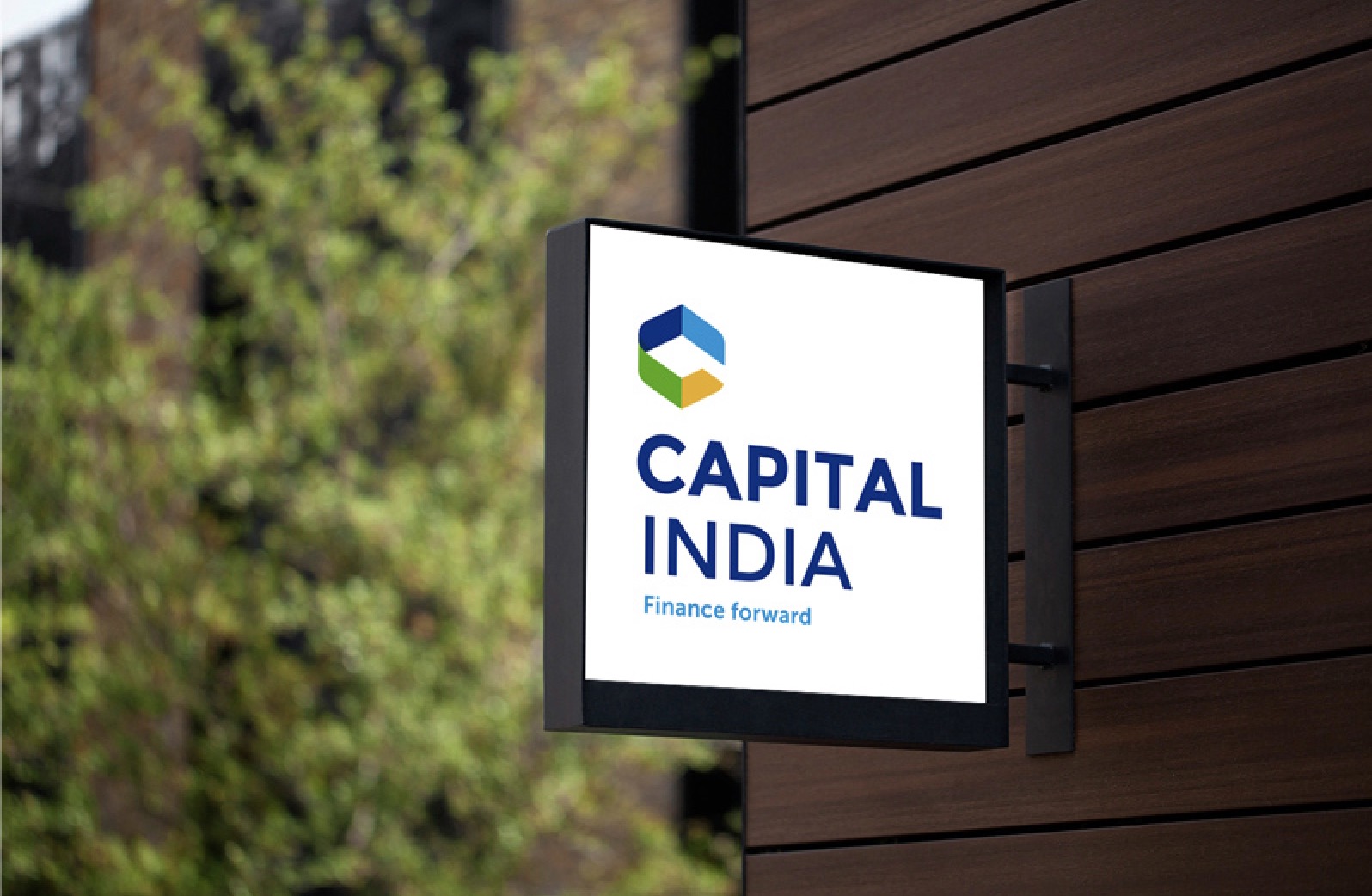
The tagline “Finance forward” reinforces the forward-thinking approach, while the visual identity elevates the brand above typical financial services aesthetics.
Logo Design: Geometric Sophistication
The Primary Brandmark
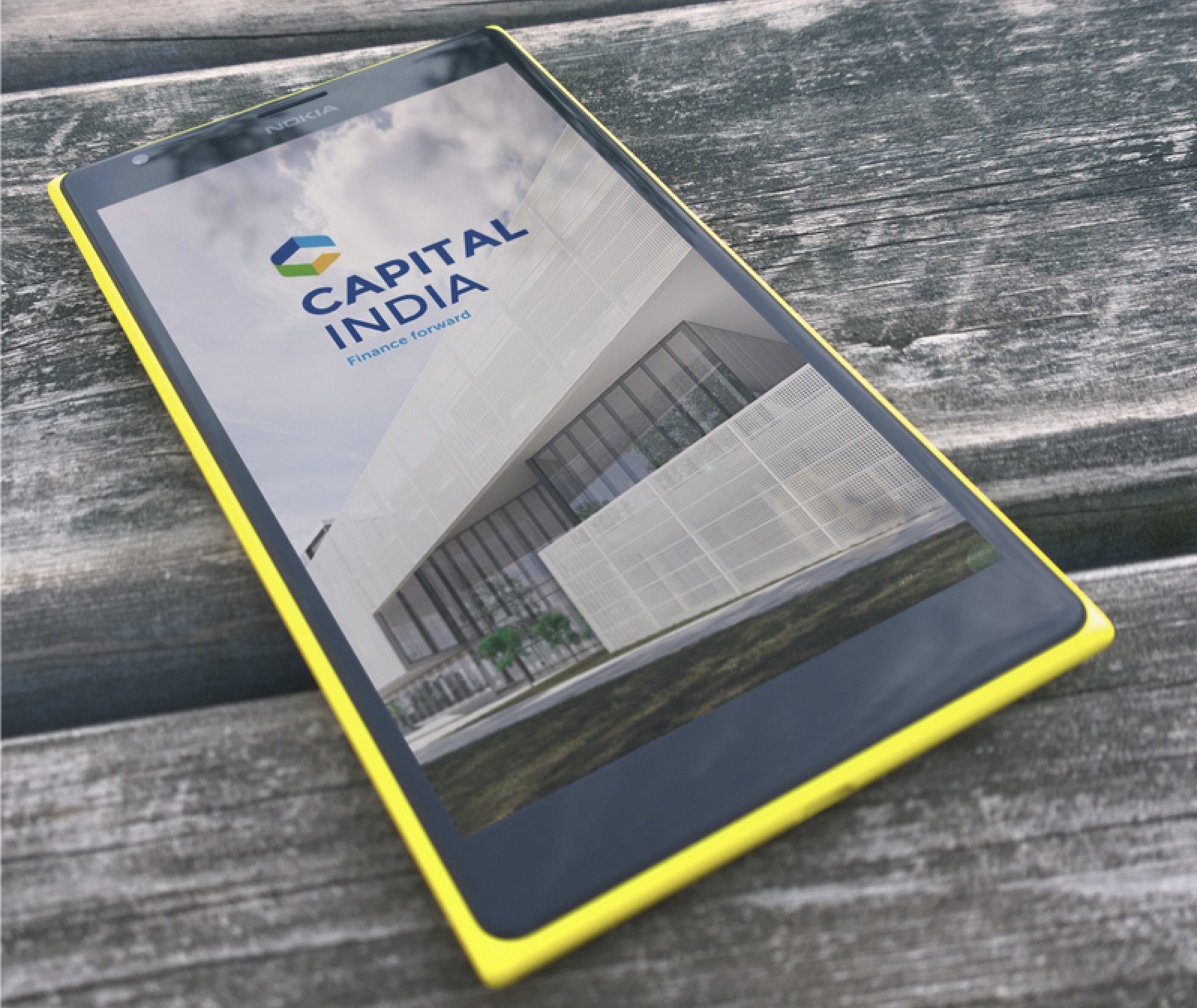
The logo consists of three distinct geometric segments that form a cohesive, memorable mark:
- The Initial ‘C’: The overall shape forms a stylized “C” for Capital, creating immediate brand recognition
- Upward Arrow (Growth & Success): The geometric form suggests an upward arrow, representing growth, success, and forward-thinking financial solutions
- Multiple Financial Offerings: The three distinct segments represent the diverse range of financial services—SME finance, retail finance, and wealth management
Together, these elements create a sophisticated mark that subtly references financial growth and forward momentum without being literal—a modern approach that maintains professional credibility.
Color Strategy
The color palette was carefully chosen to convey specific brand attributes:
- Blue: Represents trust, stability, and professionalism—core values for any financial institution
- Green: Adds energy and growth symbolism—signaling financial growth and prosperity
- Yellow/Orange: Provides warmth and approachability—making the brand feel accessible to diverse audiences
This palette stands out in the financial services market while maintaining professional credibility and trust.
Visual Identity System: Comprehensive Brand Language
Typography and Voice
The typography system balances professionalism with modern appeal. Clean, modern sans-serif fonts ensure readability across all applications while maintaining a contemporary feel. The brand voice guidelines emphasize clarity, transparency, and partnership—reflecting Capital India Finance’s commitment to customer-centric financial solutions.
Graphic Elements
Beyond the logo, we developed a comprehensive system of graphic elements:
- Geometric patterns: Abstract compositions that extend the brand language across applications
- Photography direction: Real, authentic imagery of businesses, homes, and people—avoiding stock photography clichés
- Icon system: Custom icons for different financial products and services

Real-World Applications: Making the Brand Visible
Digital Presence
The website and digital platforms showcase Capital India Finance’s brand identity prominently, with clear navigation and service information. The geometric patterns and color palette create visual consistency across all digital touchpoints, from the main website to mobile applications.

Corporate Materials
Business cards, letterhead, and email signatures were designed to reflect the new brand identity. The business cards feature the geometric logo prominently, creating a memorable first impression that reinforces brand recognition.

Environmental Branding
The brand identity extends into physical spaces, creating strong brand presence:
- Office signage: Building signage featuring the new logo creates strong street-level presence in Mumbai
- Interior branding: Branded office spaces reinforce the corporate identity for client meetings
- Promotional materials: Brochures, flyers, and marketing collateral maintain visual consistency
Outdoor Advertising: Maximum Visibility
Billboards and Digital Displays
Large-format billboards and bus stop digital displays showcase the brand identity at scale, ensuring maximum visibility in high-traffic areas across India. The geometric patterns and bold colors create eye-catching displays that stand out from typical financial services advertising. These outdoor applications ensure consistent brand presence in urban environments where potential customers encounter the brand daily.
Result: Established as Modern, Trustworthy Financial Services Partner
The brand identity for Capital India Finance successfully establishes the company as a modern, trustworthy financial services partner. The new visual identity delivers:
Strategic Outcomes
- Forward-thinking positioning: Capital India Finance now positions as a modern, technology-enabled NBFC while maintaining trust and credibility essential for financial institutions
- Clear differentiation: Sophisticated, non-literal design avoids cliché financial imagery, standing out from conservative competitors
- Multi-audience appeal: Successfully resonates with diverse audiences—from traditional SMEs to tech-savvy entrepreneurs
- Consistent brand recognition: Creates unified brand experience across all touchpoints—from digital platforms to billboards to physical signage
- Flexible growth system: Provides adaptable brand system that can evolve and expand as the company grows
Implementation Success
The comprehensive brand application system ensures that every interaction with Capital India Finance reinforces the brand identity:
- Digital presence: Modern website and digital platforms communicate professionalism and innovation
- Physical touchpoints: Office signage and corporate materials build trust and credibility
- Outdoor advertising: Billboards and bus stop displays create strong brand visibility
- Corporate materials: Business cards, letterhead, and presentations maintain brand consistency
The brand transformation successfully positions Capital India Finance as a modern, trustworthy financial services partner, balancing innovation with stability to appeal to diverse audiences while differentiating from conservative competitors in India’s competitive NBFC market.
The Future: Expanding the Brand System
With the core brand identity established, Capital India Finance is positioned to expand into additional marketing materials and touchpoints:
- Product-specific branding: Individual financial products can maintain brand consistency while having distinct visual treatments
- Additional digital applications: Social media templates, email campaigns, and digital advertising
- Environmental graphics: Wayfinding systems, branch signage, and exhibition displays
- Partnership materials: Co-branded materials for strategic partnerships and alliances
The flexible brand system accommodates future growth while maintaining visual consistency and brand recognition across all Capital India Finance’s diverse financial services offerings.
This case study demonstrates Spellbrand’s expertise in financial services branding, combining strategic thinking with sophisticated design to create brands that build trust while signaling innovation. For financial institutions looking to modernize their brand identity or create a new visual language, Spellbrand offers comprehensive brand strategy and design services tailored to the financial services industry.
Brand Name Strategy: Creating “Capital India Finance”
The name “Capital India Finance” was developed through Spellbrand’s strategic brand naming process. Our team researched the competitive landscape, target audience, and brand positioning to create a name that would resonate in the market and support long-term brand growth.
The naming process included linguistic analysis, trademark screening, domain availability verification, and brand storytelling to ensure “Capital India Finance” would be distinctive, memorable, and legally protectable. Learn more about our brand naming service or explore our full naming portfolio.