Ceyise Studios: Bringing Quiet Luxury Through Color and Art
Situation: Creating Brand Identity for Three Distinct Audiences
Ceyise Studios approached Spellbrand with a unique challenge: how to create a brand identity that resonates with three fundamentally different audiences while maintaining a cohesive, premium brand position. The studio specializes in custom, hueful, electrifying artwork that blends digital pixels with traditional paint, creating fine art photography with a flair for color and irony for life.
The three target audiences each have different needs and expectations:
- Wealthy Collectors (45-65+): Seeking artwork for their living rooms, valuing exclusivity, craftsmanship, and investment potential
- Millennial Art Investors (20-30+): Looking for affordable artwork investments, valuing authenticity, social media appeal, and contemporary aesthetics
- Commercial Businesses: Buying framed prints for lounges, waiting rooms, reception areas, and clinics—needing artwork that creates atmosphere and reflects brand values
The challenge was creating a visual identity that could speak to all three audiences without diluting the brand’s premium positioning or making it feel inaccessible to younger buyers.
Task: Create Brand Identity Speaking to Three Distinct Audiences
The challenge required:
- Multi-audience appeal: Brand identity that resonates with three fundamentally different audiences
- Premium positioning: Maintain cohesive, premium brand position
- Accessibility: Brand that feels accessible to younger buyers without diluting premium positioning
- Commercial viability: Brand that works for commercial businesses while maintaining artistic credibility
Action: Strategic Brand Development
Brand Strategy: The Universal Language of Color
We began by analyzing the fine art market, studying how successful studios position themselves across different price points and audiences. The research revealed several key insights:
- Color as universal language: Vibrant, thoughtful color palettes transcend demographic boundaries and speak directly to emotional responses
- Quiet luxury positioning: Premium doesn’t mean ostentatious—sophisticated simplicity appeals to both wealthy collectors and millennial buyers
- Digital-physical hybrid: The blend of digital pixels and traditional paint creates a unique value proposition that differentiates Ceyise Studios from purely digital or purely traditional artists
- Commercial appeal: Businesses need artwork that creates atmosphere without overwhelming—Ceyise Studios’ approach to “visual eye candy” that brings joy and calm aligns perfectly
Rather than creating separate brand identities for each audience, we developed a unified brand system built on the principle that great art transcends demographics. The tagline “Life Is Art” reinforces this philosophy—art isn’t just decoration, it’s an essential part of living well.
The brandmark needed to communicate:
- Artistry and creativity: The stylized ‘S’ suggests fluidity, movement, and artistic expression
- Celestial inspiration: The integrated star element suggests aspiration, dreams, and the infinite possibilities of art
- Sophistication: Clean, modern design that appeals to premium buyers without feeling exclusive
- Accessibility: Approachable enough for millennial buyers and commercial clients
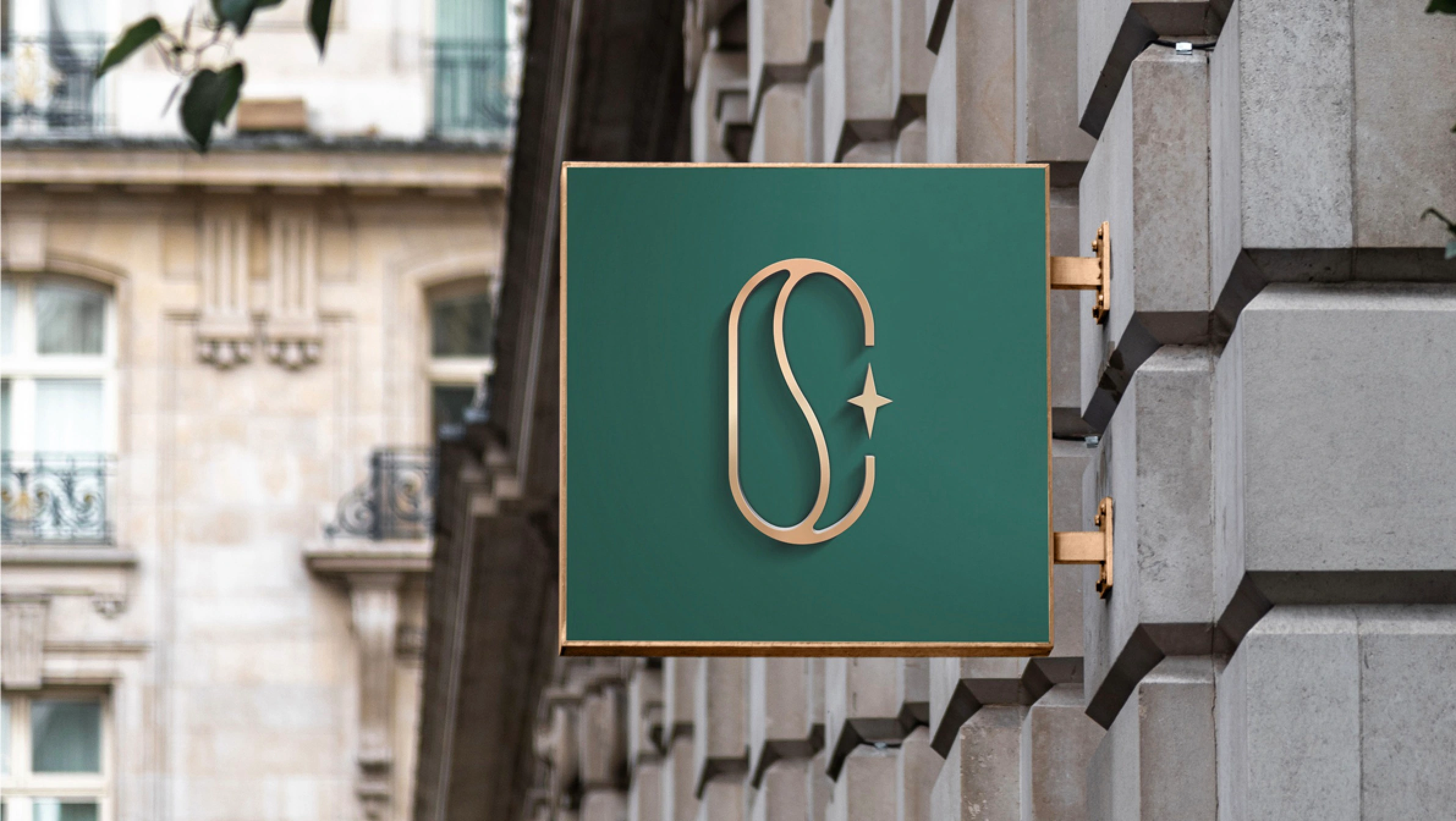
Logo Design: Celestial Artistry
The Primary Brandmark
The logo consists of a stylized ‘S’ shape that forms an elegant, flowing mark:
- The Stylized ‘S’: The overall shape forms a fluid, abstract ‘S’ for Studios, creating immediate brand recognition while maintaining artistic abstraction
- Integrated Star Element: A small four-pointed star is positioned within the curve of the ‘S’, suggesting celestial inspiration, dreams, and the infinite possibilities of artistic expression
- Fluid Movement: The curved, organic form suggests creativity, flow, and the blending of digital and physical mediums
Together, these elements create a sophisticated mark that communicates artistry and elegance without being overly literal—a modern approach that maintains artistic credibility while being commercially viable.
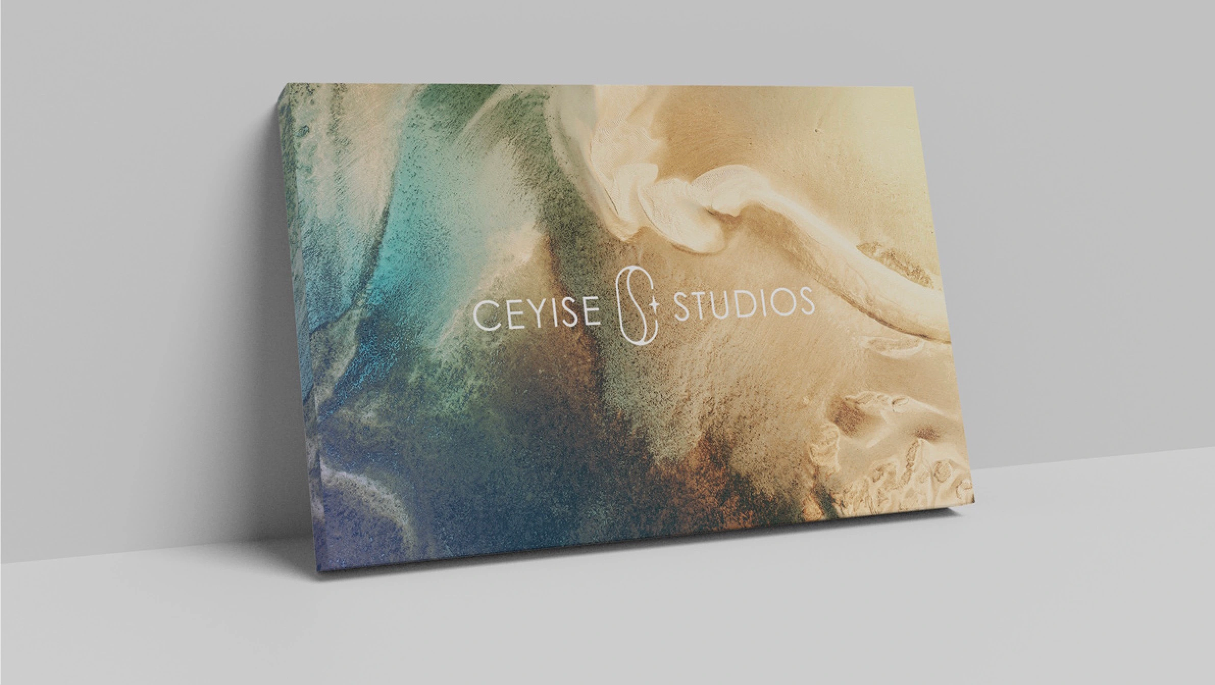
Color Strategy
The color palette was carefully chosen to convey specific brand attributes:
- Dark Green (Primary): Represents growth, nature, and sophistication—appealing to wealthy collectors while feeling fresh and contemporary
- Metallic Gold: Suggests premium quality, luxury, and value—communicating investment potential to all three audiences
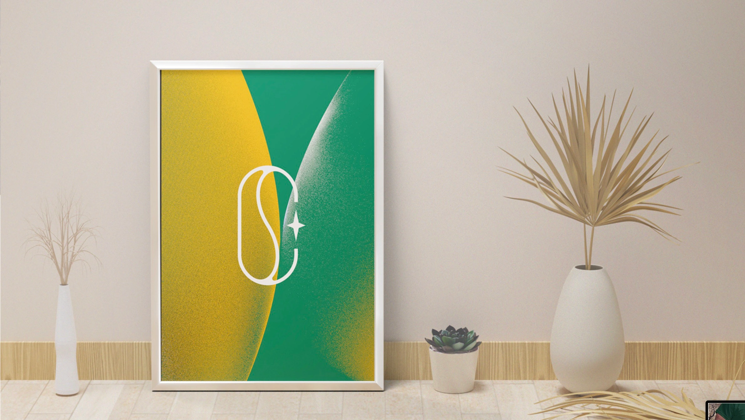
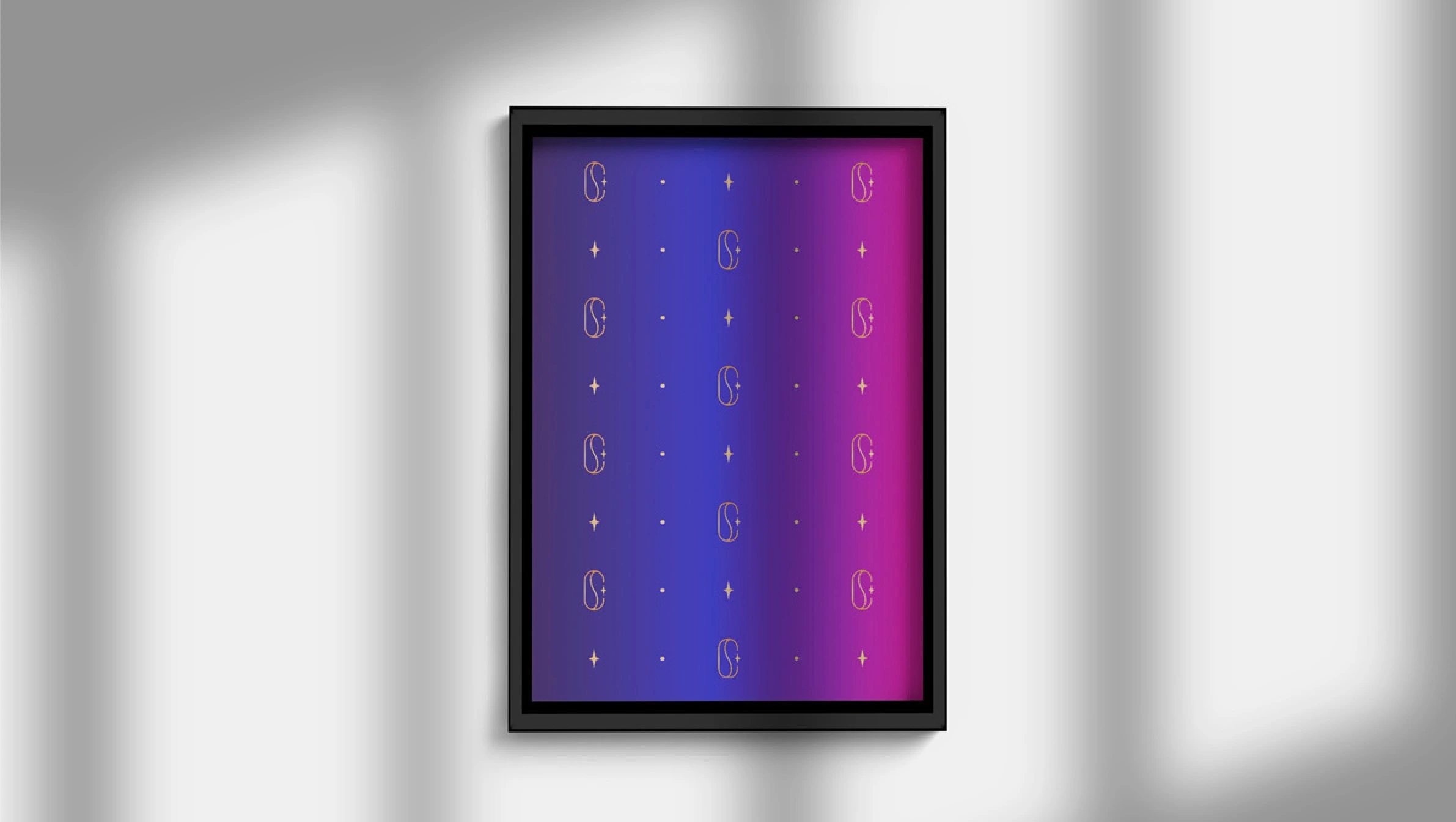
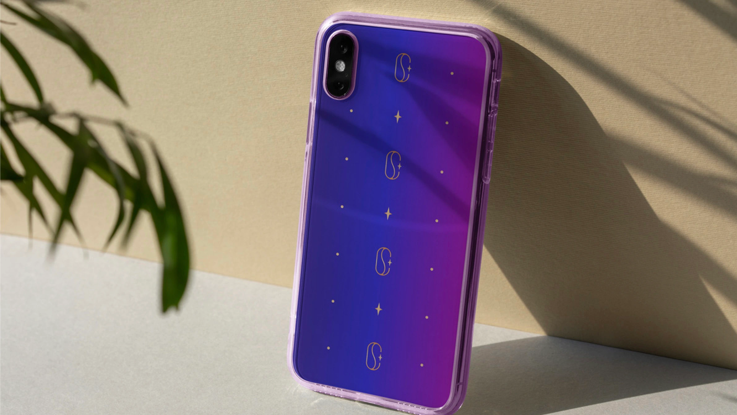
- Gradient System: Vibrant gradients transitioning from deep indigo blue to bright magenta-purple create visual interest and reflect the “hueful, electrifying” nature of the artwork
The gradient system is particularly powerful because it:
- Creates visual interest across digital and physical applications
- Reflects the studio’s signature use of vibrant color
- Works beautifully on both premium materials (gold foil, dark green) and digital screens
- Appeals to millennial buyers who value bold, contemporary aesthetics
Visual Identity System: Digital Meets Physical
Typography
The typography system balances sophistication with accessibility:
- Primary Typeface: Clean, modern sans-serif that maintains readability across all applications
- Elegant Spacing: Generous letter spacing creates a premium feel without sacrificing legibility
- Hierarchy: Clear typographic hierarchy ensures the brand name and tagline work together harmoniously
Pattern and Graphic Elements
The brand system includes a repeating pattern of golden symbols that can be used across various applications:
- Stylized ‘S’ shapes: Echoing the main logo mark
- Four-pointed stars: Reinforcing the celestial theme
- Circular dots: Adding texture and visual interest
This pattern system creates consistency across diverse applications—from product packaging to digital interfaces—while maintaining the brand’s artistic, handcrafted feel.
Brand Applications: From Digital to Physical
Digital Applications
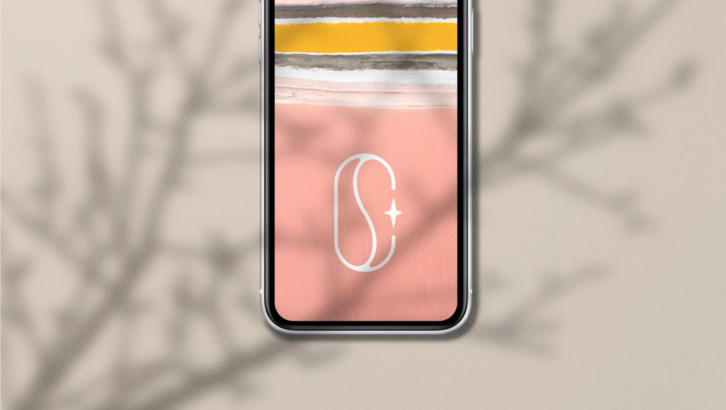
The brand identity extends seamlessly into digital spaces:
- Website and Mobile App: Vibrant gradient backgrounds with clean, readable typography create an engaging digital experience
- Social Media: Consistent use of the gradient system and logo mark ensures brand recognition across platforms
- E-commerce: Product photography and digital galleries showcase the artwork while maintaining brand consistency
The digital applications are particularly important for reaching millennial buyers who discover and purchase art online, as well as commercial clients who need to browse collections digitally before making purchasing decisions.
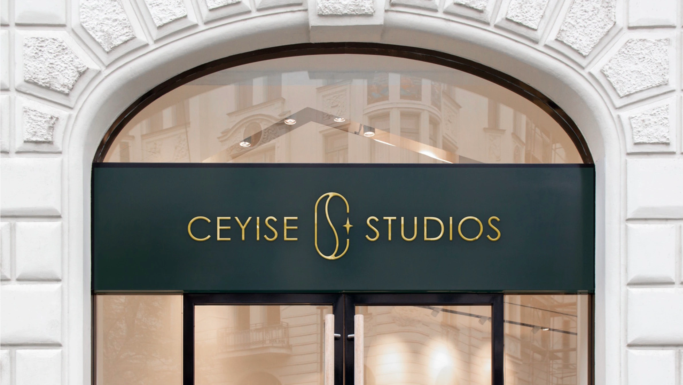
Physical Applications
The brand identity comes to life in physical spaces:
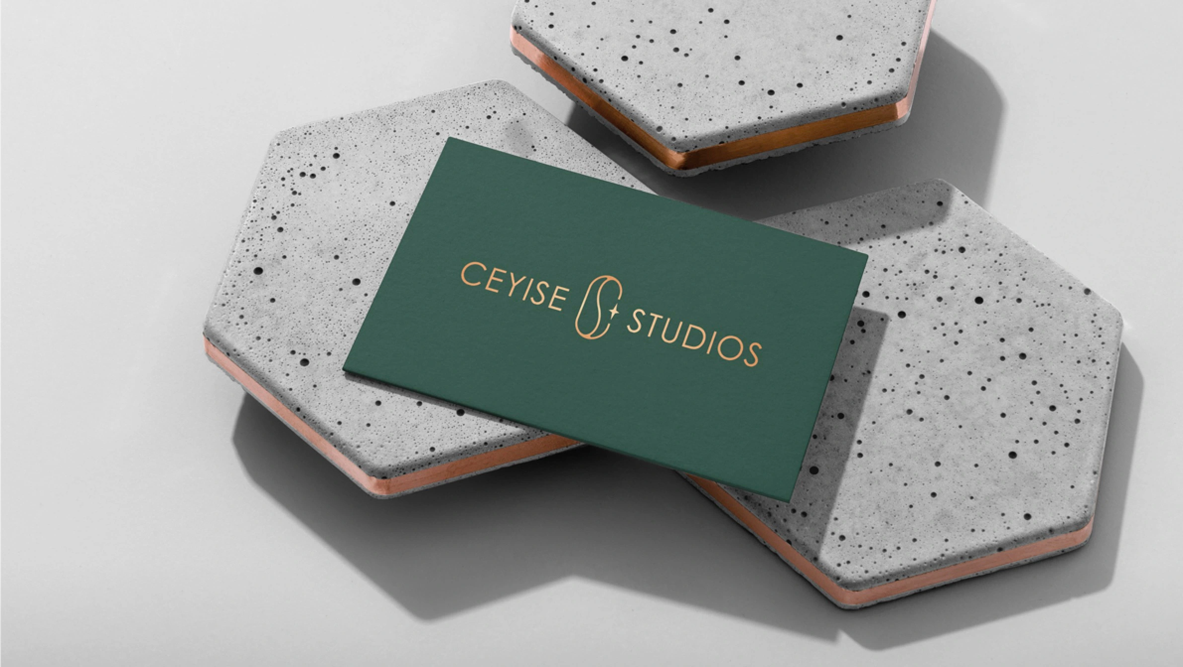
- Storefront Signage: Dark green sign with gold lettering creates a premium, sophisticated presence that appeals to wealthy collectors
- Product Packaging: Gradient boxes with gold foil accents create an unboxing experience that reinforces the brand’s premium positioning
- Business Cards: Dark green card with gold lettering creates a memorable first impression
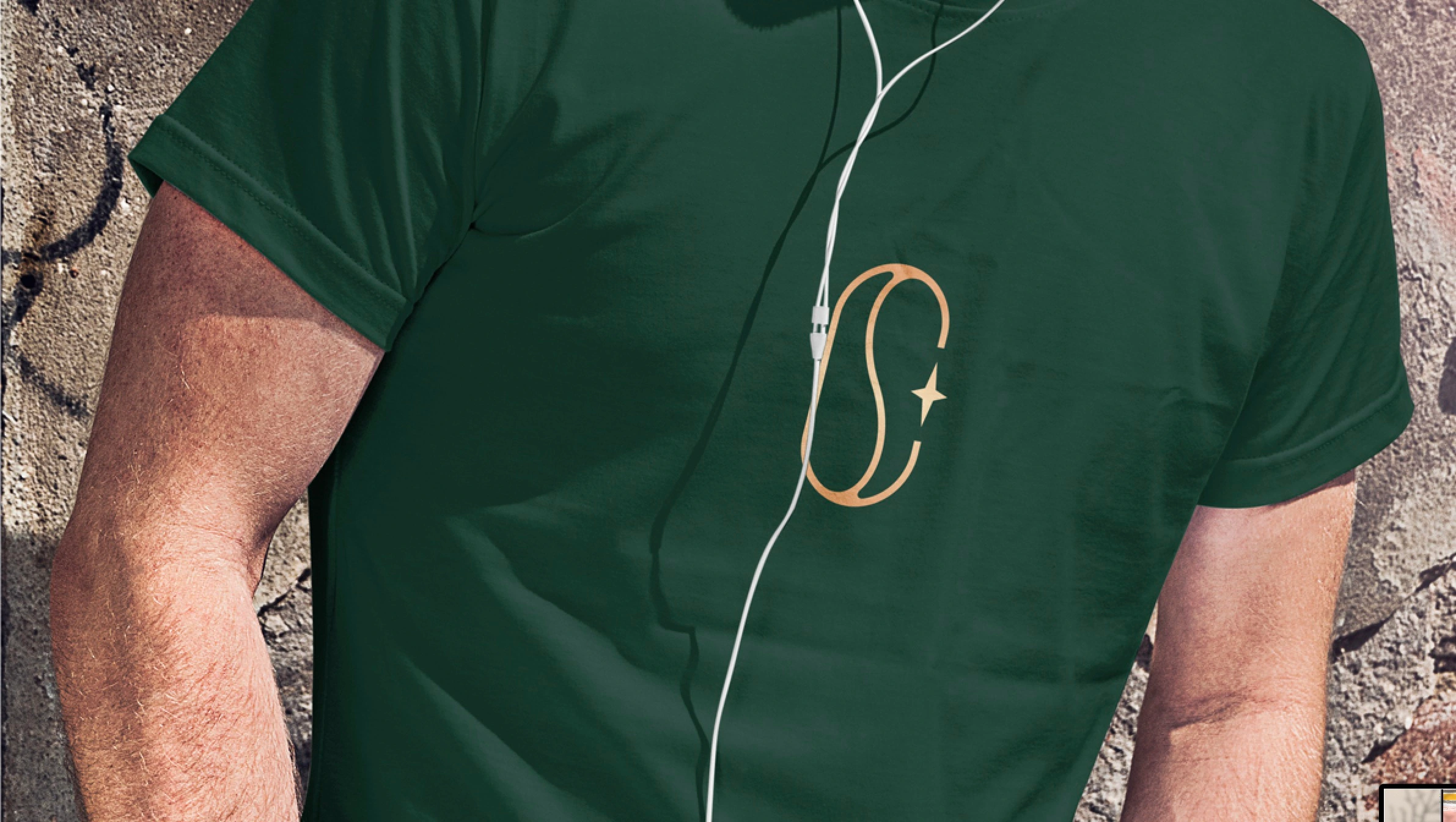
- Merchandise: T-shirts and phone cases extend the brand into lifestyle products, particularly appealing to millennial buyers
Commercial Applications
For commercial clients, the brand identity adapts to create appropriate atmospheres:
- Framed Prints: Consistent branding on artwork labels and certificates ensures commercial clients understand the value they’re purchasing
- Interior Displays: Artwork presentation maintains brand consistency while allowing the art itself to be the focal point
- Waiting Rooms and Lounges: The brand’s emphasis on “calm state of mind” and “positive energy” aligns perfectly with commercial spaces that need to create welcoming atmospheres
Result: Unified Brand Identity Across All Audiences
The complete brand identity system successfully positions Ceyise Studios as a premium fine art brand that speaks to all three target audiences. The comprehensive brand transformation delivers:
Strategic Outcomes
- Multi-audience success: Brand identity successfully resonates with three fundamentally different audiences
- Premium positioning maintained: Cohesive, premium brand position maintained across all audiences
- Accessibility achieved: Brand feels accessible to younger buyers without diluting premium positioning
- Commercial viability: Brand works for commercial businesses while maintaining artistic credibility
- Unified brand system: Single brand identity speaks to all audiences through universal language of color
Implementation Success
The brand identity maintains consistency across all touchpoints—from digital interfaces to physical storefronts, from product packaging to framed artwork—while allowing the artwork itself to remain the hero. The tagline “Life Is Art” reinforces the brand’s philosophy that art isn’t just decoration, but an essential part of living well. Today, Ceyise Studios uses this comprehensive brand identity to attract wealthy collectors, millennial art investors, and commercial businesses, successfully positioning them as a premium fine art brand that brings quiet luxury to interior spaces through the universal language of color.
Conclusion: Art That Speaks the Universal Language
Ceyise Studios’ brand identity demonstrates how thoughtful design can create a unified brand that speaks to diverse audiences without diluting its core message. By focusing on the universal language of color, sophisticated simplicity, and the emotional impact of art, the brand successfully appeals to collectors, investors, and commercial clients alike.
The brandmark’s celestial inspiration—the stylized ‘S’ with integrated star—suggests that art, like stars, can inspire dreams and bring light to any space. Whether displayed in a luxury home, a millennial’s apartment, or a commercial waiting room, Ceyise Studios’ artwork brings quiet luxury and positive energy to every environment.
Brand Name Strategy: Creating “Ceyise Studios”
The name “Ceyise Studios” was developed through Spellbrand’s strategic brand naming process. Our team researched the competitive landscape, target audience, and brand positioning to create a name that would resonate in the market and support long-term brand growth.
The naming process included linguistic analysis, trademark screening, domain availability verification, and brand storytelling to ensure “Ceyise Studios” would be distinctive, memorable, and legally protectable. Learn more about our brand naming service or explore our full naming portfolio.