

Laura Garrick Photography: A Unique Voice in Photography
Situation: Standing Out in Competitive Photography Market
Laura Garrick Photography is a London-based photography studio run by Laura Garrick, who graduated from Glasgow School of Art with a BA (Hons) Photography in 2008 and launched a studio that is gaining popularity in the UK.
In a competitive photography market where many studios look similar, Laura needed a brand identity that would communicate her unique voice and passion for perfection while helping her stand out from the competition. Most photography studios use similar white backgrounds and generic imagery, making differentiation challenging.
Task: Create Brand Identity That Communicates Unique Voice
The challenge required:
- Unique voice communication: Brand identity that communicates unique voice and passion for perfection
- Market differentiation: Stand out from competition in crowded photography market
- Professional positioning: Brand that communicates professionalism and creativity
- Website differentiation: Website that stands apart from typical white background studios
Action: Strategic Brand Development
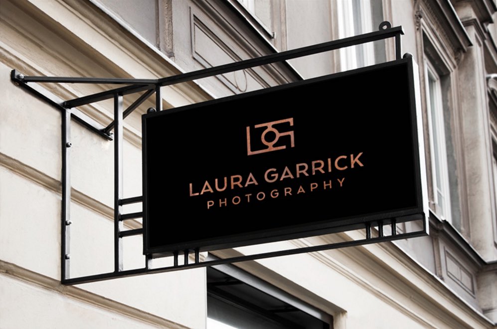
Brand Identity: Abstract Camera Icon
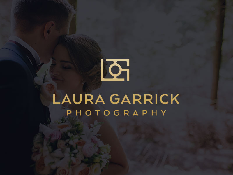
Right off the bat, the brand strategy for this client was to position the studio as a unique voice with a real passion for perfection in their work and a promise to capture their client’s journey perfectly. To translate this into a visual identity, we created a logo mark that is simple yet highly creative.
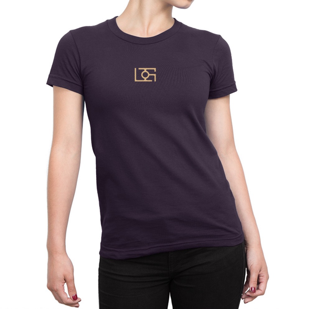
The brand icon is shaped like an abstract camera and is made up of the client’s initials. This design approach:
- Creates dual meaning: Functions as both a camera symbol and monogram
- Ensures simplicity: Clean, memorable design that’s easy to recognize
- Demonstrates creativity: Abstract approach sets it apart from typical photography logos
- Builds personal connection: Incorporates Laura’s initials for brand ownership
The result is a sublime logo design and brand identity that communicates both professionalism and creativity.
Website Design: Breaking Away from the White Background
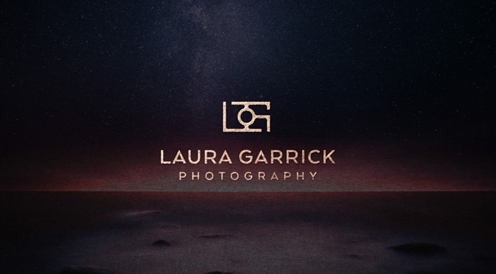
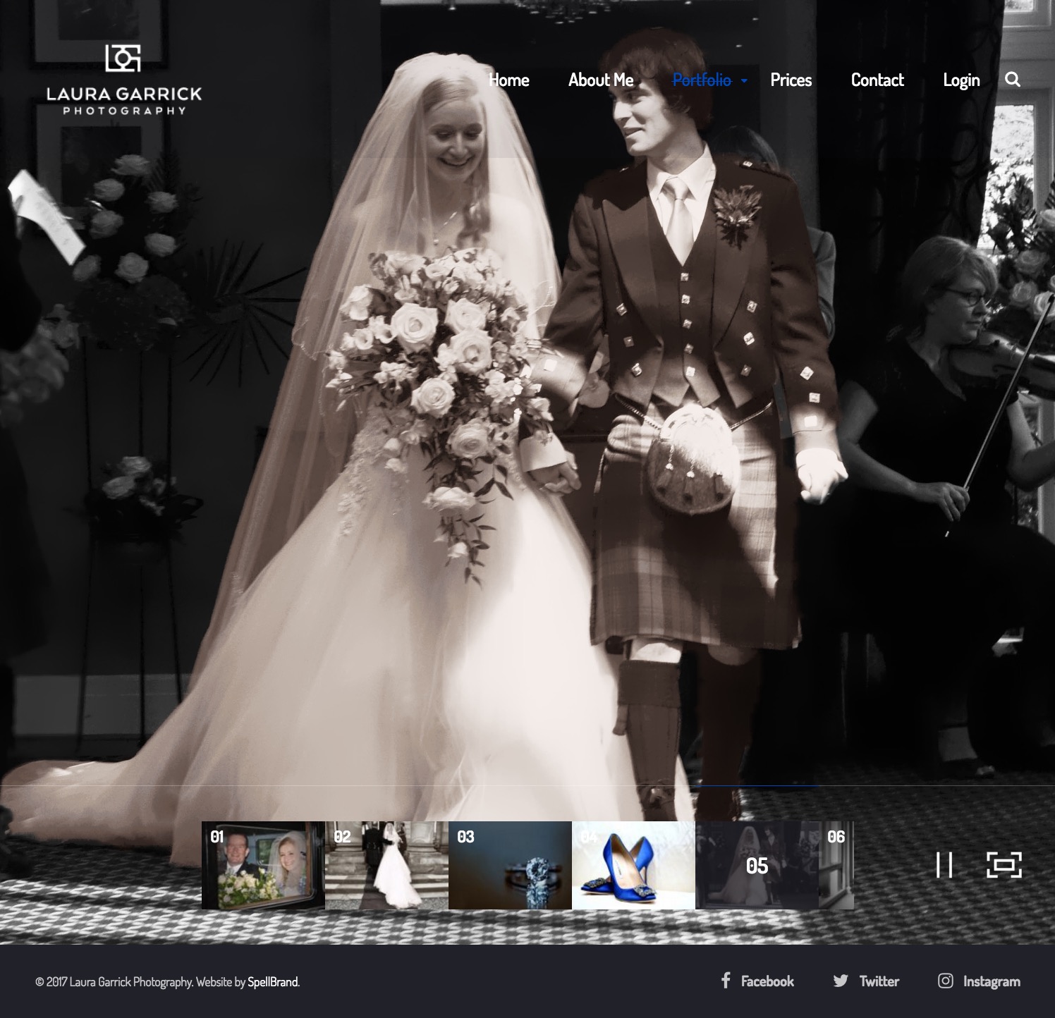
The client wanted a photography studio website that stood apart from the usual white color-based websites that other photography studios seemed to gravitate towards.
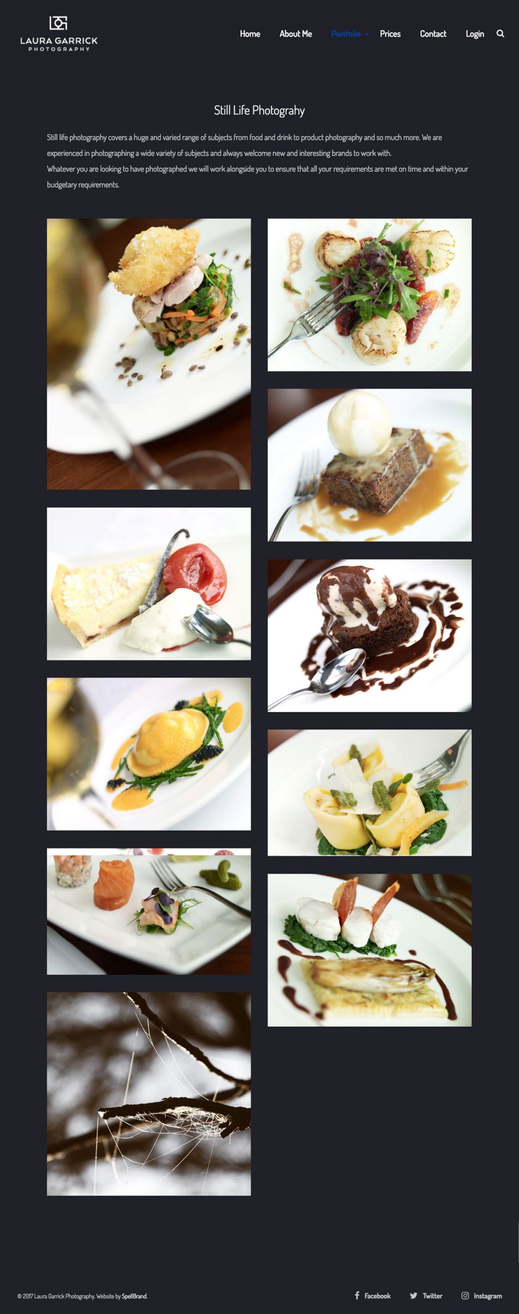
We created a stunning website that is on-brand and presents the client as a unique voice in the noisy landscape of photography studio websites. Emphasizing user experience, we created a layout that is beautifully responsive and creates the right impact.
Each page is crafted beautifully with care and passion. The use of the brand colors, beautiful typography, presentation of photos, and uncluttered navigation all make for a beautiful website that showcases Laura’s work while maintaining excellent usability.
Result: Brand Identity That Stands Out
The brand identity we created for Laura Garrick Photography successfully positions her as a unique voice in the competitive photography market. The comprehensive brand transformation delivers:
Strategic Outcomes
- Unique voice communication: Brand identity successfully communicates unique voice and passion for perfection
- Market differentiation: Stands out from competition in crowded photography market
- Professional positioning: Brand communicates professionalism and creativity
- Website differentiation: Website stands apart from typical white background studios
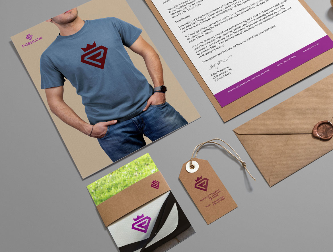
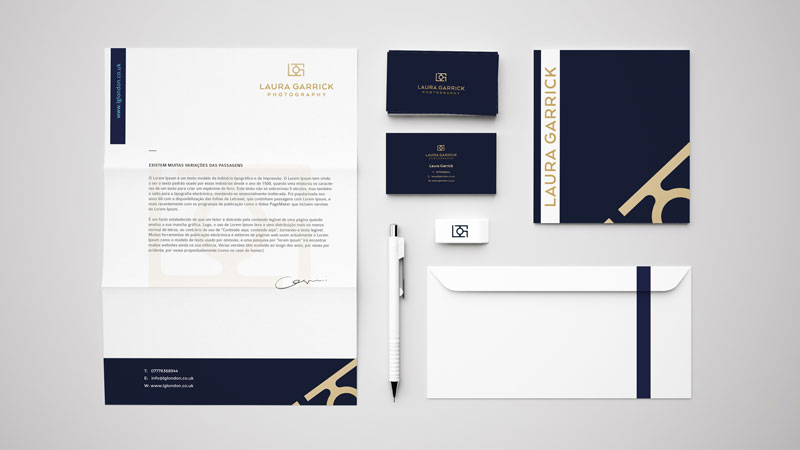
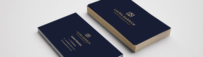
- Cohesive brand system: Abstract camera logo, stationery, and website create unified experience
Implementation Success
Today, Laura Garrick Photography uses this comprehensive brand identity to attract clients seeking a unique voice in photography. The abstract camera icon logo design, cohesive brand system, and stunning website that breaks away from white backgrounds successfully position Laura as a unique voice with a real passion for perfection, helping her stand out from the competition and gain popularity in the UK photography market.
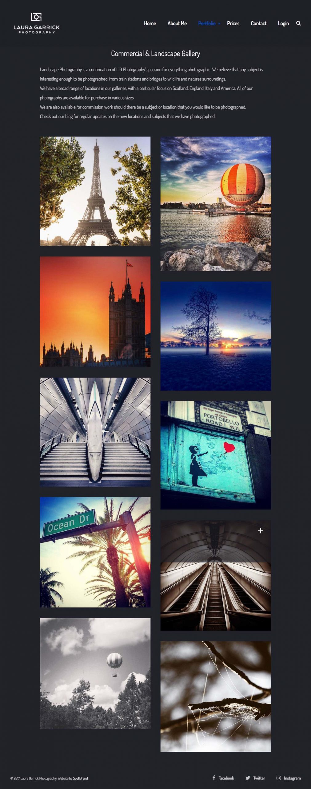
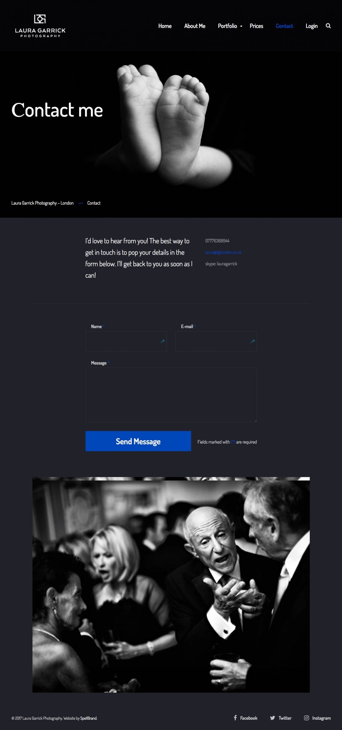
Beautiful Galleries
We created a stunning website with beautiful galleries. Each gallery is simple and elegant with either a grid layout or a mouse hover reveal style layout. This enables the users to engage with the website and explore it with out getting overwhelmed.
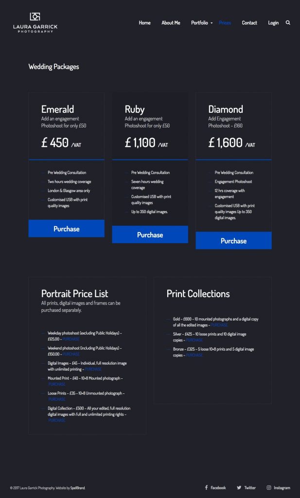
Elegant Pricing Page
The pricing page was created with conversion in mind and present the pricing options in a clear and impactful way. The bold colors make it easy to navigate and order.