

Taken: Redefining Office Wear for Modern Professionals
Situation: Creating Brand Identity for Office Wear Redefinition
Taken is a clothing and apparel brand by the super talented fashion designer, Edward Banks. With a goal to redefine office and commercial wear, Taken offers office wear and commercial wear that look awesome and yet casual enough to be seamlessly worn to out of office events.
The office wear market is evolving, with modern professionals seeking versatile clothing that works in both office and casual settings. Taken needed a brand identity that would communicate their unique value proposition: office wear that seamlessly transitions from work to play.
Task: Create Brand Identity for Seamless Work-to-Play Transition
The challenge required:
- Versatility communication: Brand identity that communicates versatility
- Work-to-play concept: Visual identity that represents seamless transition from work to play
- Modern professional appeal: Brand that appeals to contemporary work culture
- Designer credibility: Brand that reflects Edward Banks’ fashion expertise
Action: Strategic Brand Development
Logo Design: Work-to-Play Triangle Concept
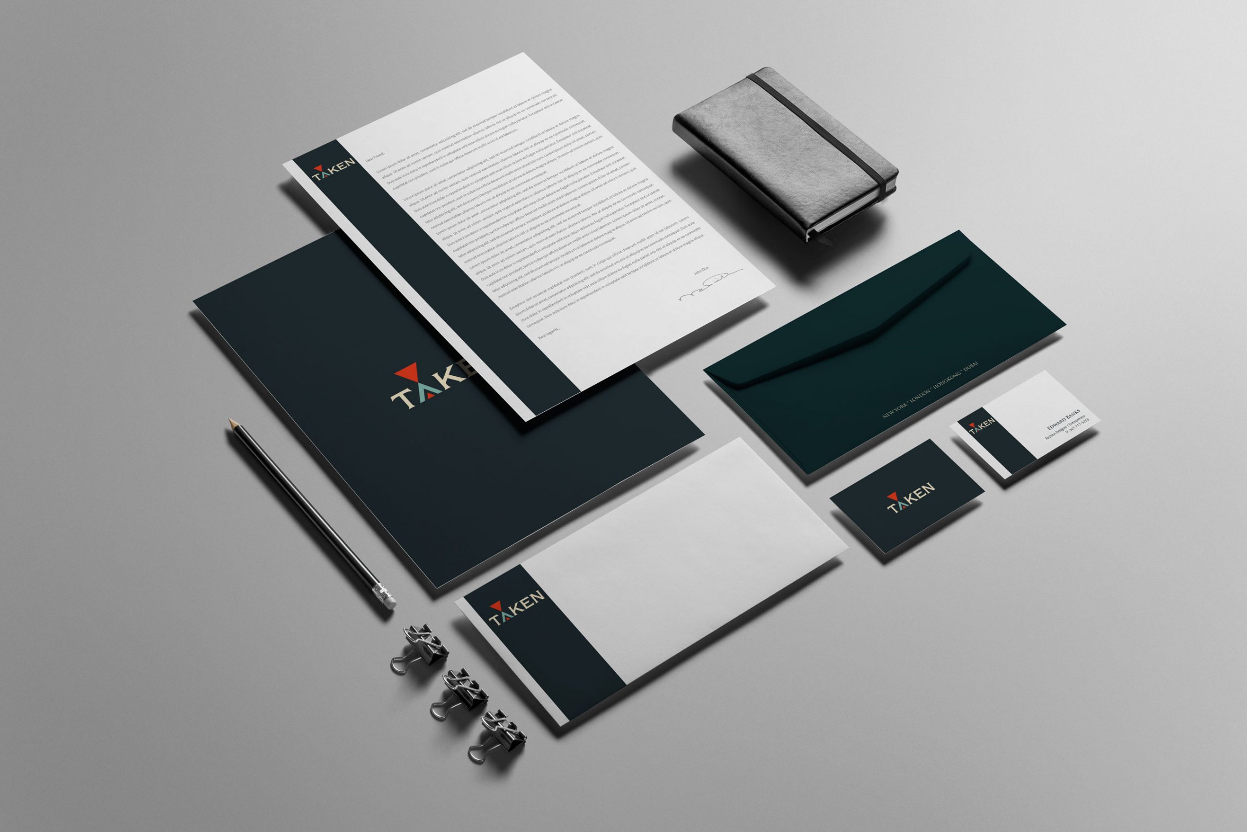
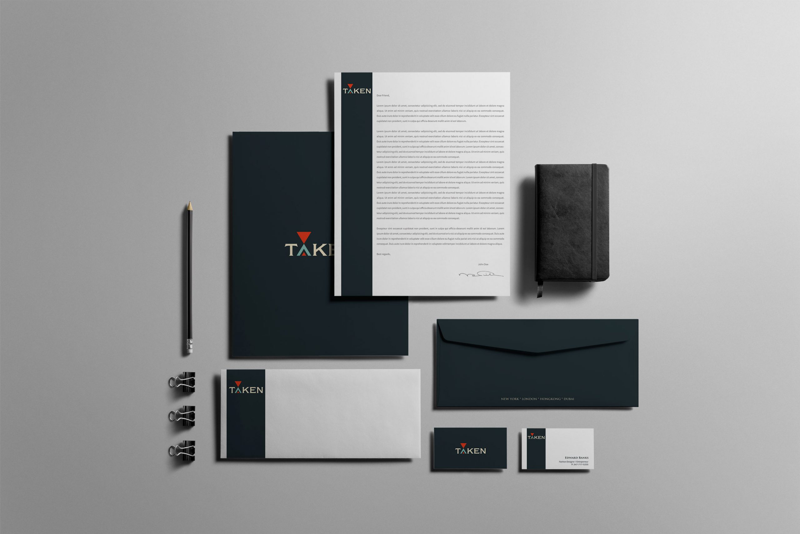
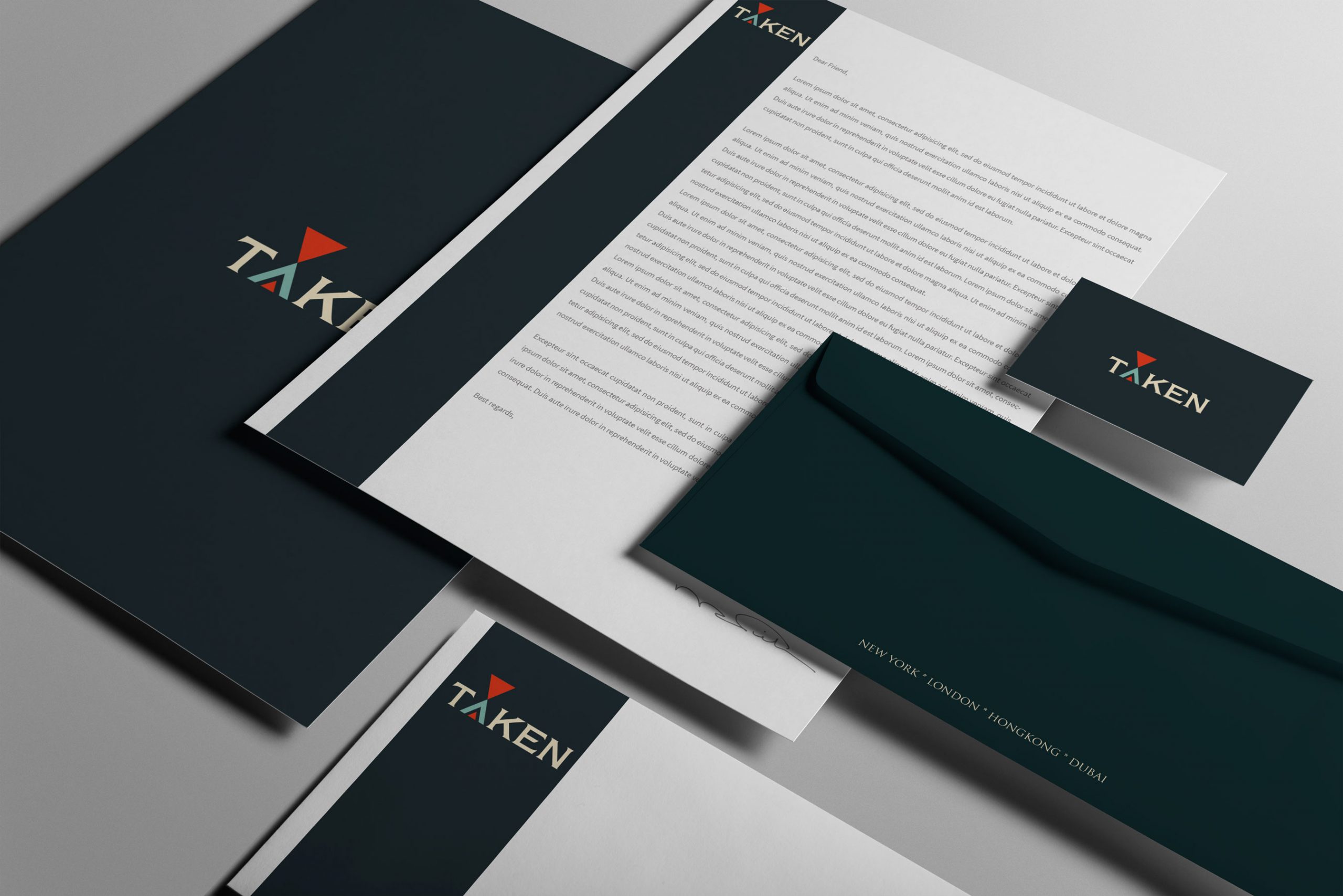
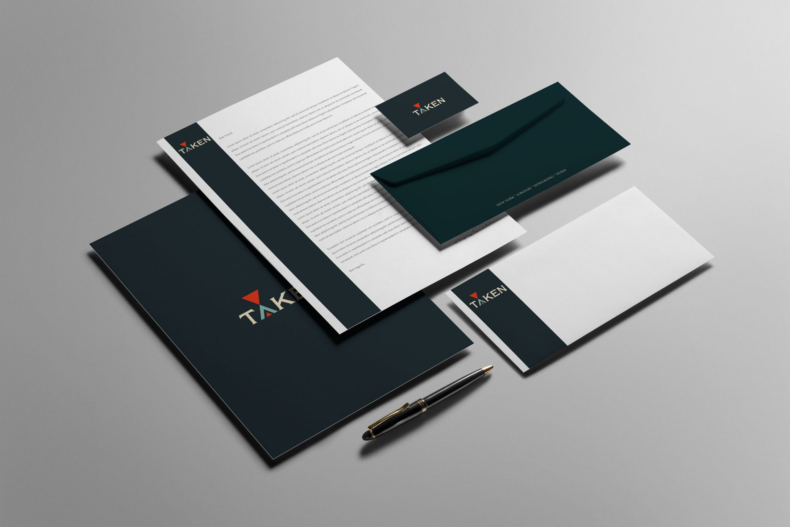
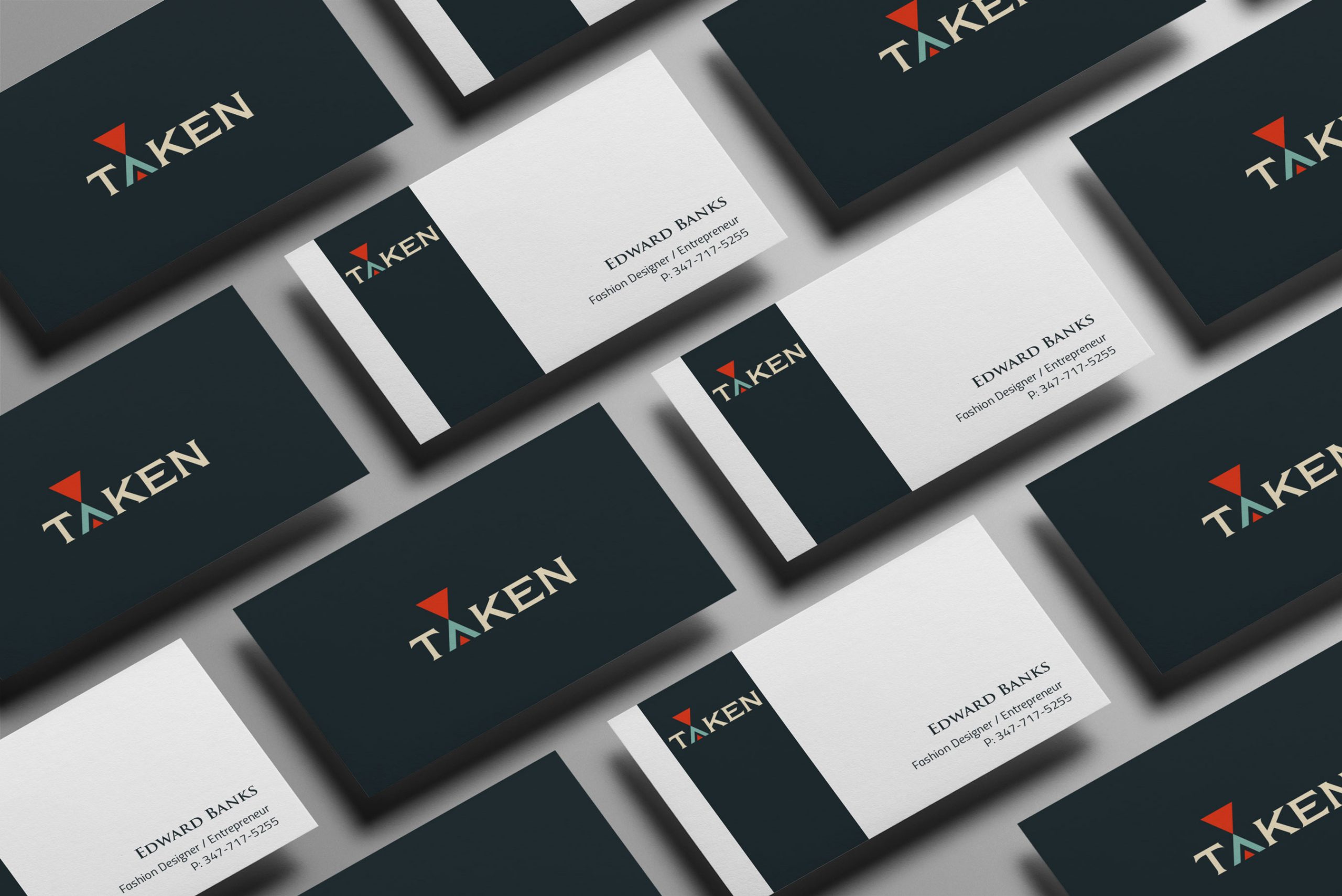
Spellbrand created a typography based logo design that has two triangles that represent the seamless move from work to play. The red triangle on top is the office and the letter A is a triangle with a smaller triangle within it and looks like the home. We also created matching stationery design.
This design approach:
- Creates visual metaphor: Triangles represent work (office) and play (home)
- Focuses on typography: Clean, modern typography appeals to professionals
- Uses color psychology: Red triangle signals energy and professionalism
- Communicates concept: Logo communicates brand’s core value proposition
Result: Brand Identity That Bridges Work and Life
The brand identity we created for Taken successfully communicates their unique value proposition of office wear that seamlessly transitions to casual wear. The comprehensive brand transformation delivers:
Strategic Outcomes
- Versatility communication: Brand identity successfully communicates versatility
- Work-to-play concept: Visual identity represents seamless transition from work to play
- Modern professional appeal: Brand appeals to contemporary work culture
- Designer credibility: Brand reflects Edward Banks’ fashion expertise
- Complete brand system: Typography-based logo, work-to-play triangle concept, and matching stationery create unified experience
Implementation Success
Today, Taken uses this comprehensive brand identity to attract professionals who want to redefine office wear. The typography-based logo design with its work-to-play triangle concept visually represents the brand’s core mission, while the complete brand identity system positions Taken as the solution for modern professionals who want versatile, stylish clothing. The brand successfully positions Taken as Edward Banks’ clothing brand that offers office and commercial wear that looks awesome yet casual enough to be seamlessly worn to out-of-office events, bridging the gap between work and play.
Brand Name Strategy: Creating “Taken”
The name “Taken” was developed through Spellbrand’s strategic brand naming process. Our team researched the competitive landscape, target audience, and brand positioning to create a name that would resonate in the market and support long-term brand growth.
The naming process included linguistic analysis, trademark screening, domain availability verification, and brand storytelling to ensure “Taken” would be distinctive, memorable, and legally protectable. Learn more about our brand naming service or explore our full naming portfolio.