Hiker Brand: From Corner Shop to Global Hiking Authority
Situation: Competing in Saturated Outdoor Clothing Market
After nearly 30 years in the outdoor clothing business, our client found themselves stuck. Despite decades of experience and quality products, they remained a small corner shop while industry giants dominated the market. The problem wasn’t their products—it was their lack of strategic positioning and brand identity.
When they approached Spellbrand, they wanted to expand beyond their local market and compete internationally. But competing head-on with established outdoor apparel brands would have been a losing battle. The outdoor clothing market is saturated with major players who owned both market share and consumer mindshare.
Task: Create Brand Strategy for International Expansion
The challenge required:
- Market differentiation: Brand strategy that differentiates from established outdoor brands
- International positioning: Brand identity that enables international expansion
- Niche specialization: Strategic positioning in specialized market segment
- Brand identity: Complete brand identity system including naming and visual design
Action: Strategic Brand Development
Brand Strategy: The Power of Specialization
The first step was understanding their vision and goals. We realized they wanted to dominate not just locally, but internationally. However, the broader “outdoor clothing” market was saturated with major players who owned both market share and consumer mindshare.
Our strategic insight was simple but powerful: specialization beats generalization.
Rather than competing in the crowded outdoor clothing space—where brands fight for attention from campers, hikers, climbers, and outdoor enthusiasts—we recommended focusing exclusively on the hiking market. This niche positioning would allow them to:
- Become the go-to brand for serious hikers
- Build a community around hiking culture
- Leverage content marketing and social media effectively
- Command premium pricing through specialization
Brand Naming: “Hiker Brand” - Simple, Powerful, Memorable
Once the positioning strategy was clear, we developed a brand name that would carry weight and instantly create an association with hiking. Among various options, “Hiker Brand” emerged as the perfect fit.
The name works on multiple levels:
- Direct and clear: Immediately communicates who the brand serves
- Aspirational: Positions the client as “the” brand for hikers
- Memorable: Simple enough to stick in consumers’ minds
- SEO-friendly: Contains the primary keyword naturally

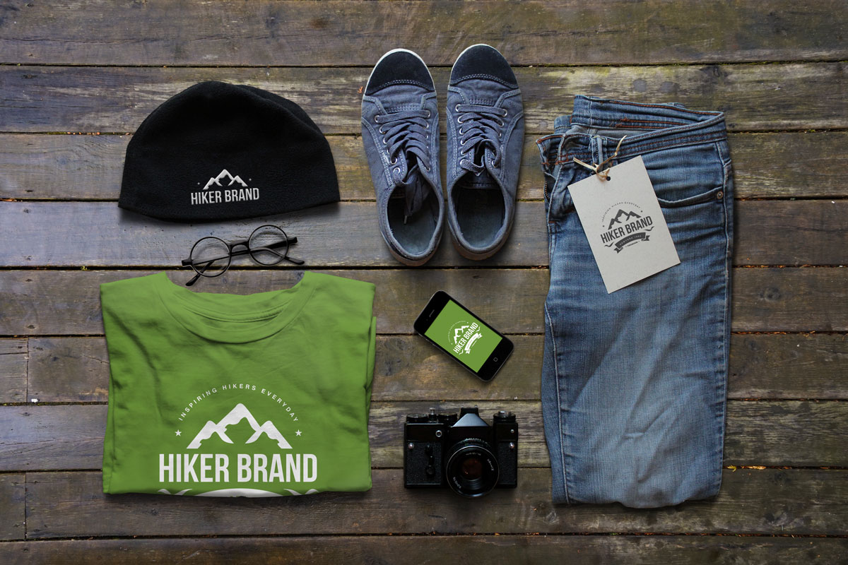
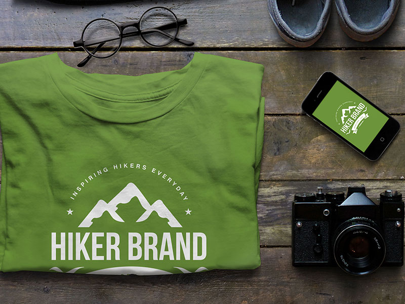
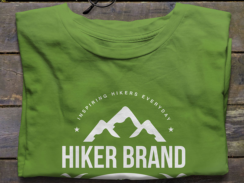
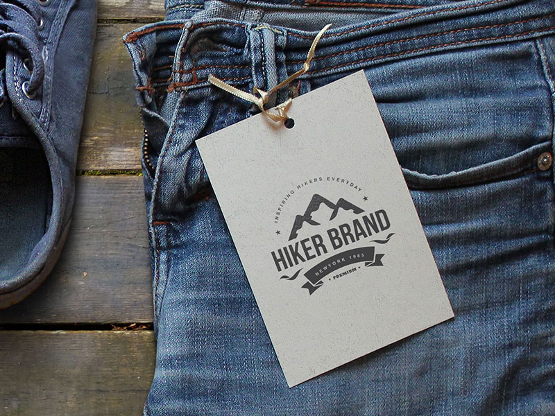
Visual Identity: Mountains and Emblem Design
With the name and strategy in place, we created a visual identity centered around mountains—the ultimate symbol of hiking. The logo design features an emblem-like mark that reinforces the brand’s premium status and connection to the hiking community.
The visual language includes:
- Mountain-inspired iconography that speaks directly to hikers
- Emblem-style design that conveys heritage and quality
- Bold, confident typography that stands out on gear and apparel
- Color palette inspired by nature but modern and versatile
Content Marketing Strategy
The rebrand wasn’t just about visual identity—it included a comprehensive content marketing strategy. By focusing exclusively on hiking, the brand could:
- Create targeted content that resonates with hikers
- Build a community through social media campaigns
- Establish authority in the hiking space
- Differentiate from general outdoor brands

Result: Brand Transformation from Corner Shop to Hiking Authority
The strategic repositioning transformed the company from a generic outdoor clothing store into a specialized hiking brand with a clear identity and purpose. The comprehensive brand transformation delivers:
Strategic Outcomes
- Market differentiation: Brand strategy successfully differentiates from established outdoor brands
- International positioning: Brand identity enables international expansion
- Niche specialization: Strategic positioning in specialized hiking market segment
- Complete brand system: Brand naming, visual identity, and marketing strategy create unified experience
- Community building: Brand positioned to build community around hiking culture
Implementation Success
By focusing on a niche market and leveraging content marketing, Hiker Brand positioned itself to become the de-facto brand for the global hiking community. The complete brand identity system—from name to visual design to marketing strategy—gave them the tools to compete effectively and build a loyal following among serious hikers worldwide. The brand successfully transforms the company from a generic outdoor clothing store into a specialized hiking brand with a clear identity and purpose, enabling them to command premium pricing through specialization.


Brand Name Strategy: Creating “Hiker Brand”
The name “Hiker Brand” was developed through Spellbrand’s strategic brand naming process. Our team researched the competitive landscape, target audience, and brand positioning to create a name that would resonate in the market and support long-term brand growth.
The naming process included linguistic analysis, trademark screening, domain availability verification, and brand storytelling to ensure “Hiker Brand” would be distinctive, memorable, and legally protectable. Learn more about our brand naming service or explore our full naming portfolio.