Spellbrand Blog
Brand Guidelines: How to Create Style Guides That Ensure Consistency

Brand guidelines are the instruction manual for your brand. They document how to correctly apply your visual identity, messaging, and voice across every touchpoint. Without them, your brand becomes inconsistent, confusing, and weak.
After creating brand guidelines for 2000+ companies, I’ve learned that great guidelines do more than show logo usage. They empower people to make good brand decisions independently. These guidelines are essential for maintaining consistency in your brand identity system and ensuring your brand strategy is properly executed across all applications.
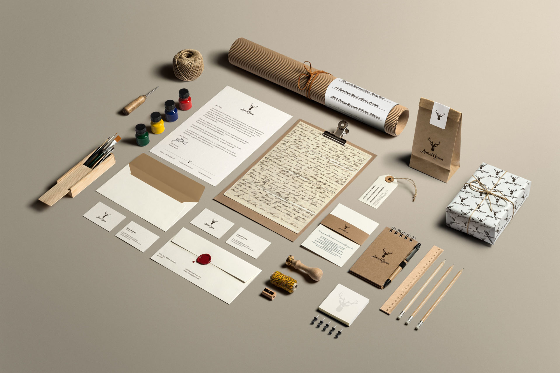
Check out our visual walkthrough of a brand manual with photos from an actual client case study showing how each section looks in practice.
What brand guidelines are
Brand guidelines (also called brand style guides, brand books, or brand manuals) are documents that specify your visual identity standards, establish messaging frameworks and voice guidelines, include application examples and use cases, and provide clear rules and restrictions governing brand usage. Their fundamental purpose is to ensure consistent, correct brand application by anyone who touches your brand, whether employees, agencies, partners, or media.
If you are building a new brand identity, start with understanding what brand identity is and how to create a brand identity system. Your guidelines will then document how to properly use all those elements.
Why they matter
When brands operate without guidelines, chaos follows. Logos get used in wrong colors, stretched beyond recognition, or cluttered with competing elements. Typography becomes inconsistent across materials. Color usage turns haphazard, with team members choosing colors that feel “close enough” but are not on-brand. Messaging drifts as different writers interpret the brand voice differently. The same questions get asked repeatedly: “Can I use this logo version?” “What color should I use here?” This back-and-forth wastes countless hours.
In the market, inconsistency creates confused brand perception. Customers encounter different versions of your brand across touchpoints, weakening the mental associations you worked hard to build. Over time, this erodes brand equity and makes your brand less recognizable.
When you have well-designed guidelines, everything changes. Your brand experience becomes consistent everywhere. Your team is empowered to make brand decisions independently because they understand the principles behind the rules. Creative production becomes faster because people are not guessing or asking permission for every decision. Your brand equity is protected, and years of brand building will not be undone by well-meaning but misguided applications.
Types of guidelines
Not every brand needs the same level of complexity.
Visual identity guidelines are the basic level, typically 10 to 20 pages focused on logo usage, colors, and typography. They suit startups, small businesses, and simple brands that need to establish consistency without overwhelming detail. Investment typically ranges from $2,000 to $10,000.
Standard brand guidelines run 30 to 60 pages and cover visual identity plus messaging, voice, and real-world applications. They suit growing companies, B2B organizations, and professional services firms. Investment ranges from $10,000 to $30,000.
Enterprise brand systems span 80 to 200 or more pages and cover the complete identity system including sub-brands, brand architecture, and governance. They are essential for large corporations and global brands. Investment ranges from $30,000 to $150,000 or more.
Mini brand guides are 5 to 10 page quick reference tools focused on essential rules only. They are perfect for vendors, freelancers, and quick onboarding situations. Investment ranges from $1,000 to $5,000.
The essential sections
Brand introduction
Before diving into visual specifications, your guidelines should help people understand your brand’s soul. The brand story section tells your company’s history and evolution, shares the founder’s vision, highlights key milestones, and explains what makes you different. The brand platform establishes your purpose, vision, mission, values, and positioning statement. When people understand your “why,” they are much better at making decisions that strengthen rather than dilute your brand.
Logo guidelines
Your logo is often the most visible brand element, so logo guidelines need to be thorough. If you are still developing your logo, our logo design service can help. Understanding logo design psychology also informs why certain design choices matter.
Document every approved logo version: primary, secondary, monochrome, icon-only, and submarks. Each should be labeled with when and where it is appropriate. Specify clear space requirements to prevent the logo from feeling cramped. Define minimum sizes for both digital (pixel dimensions) and print (inches) to protect legibility.
Show specific examples of incorrect usage: stretching, recoloring, rearranging elements, adding effects, placing on busy backgrounds, or using old versions. Visual examples of these violations make the rules concrete. Include approved background guidelines with contrast requirements, and tell people where to download assets, what file formats are available, and when to use each format.
Color palette
Color is one of the most powerful tools for brand recognition. Understanding color psychology helps explain why certain colors work for your brand.
For each primary color, provide the color name, Pantone reference, CMYK values, RGB values, hex code, and usage guidelines. Do the same for secondary and tertiary colors. Specify color accessibility requirements including contrast ratios for text, WCAG compliance notes, and approved text-background combinations. Include color dos and don’ts: use primary colors prominently, maintain contrast ratios, do not create new colors by mixing approved colors, and do not use similar off-brand colors.
Typography
Typography is the voice of your written communication, and consistent type is crucial for recognition. The value of typography in design extends well beyond the logo.
For your primary and secondary typefaces, specify the font family, where to acquire or license it, approved weights, when to use each weight, and fallback web fonts. Show typographic hierarchy examples demonstrating H1 through H4 styles, body copy, and captions with sizes, weights, and spacing. Cover usage details: line spacing, paragraph spacing, optimal line length, alignment preferences, hyphenation rules, and differences between web and print applications.
Imagery and photography
Photography style guidelines define your visual language: color treatment (vibrant, muted, or black and white), composition, subject matter, mood, lighting, and diversity standards. Show 6 to 12 examples of on-brand photography alongside off-brand photography with annotations explaining why each works or does not. Cover practical details like aspect ratios, resolution requirements, overlay treatments, and approved filters.
If your brand uses iconography, specify the style (line, filled, or duotone), size and spacing requirements, color rules, and how to create new icons that match. Do the same for illustrations if applicable.
Brand voice and messaging
Your voice is just as important as your look. Your brand messaging strategy should inform these guidelines. For lifestyle brands, our guide on creating a voice provides additional context.
Define 3 to 5 voice attributes with explanations of what each means in practice and what it does not mean. For example, “confident” means making clear claims backed by evidence and using active voice. It does not mean being arrogant, over-promising, or talking down to your audience.
Explain how tone shifts by channel while maintaining core voice: more casual on social media, more authoritative on your website, more empathetic in customer service, more precise in technical documentation. Establish grammar and mechanics preferences: Oxford comma usage, number formatting, capitalization style, punctuation preferences, and abbreviation handling. Document key messages, approved taglines, and boilerplate descriptions in multiple lengths. Show on-brand and off-brand copy examples side by side.
Applications and templates
This section demonstrates how all elements work together in the real world. Show digital applications (website, email signatures, social media, digital ads, presentations, email marketing) and print applications (business cards, letterhead, envelopes, brochures, signage, packaging) with correct examples, specifications, and links to templates. Cover branded merchandise including apparel, promotional items, and event materials. The goal is to make it easier to do things correctly than incorrectly.
Governance and approvals
Guidelines need governance. Identify who owns the brand, how to get questions answered, and what the approval workflow is. Tell people where to find brand assets, how to request new ones, and file naming conventions. Cover trademark usage (when to use the registered symbol versus the trademark symbol), legal name versus brand name distinctions, copyright notices, and co-branding rules. Note the current version number, when guidelines were last updated, and how to suggest updates.
Creating your guidelines
Start by auditing what you have. Gather all existing brand assets, review how your brand is currently used across touchpoints, identify inconsistencies, and survey stakeholders about their questions and confusion.
Then define scope. Who will use these guidelines? Just internal teams, or agencies and partners too? What applications matter most? What level of detail is appropriate?
Outline a structure using the essential sections as a starting point but customizing for your situation. Write clear, directive copy that tells people what to do, not just what not to do. Use visual examples extensively and show dos and don’ts side by side. Keep the tone helpful and supportive, not dictatorial.
Design the guidelines to exemplify your brand. Use your own fonts, colors, and photography style. Make it visually appealing and easy to navigate. If your guidelines do not look good, people will not want to use them.
Choose the right distribution format. Digital PDFs are the most common and easy to share. Interactive websites are easy to update and can track usage. Printed books offer premium presentation for onboarding. Quick reference cards give people desk essentials. Many brands use multiple formats for different audiences.
Do not just distribute guidelines and hope people use them. Present them to internal teams, walk through key sections, answer questions, and make them easily accessible. Then treat them as living documents: review annually, update when your brand evolves, track version changes, and re-communicate updates.
Common mistakes
Guidelines that are too restrictive stifle creativity and slow work. Instead, provide principles and judgment frameworks that help people make good decisions independently. Guidelines without enough examples make abstract rules hard to follow. Show extensive visual examples of correct and incorrect usage.
Focusing only on the logo neglects the full brand system. Cover all touchpoints. Making guidelines hard to use with poor organization and non-searchable formats ensures they get ignored. Creating them once and forgetting means they become outdated and irrelevant. And not explaining the reasoning behind rules makes them feel arbitrary. When people understand why a rule exists, they are more likely to follow it.
Measuring effectiveness
Track how often guidelines are accessed. Monitor the reduction in brand-related questions. Measure adherence in brand audits. Collect user feedback on helpfulness. Calculate time saved in creative production. Track brand consistency scores over time. These metrics tell you whether your guidelines are doing their job.
Your guidelines should grow with your brand
The best guidelines become beloved reference tools that people actually want to use, not dusty PDFs that sit forgotten in a folder. When they are well-crafted, they become part of your team’s daily workflow, making brand consistency effortless.
If you need help building the brand identity that guidelines will document, explore our brand identity services or learn more about our brand strategy approach. For companies creating their first brand system, our guide to creating a brand provides the foundation you need.
Start your brand guidelines project with our team.

Mash Bonigala
Creative Director & Brand Strategist
With 25+ years of building brands all around the world, Mash brings a keen insight and strategic thought process to the science of brand building. He has created brand strategies and competitive positioning stories that translate into powerful and stunning visual identities for all sizes of companies.
Featured Work
See Our Work in Action
Real brands, real results. Explore how we've helped businesses transform their identity.
Client Love
What Our Clients Say
Don't just take our word for it. Hear from the brands we've worked with.

Sue Politte
Success In Focus
"Love it! My brand identity and logo helps quickly communicate what I do. I coach very busy business leaders who want to take their organization to the next level and are tired of all the things that are slowing things down or blocking progress. My brand identity needed to grab visual attention and communicate quickly that I help my clients get focus so they gain and build success. My new brand will help my potential clients identify with me. Thank you!!!!"

Liana Alexander Raye
Harlequin Starr International Styles
"Working with the Spellbrand team has been incredibly easy. Mash has a team of experts who are extremely visionary and pioneering, pulling together ideas and initial thoughts into an actual brand giving you options that you feel best align with your thought process. I have no idea how they created my brand based on the vague brief I gave them, but they have worked wonders and magic. Their design, attention to detail, willingness to ensure the final product is exceptional all counts towards a company who has the client at the forefront of mind at every step of the way. Spellbrand is my Number 1 go to for all branding, website and design concepts moving forward. I look at them as an extension to our marketing arm. Just brilliant."
Related Services You Might Love
Based on what you just read, here are services that can help you achieve similar results for your brand.
Free Download
Brand Consistency Checklist
A 27-point checklist to audit your brand across every touchpoint. Used by our team on real client projects.
Success! Check your email for the download link.
Instant PDF download. We'll also send branding tips -- unsubscribe anytime.
Keep Reading
Related Articles

Mar 21, 2026
Brand Identity System: The Complete Guide to Building a Memorable Brand
How to build a brand identity system from strategy through logo, color palette, typography, and brand guidelines. The framework we use with every client at Spellbrand.
Read More
Mar 16, 2026
Brand Architecture: How to Structure Your Brand Portfolio for Growth
How to choose the right brand architecture model for your business. Covers branded house, house of brands, endorsed, and hybrid strategies with real examples and a decision framework.
Read More
Feb 19, 2026
How to Conduct a Brand Perception Audit: Measure the Gap Between Identity and Reality
How to conduct a brand perception audit that reveals the gap between how you see your brand and how customers actually experience it. Methodology with survey templates, analysis frameworks, and next steps.
Read More