Spellbrand Blog
The Value of Typography in Logo Design

When it comes to logo design, the value of typography can never be taken for granted. If the point of a logo is to communicate messages, there is no better way to do that than the use of letters and words. Since logos are all about aesthetics, it helps to choose the best lettering style for the design process.
There are many available options for the typography of a logo. But one needs to find the perfect logo design style for a brand when making a decision. Here are reasons a business can use as guidelines for choosing the best wordplay typography to create memorable logos:
Effective Branding
The choice of the right font must contribute positively to making a logo the visual representation of a business. It must be easily identifiable whether placed in huge billboards or small company souvenirs.
Communicating Messages
If it is true that a picture can paint a thousand words, then a logo is worth more. It embodies a business and therefore it will serve as the ambassador of its brand. The mere sight of a logo will send a message to people about the vision, mission, and ideals of a company. The right typography will help in this regard. A good choice of font will help avoid misinterpretation in people.
Adding Impact and Appeal
With so many competitors in an industry, a logo will help keep a business stand out among the rest. Apart from its function of representing a business, a logo will also help add visual impact and appeal to your brand. This helps as your edge in an otherwise crowded playing field. The right font can make a difference and initial-based logos.
The right typography will elevate the appeal and impact of any logo and not just text-based logos. It will help make its looks pleasing to the eyes. After all, no person will be attracted to a boring logo.
Unique Identification
The purpose of a brand is to make a business more noticeable among many. This is why a logo should always strive to be unique. The right choice of font will help make this possible. Distinct fonts will help a logo carve a niche in the eyes of people. This is crucial in building brand recognition.
Industry Affiliation
While a logo should strive to create separation from its rivals, it should not stray too far from the industry. Otherwise, people may be uncertain about what industry the business is pegged. The choice of typography from sans serif, cursive and decorative fonts will help tell the audience what kind of company the brand is all about.
Addressing the Target Audience
Branding is all about mixing and matching the right messages to attract the attention of the target audience. This is why an excellent logo must work to capture the fancy of its desired demographic. The right choice of typography is a significant factor in framing the perception of people about a logo.
Trust and Recognition
What it all boils down to in the creation of a logo is to gain the trust and recognition of people. When a logo is excellently designed with suitable typography, it will help establish the identity of a brand. When the company has started to make strides with its performance and quality of products and services, people will begin to trust and recognize its brand. The visual representation of this brand is the logo.
So design your logo right and work hard to make your business a success. Afterward, trust and recognition will easily follow. When your loyal customers see your logo, they know they are in good hands. This is particularly helpful because this will help spread the word about the quality of your brand.
Typography may seem like a trivial aspect of a logo. But it is pivotal in molding the impression about a brand. It is true that words in a logo can help create a good perception. But the way these words are written is equally important.
Case Study
What A Difference A Font Makes!
 The magazine industry is under attack. While magazines, newspapers, and other print periodicals were once a top means of entertainment in the United States, they have suffered massive losses as free entertainment on the internet has become the main way of passing time and getting information. Magazines all over the United States are responding by focusing on branding, developing new formats, and new logo designs for their publications.
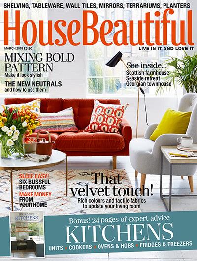
House Beautiful is the latest example of this trend. The magazine has traditionally used a rather simple logotype as a logo design. The type was tall and thin but rather plain, probably to prevent any stylistic clashes with the variety of homes and rooms published on the cover. The writing was published in colors that accented the cover to draw in reader interest at newsstands. This flexible color scheme will continue, but the font is changing as of this month’s issue. The writing has been pushed closer together and given curvy details that create a more distinctive feeling.
House Beautiful released a statement saying that the company feels its new logo is more youthful and feminine while also easier to read. However, I find it a little more difficult to read. Pushing the words together gives the text logo design a crowded feeling—like a cluttered room. The terminals definitely add interest and a youthful feeling, but they are almost girly. The fact that the terminals are placed only on certain letters keeps the logo from feeling too frilly, but it also makes them feel a little forced, especially in the word ‘House’. Putting the fancy detailing on the capital letters would probably resolve this issue.
One of the things that I really like about this logo design is that it has a general vintage feeling. However, it will still work well with a more modern cover because it has not gone full-on retro. It gives the magazine a more definite brand without limiting the editorial content. In short, while this logo definitely has a few issues, it is definitely an improvement and a much-needed update as well. The logo adds personality, while most magazine logo updates seem to be instead stripping it away.
The core problem in designing a magazine logo is that the magazine needs to appear to offer value. Americans are not afraid to pay for information, even if it is available for free, but the periodical needs to present a brand worth paying for. This logo design seems up to the task of building a House Beautiful brand among young homeowners.
With seven million readers, House Beautiful is one of the most successful American home décor magazines and also the longest continuously published name in its genre. However, even the most established business (or magazine) needs an occasional brand update. This new logo design adds character while maintaining simplicity and flexibility, which makes it a winner. It is a great design that is well-executed and will be instrumental in building a larger readership.

Mash Bonigala
Creative Director & Brand Strategist
With 25+ years of building brands all around the world, Mash brings a keen insight and strategic thought process to the science of brand building. He has created brand strategies and competitive positioning stories that translate into powerful and stunning visual identities for all sizes of companies.
Featured Work
See Our Work in Action
Real brands, real results. Explore how we've helped businesses transform their identity.
Client Love
What Our Clients Say
Don't just take our word for it. Hear from the brands we've worked with.
Gracienne Myers
Banana Vital
"If you are looking for a company to design your company’s identity or even rebrand your current brand, Spellbrand is the company that you would choose, they designed my company, Banana Vital’s logo, and provided me with 6 design to choose from which made it hard to choose because they were all very good. Just recently I hired them to rebrand Mechanical Bull Sales and again every logo was great and well thought out. I am very pleased with the work that Spellbrand has provided and I am looking for to continue working with them."
Tom McGee
PD Campus
"We tried several designers to design our logo and could not find the one that fit our company. After a few years of searching for a good branding company, I found Spellbrand through a random search. Spellbrand was sensational! They took the time to listen to our story and created a few designs that spoke to our team and what we do. We've never had a designer do that. We not only received a great logo, but we now have a brand we are all proud to wear! Thank you!"
Related Services You Might Love
Based on what you just read, here are services that can help you achieve similar results for your brand.
Free Download
Brand Consistency Checklist
A 27-point checklist to audit your brand across every touchpoint. Used by our team on real client projects.
Success! Check your email for the download link.
Instant PDF download. We'll also send branding tips -- unsubscribe anytime.
Keep Reading
Related Articles
Apr 17, 2026
Stop Naming Your Brand Like a Founder. Start Naming It Like a Buyer.
Founders name brands from the inside out: what the company does, what the technology is, what the vision means to them. Buyers don't care about any of that. After 250+ naming projects, here's how to name from the buyer's perspective and why it changes everything.
Read MoreApr 16, 2026
The Brand Name Moat: How the Right Name Creates an Unfair Advantage Your Competitors Can Never Copy
Your product can be copied in six months. Your price can be undercut tomorrow. But your brand name, if you chose it right, is the one competitive asset that's permanently yours. Here's how naming creates a moat that widens every year.
Read MoreApr 15, 2026
The Final Three: How to Pick Between Your Last Brand Name Candidates Without Blowing the Decision
You've narrowed it to three names. You can't decide. Every name has a flaw, every name has a fan on your team, and the launch date is closing in. Here's the decision framework I've used for 250+ naming projects to cut through the deadlock and pick the right name with confidence.
Read More

