Spellbrand Blog
Brand Identity System: The Six Elements That Make a Brand Unforgettable

Most businesses think a logo is enough. It is not. A logo is the most visible piece of a much larger system, and without the rest of that system, even a great logo will not create the kind of recognition and trust that builds a brand over time.
After building brand identity systems for 2000+ companies across 40+ countries over 25+ years, I have learned that the difference between a forgettable brand and an unforgettable one comes down to one thing: a well-executed system where every element reinforces every other element.
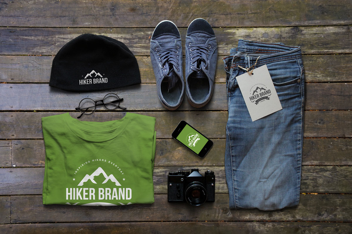
Your brand identity system is the visual and verbal DNA of your business. It is how customers recognize you, remember you, and choose you over competitors. It consists of six core assets: your primary brand mark, secondary brand mark, color palette, typography, visual extensions, and brand tone. Each plays a crucial role, but it is the combination of all six working together that creates a powerful, memorable identity.
Before diving in, it is worth noting that your identity system should align with your overall brand strategy and support your brand positioning. If you are just starting out, our guide on what brand identity is covers the fundamentals.
Why a system, not just a logo
A well-designed identity system is a strategic business asset that drives recognition, builds trust, and creates competitive advantage.

It gives your business a distinct personality that customers connect with, the same way people have unique personalities that make them memorable. Your brand might be formal and professional, casual and approachable, serious and authoritative, or playful and creative. The visual and verbal elements of your identity system express this personality consistently across all touchpoints, and that consistency becomes the foundation for how customers perceive and interact with your brand. For more on developing personality, explore our guide on brand persona.

In crowded markets, differentiation is everything. A distinctive identity system makes your brand stand out even when you offer similar products or services as competitors. The differences might be subtle, a specific color combination, a unique typographic treatment, a distinctive visual pattern, but they add up to create a brand that feels different and memorable. When your identity system is well-executed, customers can identify your brand instantly, even without seeing your logo or company name.

Consistency builds recognition and trust. When customers see your brand across different touchpoints, they should immediately recognize it as yours. Without a defined system, brands fall into inconsistency: different colors, fonts, or messaging styles across different channels. This confuses customers, weakens recognition, and damages credibility. A well-documented system brings consistency to every activity, campaign, and touchpoint, establishing your brand as reliable and professional. This is the foundation for creating brand guidelines that keep everyone aligned.

A strong identity system creates awareness by making your brand instantly recognizable. When your visual identity is consistent and distinctive, customers begin recognizing your brand even in peripheral contexts. Seeing your colors, typography, or visual patterns triggers recall. This awareness serves as a powerful filter: customers who recognize your brand are more likely to choose you over unfamiliar competitors.

And the deepest value is loyalty. When customers identify with your brand’s personality, values, and visual identity, they do not just buy from you. They become advocates. Research shows that 72% of global consumers have loyalty toward at least one brand. These loyal customers make repeat purchases, recommend you to others, and choose you even when competitors offer lower prices. While attracting new customers is important, building loyalty among existing customers is what drives sustainable growth.
The six elements

Primary brand mark
Your logo is the most visible symbol of your brand. It is often the first thing customers see and the element they remember most. But a great logo is not just a pretty picture. It is a strategic tool that communicates your brand’s essence at a glance.
The best logos are simple, memorable, and meaningful. They tend toward conceptual and abstract visual elements rather than literally depicting what the brand does. The Apple logo does not show a computer, but it is instantly recognizable and carries meaning about innovation and simplicity.
Your primary brand mark should be flexible enough to work across all media and at all sizes, from a tiny favicon to a massive billboard. It needs to be easy to reproduce in both digital and print formats. At minimum, a great logo design is scalable at any size, simple enough for easy recognition, adaptable across different media and contexts, memorable enough to create lasting impressions, unique enough to stand out from competitors, and aligned with your brand’s values and positioning.

Secondary brand mark
While your primary logo is your main identifier, a secondary brand mark provides flexibility across the many touchpoints brands now need to serve: social media profiles, product labels, mobile apps, favicons, email signatures, and merchandise.
Think of your secondary mark as a simplified version of your primary logo. It might be an icon, a monogram, or a wordmark that works when your full logo does not fit the space or context. For lifestyle brands, fashion brands, and consumer products, a secondary mark is especially valuable because it creates additional recognition opportunities without compromising the impact of the primary logo. Together, your primary and secondary marks create a flexible system that ensures recognition everywhere.

Color palette
Color is one of the most powerful tools in your identity system. It creates immediate emotional responses, reinforces recognition, and can become synonymous with your brand. Think of Tiffany’s blue, Coca-Cola’s red, or UPS’s brown. These brands have effectively owned colors in their markets.
Your color palette should not be limited to your logo and letterhead. When used strategically throughout your business, from website and packaging to physical spaces and marketing materials, your colors become so strongly associated with your brand that customers recognize you without seeing your logo. Owning a color in your market segment should be one of your branding goals.
When selecting colors, prioritize brand suitability (alignment with personality and values), target audience alignment (resonance with your market), market differentiation (standing out from competitors), and psychological impact. Your personal preferences as a stakeholder should come last. Build a structured palette with one or two primary colors, supporting secondary colors, accent tertiary colors, and neutrals for text and backgrounds. For more on color psychology, explore our guide on color psychology in logo design.

Typography
The fonts you choose communicate personality, set tone, and create recognition just as powerfully as your logo and colors. Yet many brands make typography choices based on personal preference rather than strategic thinking.
Typefaces have distinct personalities. Serifs typically convey tradition, elegance, and authority. Sans-serifs suggest modernity, simplicity, and approachability. Script fonts can feel elegant or casual. Display fonts make bold statements. Your typography choices should match your brand’s personality. A tech startup might choose a modern, clean sans-serif. A luxury brand might prefer an elegant serif.
Build a structured typography system with a primary typeface (usually for your logo and headlines), a secondary typeface (for body text and supporting content that complements the primary), and optionally a tertiary accent font for special applications. If your logo uses a custom typeface, be judicious about using that same font elsewhere. Overuse dilutes the impact. For more on typography, check out our guide on the value of typography in logo design.

Visual brand extensions
Visual extensions are supporting design elements that enhance your brand’s visual experience and create additional recognition: official brand patterns, custom iconography, illustrations, and other graphic elements.
An official brand pattern, used subtly throughout your visual identity, can significantly enhance brand recall. Patterns create visual texture and depth while reinforcing your brand. When customers see your pattern on packaging, marketing materials, or digital interfaces, they recognize it as yours. Brand patterns demonstrate attention to detail and show that your brand cares about consistency, which builds trust and reinforces the message that your brand is reliable and trustworthy.
Custom iconography establishes direct visual connections with your audience across website navigation, marketing materials, product packaging, social media graphics, and mobile apps. When your iconography follows consistent design principles and aligns with your overall visual identity, it becomes another recognition tool that strengthens your presence.

Brand tone and voice
Your brand tone is the personality and style of your communication. While your visual elements create recognition, your tone creates connection. It is not just what your brand says, but how it says it.
A consistent, well-defined tone helps your brand communicate effectively, build relationships, and differentiate from competitors. Good messaging takes your competitive positioning and brand strategy to the next level by honing in on what is essential to your market and communicating it consistently.
Your tone manifests across every touchpoint: your elevator pitch and positioning statement, your mission and vision statements, your taglines, your website copy and advertising, your social media and blog content, your press releases, and every customer interaction. For lifestyle brands and consumer-facing businesses, tone is especially important. Check out our guide on how to create a voice for your lifestyle brand. Your tone should also align with your overall brand messaging strategy for consistency across all communications.
The mistakes that weaken identity systems
The most common mistake is thinking a logo is enough. A brand identity system is a framework that includes visual elements, verbal communication, and application guidelines. Your logo is one piece of a much larger whole.
Not understanding your target audience is the second most damaging mistake. This results in inconsistent visual style, website design that misses the mark, and messaging that does not resonate. Your identity system should be built with your audience in mind, not your personal preferences.
Inconsistent tone and messaging damages your brand identity. Communicating in the right language with appropriate words is a key element of your system. Your tone should be consistent across all touchpoints and aligned with your brand’s personality and values.
And neglecting brand guidelines means your team and partners will not know how to use your identity correctly. This leads to the inconsistency that weakens recognition and trust. Our guide to creating brand guidelines covers everything you need to build effective documentation.
Ready to build a brand identity system that creates lasting recognition? Explore our brand identity services or get in touch to discuss your project. You can also see the identity systems we have built in our portfolio.

Mash Bonigala
Creative Director & Brand Strategist
With 25+ years of building brands all around the world, Mash brings a keen insight and strategic thought process to the science of brand building. He has created brand strategies and competitive positioning stories that translate into powerful and stunning visual identities for all sizes of companies.
Featured Work
See Our Work in Action
Real brands, real results. Explore how we've helped businesses transform their identity.
Client Love
What Our Clients Say
Don't just take our word for it. Hear from the brands we've worked with.

Josh Amburn
Lakefront Docks and Lifts
"I came into this project expecting to get the best logo for our brand. That’s exactly what I received. The team at SpellBrand used the descriptions of what we do along with a color palette of our site to design three amazing concepts. Once we decided on what worked best for our needs, they worked diligently to perfect the design. Their use of their project management software makes the collaboration painless. Great work team! We’ll see you on the next project! Josh"

Gracienne Myers
Banana Vital
"If you are looking for a company to design your company’s identity or even rebrand your current brand, Spellbrand is the company that you would choose, they designed my company, Banana Vital’s logo, and provided me with 6 design to choose from which made it hard to choose because they were all very good. Just recently I hired them to rebrand Mechanical Bull Sales and again every logo was great and well thought out. I am very pleased with the work that Spellbrand has provided and I am looking for to continue working with them."
Related Services You Might Love
Based on what you just read, here are services that can help you achieve similar results for your brand.
Free Download
Brand Consistency Checklist
A 27-point checklist to audit your brand across every touchpoint. Used by our team on real client projects.
Success! Check your email for the download link.
Instant PDF download. We'll also send branding tips -- unsubscribe anytime.
Keep Reading
Related Articles

Mar 21, 2026
Brand Identity System: The Complete Guide to Building a Memorable Brand
How to build a brand identity system from strategy through logo, color palette, typography, and brand guidelines. The framework we use with every client at Spellbrand.
Read More
Jan 25, 2025
Color Psychology in Logo Design: The Science of Brand Color
How color psychology shapes logo design. Why certain colors build trust, and how to pick a palette that works for your brand.
Read MoreJan 15, 2025
Real Estate Logo Design and Branding: What Actually Works
After designing brand identities for hundreds of real estate professionals, developers, and agencies, here is what separates the agents who get remembered from the ones who get scrolled past.
Read More