Spellbrand Blog
Top 10 Entertainment Industry Logos
Looking for a custom logo?
Get a professional, one-of-a-kind logo designed by our award-winning team.
Looking for a custom logo design?
Our professional designers create unique, memorable logos tailored to your brand.
See Our Logo Design Services →The entertainment industry is a field where customers usually buy the product before having even seen it. They must trust the company enough to assume that the product will be worth their upfront investment. Because this requires trust and confidence, a business logo for this field must be particularly inspiring. These ten entertainment industry logos are strong enough to provide a strong brand for the company and convince customers that their products are worth the money.
DREAMWORKS LOGO
The movie company Dreamworks has a name that suggests sleeplike catharsis and escapes from reality, which is something that many people want from a movie. Their logo is just as dreamy. It features not a man in the moon, but a small boy in the moon with a fishing pool. The deep blue hues along with the clouds accented by moonlight give the logo a sleepy feeling. The name and the logo both suggest that the movie films from this company will be a relaxing and escapist experience.
TWENTIETH CENTURY FOX LOGO
Twentieth Century Fox portrays both strength and the style of Old Hollywood with their business logo. The letters of the company appear to be carved out of stone. They are a rich, reflective gold, associated with luxury and wealth. Large lights, which are traditionally associated with theater, surround the name. In the background, it is dusk, the time when many people head to the theaters to catch a movie. These entertainment logo symbols combined into one cohesive logo make this logo a success.
RKO PICTURES LOGO
This logo has perhaps changed the least of any entertainment business logo. It simply features a radio tower, a throwback to the company’s past as a radio industry giant, on top of a globe. This suggests that this company dominates the world in its industry, which is not far from the truth. The name is written in modern letters in the color red, which is an attention-getting color.
METRO GOLDWYN MAYER LOGO
Metro Goldwyn Mayer is one of the original film companies, and it not so coincidentally has one of the most recognizable logos in the film industry. The business logo features a cameo-like picture of a lion, which was the mascot of the founder’s college. However, lions also can suggest strength, leadership, and loyalty, which is a positive first impression for any company to portray. Few people know that the words surrounding the lion, “Ars Gratis Artis” are Latin for “Art for Art’s Sake”. This logo is a clear winner because it is unique, tied into company culture, and has high recognition among moviegoers.
UNIVERSAL
Universal Pictures is one of the oldest entertainment industry companies, and they have a logo that ties into their name and their industry. The business logo of this company features a globe, representing the ‘Universal’ nature they are trying to portray. The globe is backlit as if from a large light such as those used in the film industry, tying into the company’s trade. The logo has dark colors in the background with bright colors in the foreground, creating a sense of brilliance and balance.
PARAMOUNT
The Paramount business logo features a mountain rising out of the clouds. While mountains and triangles both imply strength, the clouds surrounding this mountain imply lofty height. The blues and purples of the logo imply an evening’s calm. The ring of stars originally had 24 stars, one for each of the studio’s original contracted workers. However, the ring was redesigned with 22 stars simply because it was more aesthetically pleasing. In any case, the star is a symbol commonly associated with Hollywood, and thus very appropriate.
SONY PICTURES
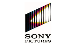
Sony Pictures is an entertainment industry giant with a business logo that is recognizable around the world. The logo features a rectangle, which is reminiscent of the screen most movies are viewed upon. It is divided by lines that become thinner toward the right side of the shape, adding visual interest. There appears to be a spotlight focused on the rectangle, which is a popular symbol of the music industry. Because this logo is both memorable and relevant to its industry, it is very appropriate for a company of this stature.
NEW LINE CINEMA
The New Lines Cinema Company aims to be just a little different from the others, and this value is portrayed by both their name and their logo. The business logo features a portion of film, which is a common entertainment industry symbol. However, one edge of the film lies diagonally across the film instead of on the side where it usually is. The message? That this film company is just a little different and edgier from the others.
CASTLE ROCK ENTERTAINMENT
Castle Rock is a medium-sized film company that is neither an industry giant nor a small independent company. However, this company is respected both among filmgoers and within its industry. While part of this is due to the high quality of the movies that are made here, at least part is because of the business logo. This logo features a lighthouse, which traditionally suggests both safety and ‘lighting the way’. The lighthouse is backlit by the moon, which looks strikingly like a movie light, a common entertainment industry symbol. The impression is that you are safe choosing a film from this company, and that they are a reliable source of entertainment.
LIONS GATE ENTERTAINMENT
Lions Gate is one of the largest independent film companies, and its business logo expresses this by being unique while using common entertainment techniques. The logo features simply the company name, avoiding the entertainment industry tradition of choosing a central icon. However, the company name is bathed in light, as if from the lights typical of a movie logo. It also is surrounded by clouds, another common theme in the entertainment industry. The message is that this is a movie company, but that it is just a little different from the rest of the pack.
The movie industry has its own rules and its own symbols, and the business logos of the most successful film houses show this in a visual, easily understandable form. Whether it is a traditional logo bringing up images of Old Hollywood, or a new age logo using the best of modern symbolism, each of these logos perfectly describes the company that sponsors it.
A collection of the top 10 media companies and their media logo designs. These media companies are the giants of the media and entertainment world. They shape what we see and how we see things. They have created history and enhanced our lifestyles significantly by making media accessible.
This week we take a look at the top 10 media logos. We do not review the logos but merely list them as a showcase. If you would like to pitch in with your own recommendations, please do leave a comment in a similar format as you see below. You can even use the “img src=” code to show the logo. The logo has to be 250px wide and 150px high.

Mash Bonigala
Creative Director & Brand Strategist
With 25+ years of building brands all around the world, Mash brings a keen insight and strategic thought process to the science of brand building. He has created brand strategies and competitive positioning stories that translate into powerful and stunning visual identities for all sizes of companies.
Featured Work
See Our Work in Action
Real brands, real results. Explore how we've helped businesses transform their identity.
Client Love
What Our Clients Say
Don't just take our word for it. Hear from the brands we've worked with.
Ernest Bannister
M.O.R.E
"My experience with the Spell brand team has been nothing short of excellent. From the beginning Mash and team made me feel very comfortable with the design process. I am extremely happy with the results of my design and look forward to working with Spellbrand; exclusively! I have told many family, friends and peers about the great work the Spellbrand team has done in creating my design. Thanks again for all your patience and professionalism; I look forward to working with you in the future."
Steve Turner
Turn2Coaching
"Delighted to have used Spellbrand for our last project. The work was thorough and results excellent. For me it was such a pleasure to work with Mash who was able to keep up with all my last minute requests for small changes. Nothing was too much of a problem and I would have to say that its great to work with people who do actually put the customer needs first! One thing saying it, its another thing doing it – Thanks Mash!"
Related Services You Might Love
Based on what you just read, here are services that can help you achieve similar results for your brand.
Free Download
Brand Consistency Checklist
A 27-point checklist to audit your brand across every touchpoint. Used by our team on real client projects.
Success! Check your email for the download link.
Instant PDF download. We'll also send branding tips -- unsubscribe anytime.
Keep Reading
Related Articles
Nov 17, 2025
Top 10 Simple Logos (Yet Effective Logos)
Discover the top 10 simple logos (yet effective logos) logos. Expert analysis of iconic logo designs, their history, and what makes them memorable.
Read MoreNov 17, 2025
Top 10 American University & College Logos
Discover the top 10 american university & college logos logos. Expert analysis of iconic logo designs, their history, and what makes them memorable.
Read MoreNov 17, 2025
Top 10 Car Company Logos
Discover the top 10 car company logos logos. Expert analysis of iconic logo designs, their history, and what makes them memorable.
Read More

