Spellbrand Blog
Top 10 Literary Publishing Logos
Looking for a custom logo?
Get a professional, one-of-a-kind logo designed by our award-winning team.
Looking for a custom logo design?
Our professional designers create unique, memorable logos tailored to your brand.
See Our Logo Design Services →Literary publishing is one of the most lucrative businesses on the globe. Even with digital media becoming the most renowned superstar of our age, at the end of the day many people turn to an old-fashioned book for entertainment and escape. There is a wide range of books, and just as wide a range of literary houses, but these ten are particularly striking and inviting to literature lovers everywhere.
Hyperion Publishing Logo Design
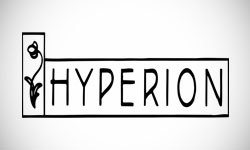
Although Hyperion is owned by Disney, there are no traces of the youthful Disney brand in this lovely and simple media logo. The logo looks a bit like a street sign, which is appropriate as it is named after the avenue on which Disney Studios was located until 1939. Two rectangular shapes are dominant, suggesting a straightforwardness and honesty. The wording is tall, narrow, and thin, to compliment this image. The single image of a flower is representative of growth and blossoming, appropriate for this industry.
Little, Brown & Company Publishing Logo Design
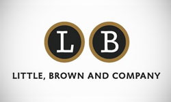
This writers logo uses a circular shape to imply inclusiveness and friendliness, both of which are positive in a market where emotion is everything. The font is straightforward and modern with little frill, while the initials are enclosed inside the circle to make for a very personal and yet recognizable image. The brown, black, and white color palette is business-like and modern as well.
Abbeville Literary Publishing Logo Design
What could be more appropriate for a publishing company than an old-fashioned wood block print? While this image is likely made with digital media, its reference to the printing methods of yesteryear give an air of Old World quality and attention to detail. The writing contains several wave-like shapes, which usually give a feeling of forward movement. The message that this press has a solid grounding in the past with an eye toward the future is both unmistakable and incredibly positive for a field like literature.
Poisoned Pen Press Publishing Logo Design
This literary label specializes in mysteries, making the name very appropriate as a part of the overall brand. The old fashioned cursive writing is visually attractive while tying into the name. The many curves above the pen nib in the image are representative of the many twists and turns that a traditional mystery novel can take before the truth is at last discovered. The spot of red represents blood and also adds a bold and attention-getting splash of color to an otherwise black and white logo. Mystery lovers everywhere will be intrigued by this literary logo.
Candlewick Press Literary Publishing Logo Design
This literary house has a more juvenile image, which is appropriate considering that they specialize in children’s books. The general shape is of a street sign, which is often seen in children’s logos—think of Sesame Street. The initials are on either side of a bear carrying a candle. The candle ties into the name, while also representing the light of knowledge and the comforting tradition of bedtime stories. The name of the publishing house is written in a newsy font that is similar to that used in most published books while also being plain enough not to detract from the child friendly image above.
Emerald Group Publishing Logo Design
A spiral relates both to the movement of the wave and the inclusiveness of the circle. Further, there is a certain hypnotic effect associated with this shape. For these reasons, having a logo using the E that is the initial letter of the writing house in a spiral shape is both clever and appropriate. The green color relates again to the name. The actual name of the publisher is written in a plain font in a simple white color that stands out against the black background without moving the viewer’s eye from the image.
South End Press Literary Publishing Logo Design
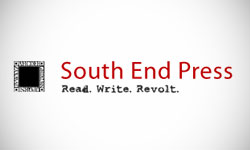
This publishing house focuses on activism, which is why a square shape for the logo is such an unexpected choice. Like the Abbeville logo, this one appears to be an old fashioned wood block print. However, the square is filled with simply black surrounded by a white border. The publisher’s name is written in eye catching red, but in a simple, unassuming font. The tagline below appears to have been typewritten: Read. Write. Revolt. This is very telling of the unique mission of this literary house, making it an appropriate addition to the logo.
Harper Collins Publishing Logo Design
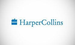
The color blue in this logo is calming and soothing, suggesting that these are books readers can use to escape from reality. The company name is written in a simple, newsy font, but the serifs are slightly rounded to add visual interest and soften an otherwise business-like image. The actual picture features waves of water beneath flames, which are shown as red in some versions of the logo, juxtaposing two opposites to suggest that a variety of perspectives can be found in these books. An alternative explanation is that the waves represent movement while the fire represents knowledge. Either way, it is a well balanced and attractive image for the logo of a prominent publishing house.
Tor Books Publishing Logo Design

Here, the tor of a mountain is shown in a triangular shape that represents strength while relating directly to the publisher’s name. The rounded square that partially surrounds the image gives it a definite shape and emphasis, while the wording below is bold, thick, and plain. The simple and strong image that this logo portrays cannot be denied, which is why it is so recognizable in a market with many competing companies.
Dove Medical Press Publishing Logo Design
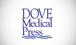
It is only appropriate that a medical press have a more business-like logo than most competitors, but Dove Medical Press does this without being generic or meaningless. The name is written in a simple, newsy font, while the logo is shaped like a straightforward square, which is highly appropriate for this niche market. The waves below the writing suggest movement forward, exactly what most people expect from the medical industry. The blue color is serious and calming at the same time, making this medical logo a clear winner in its field.

Mash Bonigala
Creative Director & Brand Strategist
With 25+ years of building brands all around the world, Mash brings a keen insight and strategic thought process to the science of brand building. He has created brand strategies and competitive positioning stories that translate into powerful and stunning visual identities for all sizes of companies.
Featured Work
See Our Work in Action
Real brands, real results. Explore how we've helped businesses transform their identity.
Client Love
What Our Clients Say
Don't just take our word for it. Hear from the brands we've worked with.
Josh Amburn
Lakefront Docks and Lifts
"I came into this project expecting to get the best logo for our brand. That’s exactly what I received. The team at SpellBrand used the descriptions of what we do along with a color palette of our site to design three amazing concepts. Once we decided on what worked best for our needs, they worked diligently to perfect the design. Their use of their project management software makes the collaboration painless. Great work team! We’ll see you on the next project! Josh"
Ernest Bannister
M.O.R.E
"My experience with the Spell brand team has been nothing short of excellent. From the beginning Mash and team made me feel very comfortable with the design process. I am extremely happy with the results of my design and look forward to working with Spellbrand; exclusively! I have told many family, friends and peers about the great work the Spellbrand team has done in creating my design. Thanks again for all your patience and professionalism; I look forward to working with you in the future."
Related Services You Might Love
Based on what you just read, here are services that can help you achieve similar results for your brand.
Free Download
Brand Consistency Checklist
A 27-point checklist to audit your brand across every touchpoint. Used by our team on real client projects.
Success! Check your email for the download link.
Instant PDF download. We'll also send branding tips -- unsubscribe anytime.
Keep Reading
Related Articles
Nov 17, 2025
Top 10 Simple Logos (Yet Effective Logos)
Discover the top 10 simple logos (yet effective logos) logos. Expert analysis of iconic logo designs, their history, and what makes them memorable.
Read MoreNov 17, 2025
Top 10 American University & College Logos
Discover the top 10 american university & college logos logos. Expert analysis of iconic logo designs, their history, and what makes them memorable.
Read MoreNov 17, 2025
Top 10 Car Company Logos
Discover the top 10 car company logos logos. Expert analysis of iconic logo designs, their history, and what makes them memorable.
Read More
