Spellbrand Blog
Top 10 Professional Blogger Logos

There was a time when bloggers logos and writers logos were a fringe group sharing their feelings about politics and their recipe for awesome peanut butter cookies. While we have nothing against politics or cookies, it was hard to take the genre seriously. In the last few years, however, the field has become more and more professional—even cut-throat in some areas. This means that professional bloggers must think of their blog as a small business and market it accordingly. The following ten blog logo designs are attractive and communicative enough to take their blog into the future.
Kentucky Girl Professional Blog Logo Design

The name suggests Southern charm, which is why the logo design is so important. The woman in the image is definitely edgy, which fluffy, bright red hair. A red, gray, and black color palette suggests that this edge is sophisticated and fashionable as well. With flowers, butterflies, and other symbols of femininity, it is easy to guess that this is a girly blog—although not the wilting violet sort of girl that you might initially guess from the name.
Ten Thousand Things Professional Blog Logo Design
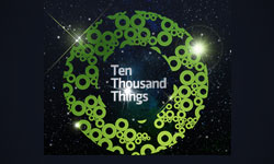
The background for this blog’s logo design is outer space, which can suggest infinity or merely that the blog posts on somewhat random topics. The use of a circle—not just once, but repeatedly—brings up friendly, inclusive feelings in the viewer. The way several small circles are combined to create a single whole is a modern and attractive while also suggesting that this blog brings together diverse concepts. Green is a calming and natural color, but also one identified heavily with the software industry. The writing is simple, but anything more would detract from the simplicity and beauty of the image.
I Can Has Cheezburger Professional Blog Logo Design
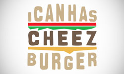
This cat lovers blog is a little crazy and more than a little grammatically incorrect, which is what makes the name and the logo design so appropriate. The wording is fit into an obvious cheeseburger shape, complete with lettuce and tomato. The thick and somewhat irregular writing give a bold image that is nonetheless homegrown. This logo design is fun and definitely relevant to the name.
L’Effet Crea Professional Blog Logo Design
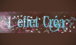
This blog has a logo design that is modern and feminine at the same time. Brown is a fashionable color right now, so it makes a perfect background. The brown also helps the bright blue, pink, and white to stand out more without appearing cluttered or offensively bright. Again we see butterflies, flowers, and all things girly, although the effect is very different from the other blog logos we have looked at.
5. Penguin & Fish Professional Blog Logo Design

Mash Bonigala
Creative Director & Brand Strategist
With 25+ years of building brands all around the world, Mash brings a keen insight and strategic thought process to the science of brand building. He has created brand strategies and competitive positioning stories that translate into powerful and stunning visual identities for all sizes of companies.
Featured Work
See Our Work in Action
Real brands, real results. Explore how we've helped businesses transform their identity.
Client Love
What Our Clients Say
Don't just take our word for it. Hear from the brands we've worked with.
Steve Turner
Turn2Coaching
"Delighted to have used Spellbrand for our last project. The work was thorough and results excellent. For me it was such a pleasure to work with Mash who was able to keep up with all my last minute requests for small changes. Nothing was too much of a problem and I would have to say that its great to work with people who do actually put the customer needs first! One thing saying it, its another thing doing it – Thanks Mash!"
Ernest Bannister
M.O.R.E
"My experience with the Spell brand team has been nothing short of excellent. From the beginning Mash and team made me feel very comfortable with the design process. I am extremely happy with the results of my design and look forward to working with Spellbrand; exclusively! I have told many family, friends and peers about the great work the Spellbrand team has done in creating my design. Thanks again for all your patience and professionalism; I look forward to working with you in the future."
Related Services You Might Love
Based on what you just read, here are services that can help you achieve similar results for your brand.
Keep Reading
Related Articles
Nov 17, 2025
Top 10 Simple Logos (Yet Effective Logos)
Discover the top 10 simple logos (yet effective logos) logos. Expert analysis of iconic logo designs, their history, and what makes them memorable.
Read MoreNov 17, 2025
Top 10 American University & College Logos
Discover the top 10 american university & college logos logos. Expert analysis of iconic logo designs, their history, and what makes them memorable.
Read MoreNov 17, 2025
Top 10 Media Company Logos
Discover the top 10 media company logos logos. Expert analysis of iconic logo designs, their history, and what makes them memorable.
Read More
