Spellbrand Blog
Top 10 Pizza Company Logos
Looking for a custom logo?
Get a professional, one-of-a-kind logo designed by our award-winning team.
Looking for a custom logo design?
Our professional designers create unique, memorable logos tailored to your brand.
See Our Logo Design Services →A collection of the top 10 pizza companies and their logo designs. Almost everyone loves pizza and there are great pizza franchises around every corner. If you are in the market for pizza logos or any type of small business logo design, you are probably interested in how some of the nation’s most popular pizza restaurants have had success in creating logos that work. The most amazing part of these pizza logos is that, however, different they may be, they all do an excellent job of representing their food company.
This week we take a look at the top 10 pizza companies and their company logos. If you would like to pitch in with your own recommendations, please do leave a comment in a similar format as you see below. You can even use the “img src=” code to show the logo. The logo has to be 250px wide and 150px high.
Domino’s
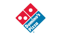
Like many pizza logos, Domino’s (headquarters in Ann Arbor, Michigan) uses the red colors associated with the food. Its logo, however, is more a representation of the company name than of the type of food. Once called Dominick’s, Domino’s Pizza is now recognizable all over the world thanks to having one of the world’s most identifiable logos, a red, white, and blue domino turned on its tip.
Pizza Hut
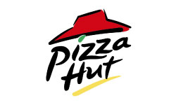
Pizza Hut (headquarters in Dallas, Texas) company’s recognizable red roof has left its mark on the logo. Beneath the red ‘hat’, the Pizza Hut features a familiar green splash, an easily legible name, and a yellow accent. Using the roof in the pizza logos has helped Pizza Hut develop a brand that is easily recognizable by customers all over the United States.
Round Table
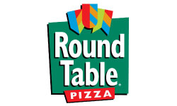
Many pizza logos have round shapes to evoke the recognizable shape of a pizza, but Round Table (headquarters in Walnut Creek, California) sets themselves apart by using a less generic square. Round Table makes that square green to suggest freshness, while the large white letters used for the company’s name are easy to identify against the dark background. Three medieval flags at the top of the logo pay homage to the medieval nature of the company’s name. The motto is often placed below the logo lets customers forget that they are the ‘last honest pizza’.
Papa John’s

Papa John’s (headquarters in Louisville, Kentucky) is a good example of success in creating logos that are simple yet effective. This company’s pizza logos stick to red (for pizza) and green (for freshness). There are no graphics, merely the company name, and motto: “Better Ingredients. Better Pizza.” This gives the image of simplicity, which is congruent with the company’s core values.
Papa Murphy’s

When it comes to pizza logos, Papa Murphy’s (headquarters in Vancouver, Washington) follows the same route as Papa John’s. Using the main colors red and green, the name is displayed prominently in an easy to read font. The key difference is in the font: Papa Murphy’s uses a cursive font, while Papa John’s uses block letters with serifs.
Godfather’s Pizza

Godfather’s Pizza (headquarters in Omaha, Nebraska) offers Taco Feast combo includes taco pizza, burrito-like Taco Stix, and cinnamon sticks for dessert. The brand name brings a smile to anyone who has either read The Godfather book or watched the movie. The icon looks a little weak and confusing. Upon closer inspection, one realizes it is a hand holding a hot pizza.
Little Caesars

Little Caesars Pizza’s (headquarters in Detroit, Michigan) Hot and Ready program offers premade pizzas to lure walk-in diners and cut waiting times. By far the weakest logo, Little Caeser’s logo shows a caveman eating a slice of pizza while in his other hand is a pizza stuck to the end of a stick. The font used also looks quite tacky.
Chuck E. Cheese’s Pizza
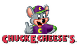
Chuck E. Cheese’s Pizza’s (headquarters in Irving, Texas) menu is expanding with sandwiches, salads, even cotton candy, and dessert pizzas. Targeted at the family and children market, the Chuck E Cheese’s logo is cartoony and quite easy on the eye. One could argue that it looks so similar to Tom from Tom and Jerry and perhaps could constitute copyright infringement!
CiCi’s Pizza

CiCi’s Pizza (headquarters in Coppell, Texas) offers specialty pizzas including Pizza Olé, Spinach Alfredo, Tomato Alfredo, and Zesty Ham and Cheddar. Cici’s logo is quite uninspiring and cliche. It shows the line art of a pizza with a tomato in the middle.
Hungry Howie’s Pizza & Subs

Hungry Howie’s Pizza & Subs (headquarters in Madison Heights, Michigan) offers flavored-crust pizzas (above) or new Bold & Spicy Sauce on any pizza with Cajun bread on the side. Hungry Howies logo looks confusing (especially at small sizes) and shows a cartoon boy/child licking his lips and the head seems to have been placed on a pizza.
Common Threads
As you can see, the most successful pizza logos incorporate several key elements. First, red is used because it is similar to the red sauce for which pizza is known. Second, many of them include elements that represent elements of their name, such as the red roof of Pizza Hut or the medieval flags of Round Table. While a logo with a pizza could be used for any pizza company, these logos are uniquely and recognizably theirs. All of these lessons can be used in small business logo design to help you and other people who are interested in creating logos settle on a design that works.

Mash Bonigala
Creative Director & Brand Strategist
With 25+ years of building brands all around the world, Mash brings a keen insight and strategic thought process to the science of brand building. He has created brand strategies and competitive positioning stories that translate into powerful and stunning visual identities for all sizes of companies.
Featured Work
See Our Work in Action
Real brands, real results. Explore how we've helped businesses transform their identity.
Client Love
What Our Clients Say
Don't just take our word for it. Hear from the brands we've worked with.
Christian Nocera
Dapper Yankee
"Delighted to have used Spellbrand for our last project. The work was thorough and results excellent. For me it was such a pleasure to work with Mash who was able to keep up with all my last minute requests for small changes. Nothing was too much of a problem and I would have to say that its great to work with people who do actually put the customer needs first! One thing saying it, its another thing doing it – Thanks Mash!"
Gracienne Myers
Banana Vital
"If you are looking for a company to design your company’s identity or even rebrand your current brand, Spellbrand is the company that you would choose, they designed my company, Banana Vital’s logo, and provided me with 6 design to choose from which made it hard to choose because they were all very good. Just recently I hired them to rebrand Mechanical Bull Sales and again every logo was great and well thought out. I am very pleased with the work that Spellbrand has provided and I am looking for to continue working with them."
Related Services You Might Love
Based on what you just read, here are services that can help you achieve similar results for your brand.
Free Download
Brand Consistency Checklist
A 27-point checklist to audit your brand across every touchpoint. Used by our team on real client projects.
Success! Check your email for the download link.
Instant PDF download. We'll also send branding tips -- unsubscribe anytime.
Keep Reading
Related Articles
Nov 17, 2025
Top 10 Simple Logos (Yet Effective Logos)
Discover the top 10 simple logos (yet effective logos) logos. Expert analysis of iconic logo designs, their history, and what makes them memorable.
Read MoreNov 17, 2025
Top 10 American University & College Logos
Discover the top 10 american university & college logos logos. Expert analysis of iconic logo designs, their history, and what makes them memorable.
Read MoreNov 17, 2025
Top 10 Car Company Logos
Discover the top 10 car company logos logos. Expert analysis of iconic logo designs, their history, and what makes them memorable.
Read More
