Spellbrand Blog
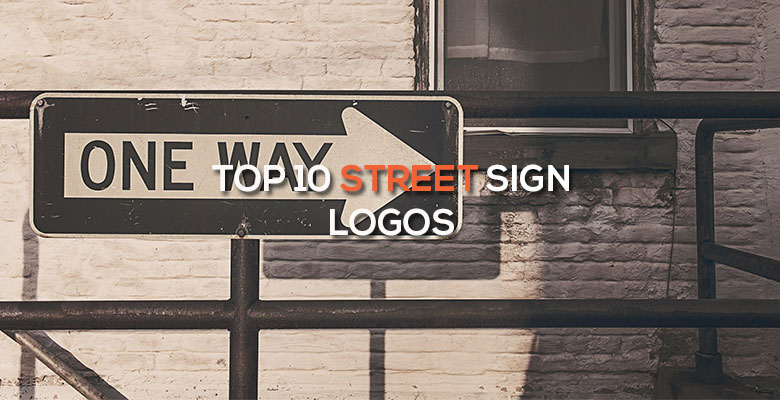
Top 10 Street Sign Logos
Looking for a custom logo?
Get a professional, one-of-a-kind logo designed by our award-winning team.
Looking for a custom logo design?
Our professional designers create unique, memorable logos tailored to your brand.
See Our Logo Design Services →The Logo on Every Street Corner: The Hidden Meaning Behind the Traffic Signs You See Every Day
Many people do not believe that travel logos are all around them, having a subconscious effect on their behavior. If you are one of these people, here is some evidence that may change your mind: traffic signs. While these signs do not sell a product per se, they are selling a particular type of behavior. Here are the ten major classes of traffic signs and how their design influences your behavior.
Signs of Instruction Logo Design
The most common signs seen on roads are traffic lights. The classic color scheme used in the United States and most countries is green for ‘go’, red for ‘stop’, and yellow as a warning that a light is about to turn red. These lights are lit with light bulbs so that it is almost impossible not to see them. There has been some controversy about the color choice because with graphic design logos the color red subconsciously makes people feel like taking action rather than stopping their action, and because color-blind people often cannot distinguish between green and red.
Signs of the Forbidden Logo Design
Signs that forbid actions, such as stop signs, are usually red with white lettering and a white border to further increase visibility. Many of these signs are octagons, which incorporate the inclusiveness of the circle with the authority of a square shape. Because stop signs are similar in most countries, this convention makes it easy for drivers who do not speak or read a language to understand what is being asked of them.
Signs of Regulation Logo Design
Speed limits, weight limits, and other regulated limits commonly use a white rectangle with black lettering and a black border, making these graphic design logos universal. This may be both because of the power associated with a square as well as the high contrast of black and white. Even with the many distractions on a road or highway, such as foliage and buildings, it is easy to pick out these signs, which is exactly what government officials want.
Signs of Warning Logo Design
Although few people make the connection, yield signs, animal crossings, railroad warnings, and other warning signs all have the same basic form: a diamond shape in deep gold with black writing and borders. This yellow is a bright, attention-grabbing color that is not present in most environments, helping these signs to stand out. Yellow also is associated with caution in graphic design logos, making it a very appropriate color for these signs. The diamond shape is simply an authoritative square turned on its side, which distinguishes it from the squares used in other signs.
Signs of Information Logo Design
It’s important to distinguish mile markers, location indicators, and other informative signs from those that are giving commands. This is why a very different shape and color palette are used for these signs. The deep green is a soothing color that is associated with nature and geography, which makes these signs easy to recognize as location signs. The edges are often rounded to take away from the commanding presence of the square of these graphic design logos.
Signs of Services Logo Design
When you are on a long trip, you probably notice that signs designating necessary services such as food, water, and gasoline are everywhere. These graphic design logos are usually blue with white writing and borders. The bright blue used in these signs is the same color as water. This is because water is the most necessary commodity for human life. We subconsciously associate blue not just with life-giving resources, but also with the relaxation that these services offer to travelers. As with in formative signs, the edges of service signs are often rounded to take away from the commanding presence of the square.
Signs of Life Logo Design
School zones, parks, and other places where pedestrians and children are likely to be present have their own color palette and design. The white with black scheme used for regulations is usually combined with a bright fluorescent yellow in signs like this. While yellow is the color of warning, a different and distinct yellow is generally used to differentiate these graphic design logos from normal warning signs. Lights or flags are often attached to these signs at times when foot traffic is heaviest, increasing the visibility of these signs and the safety of the people who are present.
Signs of Change Logo Design
These signs are used when there is construction or other changes to the normal flow of traffic, such as in ‘Men at Work’ and detour signs. In this case, orange is used because it is a bright color that is not used in any other street signs. Different shapes are used according to the type of change that is occurring, with diamonds and squares being the most common. Arrows may be used to communicate new directions, which is common in graphic design logos, as well as the desired movement of traffic.
Signs of Places of Interest Logo Design
Brown is a color normally associated with earth and earthy activities, which makes it a perfect color for forest service graphic design logos as well as signs that indicate campgrounds, outdoor wonders, and forests. It is also a less attention-grabbing color, which keeps these signs from detracting from the yellow, white, and orange signs that imply mandatory compliance.
Signs of Compassion Logo Design
As of now, there is no designated color palette for signs and graphic design logos that indicate disabled access or other signs that indicate services for people with special needs. While blue and white is the most common color scheme due to the fact that special services are being offered, the most recognizable aspect of these signs is the unique wheelchair icon that implies disability. While most disabled persons are not actually in wheelchairs, this logo is a true success story because its meaning is recognized by most Americans.
As you can see, ‘logos’ are all around us. Even street signs are designed with the attention to shape and color that a professional graphic designer uses when designing a logo. The message here is that attention to details can create a powerful impression, one that commands action. Your logo can have the same effect when it is designed using these same principles.

Mash Bonigala
Creative Director & Brand Strategist
With 25+ years of building brands all around the world, Mash brings a keen insight and strategic thought process to the science of brand building. He has created brand strategies and competitive positioning stories that translate into powerful and stunning visual identities for all sizes of companies.
Featured Work
See Our Work in Action
Real brands, real results. Explore how we've helped businesses transform their identity.

Client Love
What Our Clients Say
Don't just take our word for it. Hear from the brands we've worked with.

Steve Turner
Turn2Coaching
"Delighted to have used Spellbrand for our last project. The work was thorough and results excellent. For me it was such a pleasure to work with Mash who was able to keep up with all my last minute requests for small changes. Nothing was too much of a problem and I would have to say that its great to work with people who do actually put the customer needs first! One thing saying it, its another thing doing it – Thanks Mash!"

Christian Nocera
Dapper Yankee
"Delighted to have used Spellbrand for our last project. The work was thorough and results excellent. For me it was such a pleasure to work with Mash who was able to keep up with all my last minute requests for small changes. Nothing was too much of a problem and I would have to say that its great to work with people who do actually put the customer needs first! One thing saying it, its another thing doing it – Thanks Mash!"
Related Services You Might Love
Based on what you just read, here are services that can help you achieve similar results for your brand.
Free Download
Brand Consistency Checklist
A 27-point checklist to audit your brand across every touchpoint. Used by our team on real client projects.
Success! Check your email for the download link.
Instant PDF download. We'll also send branding tips -- unsubscribe anytime.
Keep Reading
Related Articles
Nov 17, 2025
Top 10 Simple Logos (Yet Effective Logos)
Discover the top 10 simple logos (yet effective logos) logos. Expert analysis of iconic logo designs, their history, and what makes them memorable.
Read MoreNov 17, 2025
Top 10 American University & College Logos
Discover the top 10 american university & college logos logos. Expert analysis of iconic logo designs, their history, and what makes them memorable.
Read MoreNov 17, 2025
Top 10 Car Company Logos
Discover the top 10 car company logos logos. Expert analysis of iconic logo designs, their history, and what makes them memorable.
Read More