Spellbrand Blog
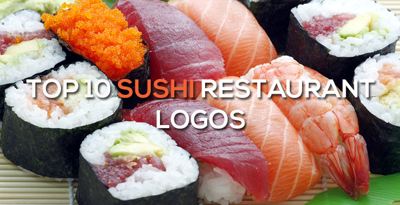
Top 10 Sushi Logos
Looking for a custom logo?
Get a professional, one-of-a-kind logo designed by our award-winning team.
Looking for a custom logo design?
Our professional designers create unique, memorable logos tailored to your brand.
See Our Logo Design Services →Top 10 Sushi Logos – Sushi restaurants are white hot in the United States, with restaurants popping up in even the most mundane towns all over the nation. However, these restaurant logos need a very different brand from the average diner. Sushi restaurants must have a brand that is exotic yet approachable, promising excellent food and an ambience that appeals to their target audience. These ten sushi restaurants from all over the world have food and drink logos that are very different, but winners in their own way. We even created a sushi mascot character design for one of our clients in the past.
Haiku Sushi Logo Design
The circle in this case is not just a symbol of friendliness and inclusiveness, but a reflection of the rising sun seen on the Japanese flag. The writing is simple and basic with a few notable touches. First, the H is crossed with a pair of chopsticks, relating to the type of food offered. Second, the K has waves that create a feeling of movement. The black and white color palette creates an ultra-modern image that is easily recognized.
Rainbow Roll Sushi Logo Design
This restaurant’s brand and logo design are very different from the preceding logo. Rather than black and white, the predominant color is a healthy, organic green. Again we see circles used as the primary image, this time layered inside each other so that the image appears to have been rolled. The restaurant initials are placed in small letters inside the image. Rounded, all lower case letters complete the friendly image and create an overall feeling of friendliness.
Tsunami Sushi Logo Design
This logo design borrows from an idea that is wisely associated with Japan and Japanese art: the tsunami. In this case, a sushi roll is drawn so that it also appears to be a large wave about to break. The combination of the two images creates interest, as does the rather stark color palette of black and white with just a small blob of red. Again we also see thin, lower case writing in a rounded font to create that all-important approachability.
Nami Sushi Logo Design
This sushi restaurant logo design uses a different approach from many others in its field. Instead of using crisp lines, the entire logo appears to have been painted with ink and a brush, relating to a classical Japanese art. The use of distinctly oriental writing for one word and a newsy font for the other suggests a fusion between Eastern and Western cooking styles, while the leafy plant in the background suggests health and nature.
Sushi Logo Design
Instead of an image, this text based logo design uses the details to communicate subtle messages. Although the name leaves no doubt as to the type of food being offered, the chopsticks that form the H also suggest Asian food. The small red circle that crosses the H doesn’t just add a focal point, it also relates once again to the rising sun seen on the Japanese flag. Black, white, and red, which are common colors used in this type of restaurant logo, are seen once again here.
Sushi Loca Logo Design
The name of this restaurant suggests that the experience there will be different from the average sushi restaurant, and the logo design suggests this as well. The writing is jagged and irregular, appearing to have been hastily hand-painted. The image is similar, appearing to be a views from a round Asian window but too messy to tell for certain. The tagline, “Fresh, Fun, and Fabulicious,” is playful and fun, much like the name and the logo image.
Onuko Sushi Logo Design
One of the most notable parts of this logo design is the way the N flows into the U, creating a wavelike image that is reminiscent of water and movement. The writing in a mixture of cases is rounded and friendly, but thick enough to be taken seriously. A piece of salmon sashimi, which is one of the most recognizable items to people unfamiliar with Japanese cuisine, forms the sole image. It is easy to identify this logo design with the restaurant and the brand, making it successful on all fronts.
8 Fish Logo Design
This restaurant is unique in its use of an unusual color palette for a sushi restaurant, burgundy and gold. The image is of eight fish, with four drawn outright and four created from the negative space. The writing is plain, without serifs, but written in all capital letters and angled so it is written sideways. This image is interesting enough to imply that the restaurant itself is unique and offers a very different experience from its competition.
Sushi Tei Logo Design
This restaurant suggests a traditional Japanese experience, but in a very different way from the logos we have looked at so far. The predominant shape is of a square, suggesting tradition. The green color implies freshness, which is very important in traditional sushi preparation. The name of the restaurant is written in traditional Japanese characters as well as plain, rounded Western letters. A tagline below promises “A Good Deal of Sushi”, which is relevant because this is one of many conveyor belt style restaurants that are gaining popularity.
Sushi King Logo Design
This last logo has an image that ties directly into its name. A traditional gold square encloses the logo, defining the space while adding a touch of tradition to an otherwise whimsical logo. The main image os of a fish wearing a crown, which is relevant for obvious reasons. The tagline promises “healthy good taste,” which is what many consumers want from restaurant food in general. Again we see the name written in both English and Japanese lettering, which promises a fusion of the traditional and the Westernized.
There are several commonalities among these logos. In many, we see black, white, and red colors, although there are certainly notable exceptions. References to fish and/or Japanese culture are also common themes. However, as with all types of logo design, a logo can be just as successful breaking the rules as it is following them. The secret is to have a professional logo design that is absolutely perfect for your unique company and brand. This will give your business the chance at success that it deserves.

Mash Bonigala
Creative Director & Brand Strategist
With 25+ years of building brands all around the world, Mash brings a keen insight and strategic thought process to the science of brand building. He has created brand strategies and competitive positioning stories that translate into powerful and stunning visual identities for all sizes of companies.
Featured Work
See Our Work in Action
Real brands, real results. Explore how we've helped businesses transform their identity.
Client Love
What Our Clients Say
Don't just take our word for it. Hear from the brands we've worked with.

Raymond Chen
RLC Global Archicom, Singapore
"SpellBrand was very accommodating from the beginning of the design process even when we had distinct design ideas, being architect designers ourselves. Jeff responded with many preliminary style options based on our initial sketchy ideas, enabling us to zoom in on the specific feel we were looking for. From that point on, it was just refinement and the final logo was in our hands in a matter of days. We have used SpellBrand on other logos for my clients projects."

Ernest Bannister
M.O.R.E
"My experience with the Spell brand team has been nothing short of excellent. From the beginning Mash and team made me feel very comfortable with the design process. I am extremely happy with the results of my design and look forward to working with Spellbrand; exclusively! I have told many family, friends and peers about the great work the Spellbrand team has done in creating my design. Thanks again for all your patience and professionalism; I look forward to working with you in the future."
Related Services You Might Love
Based on what you just read, here are services that can help you achieve similar results for your brand.
Free Download
Brand Consistency Checklist
A 27-point checklist to audit your brand across every touchpoint. Used by our team on real client projects.
Success! Check your email for the download link.
Instant PDF download. We'll also send branding tips -- unsubscribe anytime.
Keep Reading
Related Articles
Nov 17, 2025
Top 10 Simple Logos (Yet Effective Logos)
Discover the top 10 simple logos (yet effective logos) logos. Expert analysis of iconic logo designs, their history, and what makes them memorable.
Read MoreNov 17, 2025
Top 10 American University & College Logos
Discover the top 10 american university & college logos logos. Expert analysis of iconic logo designs, their history, and what makes them memorable.
Read MoreNov 17, 2025
Top 10 Car Company Logos
Discover the top 10 car company logos logos. Expert analysis of iconic logo designs, their history, and what makes them memorable.
Read More