Spellbrand Blog
Top 10 Toy Company Logos
Looking for a custom logo?
Get a professional, one-of-a-kind logo designed by our award-winning team.
Looking for a custom logo design?
Our professional designers create unique, memorable logos tailored to your brand.
See Our Logo Design Services →Playing with Design: The Top Ten Toy Logos
Often, just as much time and money go into developing a logo and brand image for a toy as went into actually developing the toy. This is because toy designers and executives know that the quality of a logo is essential to the success of the toy. Here are a few toy logos that are the winner when it comes to marketing.
Lego Logo Design
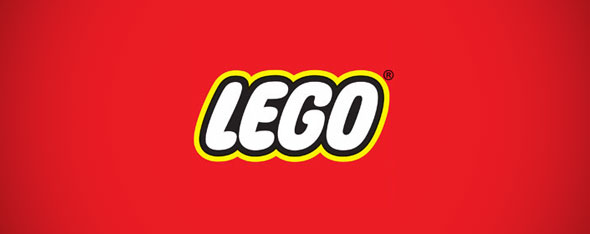
A toy designer’s dream, Legos are one of the must-haves for every child in the United States and Western Europe, and even adults find distraction and enjoyment while building with these tiny plastic blocks. Legos are also among the best branded toys, with everything from theme parks to fruit snacks bearing their name. The simple logo design may be one of the reasons that Legos enjoy this renown. The square logo seems business-like, but the rounded, bubbly writing shows a softer side. The red and yellow color scheme attract attention and are appropriate for the younger consumer.
Playmobil Logo Design
This company produces small toy people along with small settings for them to ‘play’ in. Whether your child is into pirate ships or fantasy castles, designers have created a Playmobil set sure to please them. The logo features the company name in a rounded, almost tubular print that is bubbly enough to lend a friendly edge to the company, while the familiar facial features of one of the toy people looms over the lettering. This logo wins for being kid-friendly while tying in to the company’s main product.
American Girl Logo Design
American Girl makes dolls and books based on different historical time periods in the United States. The logo features a newspaper-like print to show their dedication to showing real events in an accurate manner, but in a magenta that will appeal to the young girls that the company targets. The star in the logo are not just decorative, but symbols of the ‘stars’ that the dolls represent, girls who triumphed over difficult situations.
Hot Wheels Logo Design
This logo is a designer’s dream because it uses many of the best principles of logo design. First, the color choice is appropriate for the audience—bright red and yellow for small boys. Second, the logo is formed into a wavy shape, which gives it a sense of movement that is appropriate for a toy auto. Last, the font is distinctive enough that anyone who sees it will associate it with the company. This company’s logo surely is a part of the overwhelming success.
Crayola Logo Design

The Crayola logo tells the viewer a lot about this company. First, it is in the shape of a circle, which designers know makes it feel inclusive. Second, the yellow and green of the classic Crayola box are still used, tying in to the company’s past. However, the new logo includes a wide smile with a full range of colors inside, showing the company’s colorful side.
Nerf Logo Design
Nerf has been the maker of soft foam action-oriented toys for several generations of boys and men for decades now. The company designers show this through their logo, with an attention-getting red and yellow color scheme and bold black backing. The logo is rounded at the bottom while square at the top, with a generally rectangular shape along with a round circle placed in the background. These elements combine the business-like feeling of the square with the inclusiveness of the circle.
Hasbro Logo Design
Hasbro may make some of our children’s favorite toys, but its well designed logo sets it apart from the pack. Instead of bold and bright hues, the designers chose a calming blue. Rather than an inclusive circle, the more straightforward square is the main shape. The font is not bold or blocky; the name is written in a smooth, brushed font that appears to be hand lettered. Last, there is a wide, happy smile beneath the company name, showing the way that Hasbro wants children using its products to feel.
Tonka Logo Design
The square shape was never as appropriate for a logo as it is for this rough, tough construction toy giant. The straight and narrow image is driven home by the use of black and white as the color scheme. One interesting fact about this logo: the ‘T’ and the ‘k’ connect so that they resemble the bucket of one of this toy company’s iconic toy dump truck. The logo designer could not have done better on this one.
Baby Einstein Logo Design
This toy and video company produces products that are designed to enrich the worlds of infant and young children with art, music, and color. The logo is a fun way of expressing this. A young child resembling Albert Einstein is drawn in plain black and white lines, to contrast with the company name written in what appears to be bright colored crayon. It’s easy to see the association with both intelligence and early children, making this a designer’s logo success story.
Barbie Logo Design
What girl hasn’t owned Barbie dolls or at least wanted to? Branding is part of the reason that this doll has become such a huge part of American culture. Designers periodically redesign the Barbie logo to keep it congruent with modern girls, and this latest logo is a masterpiece. In a bold but feminine pink, the logo features the doll’s well known name in a font similar to a young woman’s writing, with the ‘I’ dotted with a flower. In all, the Barbie logo is simple and girly enough to speak to a whole new generation of young women, a winning logo by all accounts.
Toy logos tend to be very targeted to their audience, but there is still much to be learned from them. The key lesson is to target every aspect of your logo, from color to fonts to choices in shapes, to the unique likes and dislikes of your audience. With the help of designers with experience in logo design, you too can have a top ten logo.

Mash Bonigala
Creative Director & Brand Strategist
With 25+ years of building brands all around the world, Mash brings a keen insight and strategic thought process to the science of brand building. He has created brand strategies and competitive positioning stories that translate into powerful and stunning visual identities for all sizes of companies.
Featured Work
See Our Work in Action
Real brands, real results. Explore how we've helped businesses transform their identity.
Client Love
What Our Clients Say
Don't just take our word for it. Hear from the brands we've worked with.
Gracienne Myers
Banana Vital
"If you are looking for a company to design your company’s identity or even rebrand your current brand, Spellbrand is the company that you would choose, they designed my company, Banana Vital’s logo, and provided me with 6 design to choose from which made it hard to choose because they were all very good. Just recently I hired them to rebrand Mechanical Bull Sales and again every logo was great and well thought out. I am very pleased with the work that Spellbrand has provided and I am looking for to continue working with them."
Sue Politte
Success In Focus
"Love it! My brand identity and logo helps quickly communicate what I do. I coach very busy business leaders who want to take their organization to the next level and are tired of all the things that are slowing things down or blocking progress. My brand identity needed to grab visual attention and communicate quickly that I help my clients get focus so they gain and build success. My new brand will help my potential clients identify with me. Thank you!!!!"
Related Services You Might Love
Based on what you just read, here are services that can help you achieve similar results for your brand.
Free Download
Brand Consistency Checklist
A 27-point checklist to audit your brand across every touchpoint. Used by our team on real client projects.
Success! Check your email for the download link.
Instant PDF download. We'll also send branding tips -- unsubscribe anytime.
Keep Reading
Related Articles
Nov 17, 2025
Top 10 Simple Logos (Yet Effective Logos)
Discover the top 10 simple logos (yet effective logos) logos. Expert analysis of iconic logo designs, their history, and what makes them memorable.
Read MoreNov 17, 2025
Top 10 American University & College Logos
Discover the top 10 american university & college logos logos. Expert analysis of iconic logo designs, their history, and what makes them memorable.
Read MoreNov 17, 2025
Top 10 Car Company Logos
Discover the top 10 car company logos logos. Expert analysis of iconic logo designs, their history, and what makes them memorable.
Read More
