Baycon: Sustainable Architecture Through Innovation
Situation: Rebranding Architectural Technologist Company
Baycon is a chartered architectural technologist company with 12 years of experience in the construction industry working on residential projects with an emphasis on sustainable design and construction.
They have a particular interest in the use of sustainable timber in their projects. When Baycon wanted to rebrand themselves and create a fresh new look and feel they came to Spellbrand.
The architecture and construction industry requires brands that communicate expertise, sustainability, and innovation. Baycon needed a brand identity that would reflect their 12 years of experience while positioning them for future growth.
Task: Create Brand Identity Reflecting Sustainability and Innovation
The challenge required:
- Rebranding: Create fresh new look and feel
- Sustainable design: Brand identity that emphasizes sustainable design and construction
- Sustainable timber: Visual identity that reflects interest in sustainable timber
- Accessibility: Brand that communicates services accessible to everyone regardless of project size
- Iconic treatment: Brand identity that transcends competition
Brand Strategy: Iconic Treatment That Transcends Competition
Starting with distilling their brand strategy the strategy team at Spellbrand created a creative strategy that involved an iconic treatment that transcends their competition. Coming from the Shetland Islands, the client has extensive experience in designing attractive energy-efficient homes, suitable for a harsh environment. Good management and efficiency are key to the success of their company.
This brand strategy works because:
- Iconic treatment: Iconic treatment that transcends competition
- Shetland Islands: Extensive experience from Shetland Islands
- Energy-efficient homes: Designing attractive energy-efficient homes
- Harsh environment: Suitable for harsh environment
- Management and efficiency: Good management and efficiency key to success
Brand Mission: Accessibility Through Innovation
Sustainability, quality, innovation, value for money, and efficiency are all important to the client. Ultimately they want their services to be accessible to everyone regardless of the size of the project. They believe that sustainable design features shouldn’t only be accessible to those who can afford them as an extra, they should be accessible to all potential clients. They think this can be achieved through innovation and thoughtful design. They want to grow the company with a strong reputation for providing superior service and excellent value for money.
This brand mission works because:
- Core values: Sustainability, quality, innovation, value for money, efficiency
- Accessibility: Services accessible to everyone regardless of project size
- Innovation: Achieved through innovation and thoughtful design
- Reputation: Strong reputation for superior service and excellent value
Target Audience: Broad Spectrum of Clients
A broad spectrum of clients from young couples building their first home to elderly people downsizing for retirement. In the future, they may also have commercial clients. Sometimes there are tight budgetary constraints but not always. People looking to build will be looking for someone trustworthy to guide them through the process and they will always want value for money.
Action: Strategic Brand Development
Brand Strategy: Iconic Treatment That Transcends Competition
Starting with distilling their brand strategy the strategy team at Spellbrand created a creative strategy that involved an iconic treatment that transcends their competition. Coming from the Shetland Islands, the client has extensive experience in designing attractive energy-efficient homes, suitable for a harsh environment. Good management and efficiency are key to the success of their company.
This brand strategy:
- Creates iconic treatment: Iconic treatment that transcends competition
- Leverages experience: Extensive experience from Shetland Islands
- Emphasizes efficiency: Designing attractive energy-efficient homes
- Addresses environment: Suitable for harsh environment
- Focuses on management: Good management and efficiency key to success
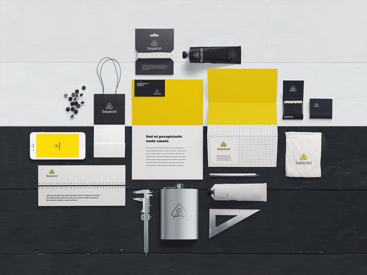
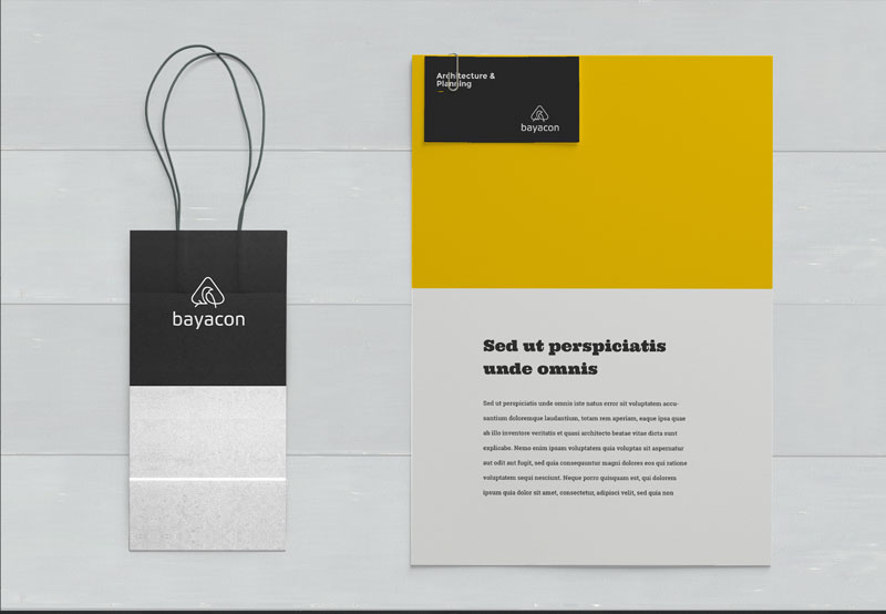
Brand Solution: Baya Weaver Bird Symbolism
Baya is in reference to the Baya Weaver bird, which is best known for its elaborately woven nests. A widespread folk belief in India is that the Baya sticks fireflies with mud to the nest walls to light up the interior of the nest at night. This really symbolizes my low energy design and sustainability aspirations for the company. Although it is only a folk belief it still reflects a desire to be innovative. Tech or tec is an abbreviation of technical and encompasses all the construction services the client hopes to offer now and in the future.
This brand solution:
- References Baya Weaver: Reference to Baya Weaver bird with elaborately woven nests
- Uses firefly symbolism: Folk belief about fireflies lighting nest symbolizes low energy design
- Reflects sustainability: Reflects sustainability aspirations
- Shows innovation: Reflects desire to be innovative
- Encompasses services: Tech encompasses all construction services
Result: Brand Identity That Reflects Sustainability and Innovation
The brand identity we created for Baycon successfully rebrands their 12 years of experience in sustainable design and construction. The comprehensive brand transformation delivers:
Strategic Outcomes
- Rebranding: Fresh new look and feel successfully created
- Sustainable design: Brand identity successfully emphasizes sustainable design and construction
- Sustainable timber: Visual identity successfully reflects interest in sustainable timber
- Accessibility: Brand successfully communicates services accessible to everyone regardless of project size
- Iconic treatment: Brand identity successfully transcends competition
- Complete brand system: Baya Weaver bird logo design creates unified experience
Implementation Success
Today, Baycon uses this comprehensive brand identity to attract clients from young couples building their first home to elderly people downsizing for retirement. The Baya Weaver bird logo design, symbolizing elaborately woven nests and fireflies lighting the nest, reflects their low energy design and sustainability aspirations while maintaining their commitment to accessibility, innovation, and excellent value for money. The brand successfully positions Baycon as a chartered architectural technologist company with an iconic treatment that transcends competition, making sustainable design features accessible to all potential clients through innovation and thoughtful design, with a strong reputation for providing superior service and excellent value for money.