

Blacksburg United Methodist Church: Uniting Two Campuses Through Design
Situation: Rebranding Church Representing Diverse Community
Blacksburg United Methodist Church is a large(ish) church in a small town—800 members in a town of about 25,000. The church wanted to rebrand, looking for a new church logo to represent their whole church (both campuses) as well as update their website and future communications tools.
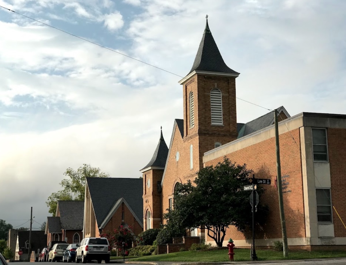
Blacksburg United Methodist Church is a college community; Virginia Tech is literally across the street from their main campus. They have two campuses: one is an older, traditional group, while the other campus is young, modern, and vibrant. They are a diverse community and an open church community.
The church branding market requires brands that communicate inclusivity, tradition, and community connection. Blacksburg United Methodist Church needed a brand identity that would resonate with both traditional and modern congregations while honoring their connection to the college community.
Task: Create Brand Identity Representing Diverse Community
The challenge required:
- Unite both campuses: Brand identity that represents whole church (both campuses)
- Traditional appeal: Visual identity that resonates with older, traditional group
- Modern appeal: Brand that appeals to young, modern, and vibrant campus
- College connection: Brand that honors connection to Virginia Tech college community
- Diversity communication: Brand that communicates diverse and open church community
Action: Strategic Brand Development
Brand Strategy: Simplifying the Message
When rebranding a church, it is very important that the message is distilled and clear. The temptation to have too many cooks should be resisted. A core group of stakeholders strive to simplify the message and what the church stands for.
Our approach focused on creating a design that would:
- Unite both campuses: Under a single visual identity
- Honor tradition: While appealing to modern, vibrant members
- Connect to community: By acknowledging the Virginia Tech relationship
- Communicate openness: And diversity through inclusive design
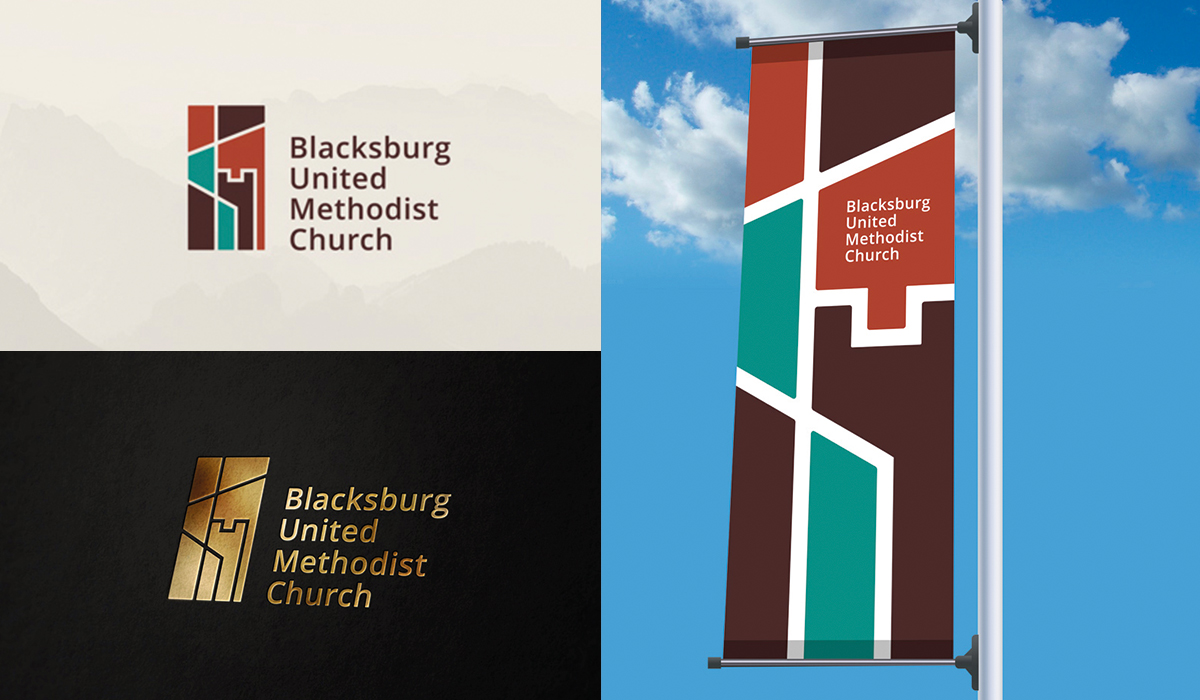
Logo Design: Stained Glass Modern
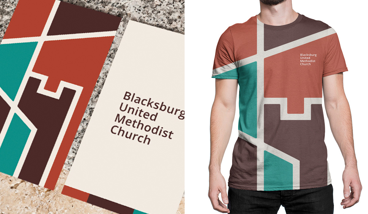
The result is a stunning and modern-looking logo design! The logo design shows an abstract, modern church stained glass window effect featuring a cross, the facade of the church building, and the Virginia Tech building. This design works because it:
- Honors tradition: The stained glass effect connects to church heritage
- Feels modern: Abstract design appeals to younger, vibrant members
- Represents community: The Virginia Tech building acknowledges their college community connection
- Unifies campuses: The cross and church facade represent both traditional and modern congregations
Result: Brand Identity That Unites
The brand identity we created for Blacksburg United Methodist Church successfully unites their two campuses. The comprehensive brand transformation delivers:
Strategic Outcomes
- Unite both campuses: Brand identity successfully represents whole church (both campuses)
- Traditional appeal: Visual identity successfully resonates with older, traditional group
- Modern appeal: Brand successfully appeals to young, modern, and vibrant campus
- College connection: Brand successfully honors connection to Virginia Tech college community
- Diversity communication: Brand successfully communicates diverse and open church community
- Complete brand system: Stained glass modern logo, brand identity system, and visual language create unified experience
Implementation Success
Today, Blacksburg United Methodist Church uses this comprehensive brand identity across both campuses, their website, and all communications. The stained glass-inspired logo design creates a memorable mark that resonates with their diverse, open community while acknowledging their unique position as a church serving both a small town and a major university community. The brand successfully creates a cohesive brand experience that welcomes both traditional and modern members while honoring their connection to Virginia Tech and the broader Blacksburg community, uniting their two campuses under a single visual identity while honoring both their traditional roots and modern vibrancy.