Fortress Financial: Building Trust Through Design
Situation: Creating Brand Identity for Financing Company
Fortress is a financing, loans, and credit company that provides financing and advances short-term and long-term loans and credits to individuals, companies, or associations of individuals. Based in Los Angeles, they operate in a highly competitive market where differentiation is crucial.
When a consumer starts exploring the market to figure out which financing company to go with, you want to be sure that your name stands above the crowd.
The financing and loans market requires brands that communicate trust, professionalism, and security. Fortress Financial needed a brand identity that would help them stand out while building trust with potential clients.
Task: Create Brand Identity Standing Out in Crowded Market
The challenge required:
- Market differentiation: Brand identity that helps stand out in crowded market
- Trust building: Visual identity that builds trust with potential clients
- Multiple attributes: Logo design that communicates trust, professionalism, robustness, safety, security, care
- High-tech appeal: Brand that is high-tech, abstract/artistic, clean/simplistic

Action: Strategic Brand Development
Brand Strategy: Communicating Multiple Attributes
The client wanted a finance logo that was high-tech, abstract/artistic, and also clean/simplistic. They wanted a combination of text and symbol/design that communicated trust, professionalism, robustness, safety, security, and care.
However, communicating all these messages in a single logo icon can be quite difficult, and the cardinal rule of any brand mark should be simplicity. So the talented branding team at Spellbrand distilled all these attributes into a single focal point: care and trust.
Logo Design: Caring Hands
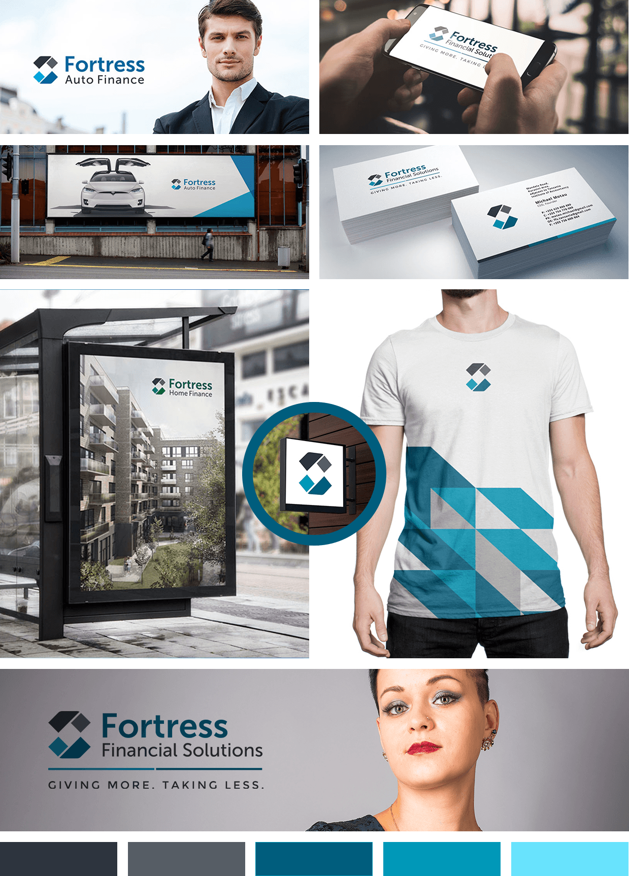
This message was visualized into an icon that depicted an abstract pair of hands cupping. The negative space between the abstract hands is where the customers will be—in a caring and safe pair of hands.
This design approach:
- Communicates care: The cupping hands suggest protection and nurturing
- Builds trust: The gesture implies safety and security
- Remains simple: Clean, abstract design that’s easy to recognize
- Works across contexts: Versatile enough for all applications
Complete Brand Identity System
The logo design isn’t just used on their website—it’s been extended onto business cards, letterheads, and envelopes. This logo is so simple and clean that it can easily be transferred to work with any type of marketing or business material, ensuring brand consistency wherever Fortress Financial appears.
Result: Brand Identity That Builds Confidence
The brand identity we created for Fortress Financial successfully communicates trust and professionalism. The comprehensive brand transformation delivers:
Strategic Outcomes
- Market differentiation: Brand identity successfully helps stand out in crowded market
- Trust building: Visual identity successfully builds trust with potential clients
- Multiple attributes: Logo design successfully communicates trust, professionalism, robustness, safety, security, care
- High-tech appeal: Brand successfully is high-tech, abstract/artistic, clean/simplistic
- Complete brand system: Caring hands logo, brand identity system, and visual language create unified experience
Implementation Success
Today, Fortress Financial uses this comprehensive brand identity to differentiate themselves in the competitive Los Angeles financing market. The caring hands icon creates an emotional connection with potential clients, suggesting that their financial needs will be handled with care and expertise. The brand successfully communicates trust, professionalism, robustness, safety, security, and care—all essential qualities for a financing company—with logo design that is so simple and clean that it can easily be transferred to work with any type of marketing or business material, ensuring brand consistency wherever Fortress Financial appears, building trust with clients who need short-term or long-term loans and credit solutions.

