Spellbrand Blog
10 Inspiring Book Branding Designs
I love books. The feeling you get when you touch and feel a well designed and crafted book is unlike anything. Designing books, whether covers or interior layout, is an art form that demands a high level of skill and experience. In this branding inspiration feature, we look at 10 book branding designs from talented designers and brand builders that stand head and shoulders above the rest.
1. Scandinavian Graphic Design
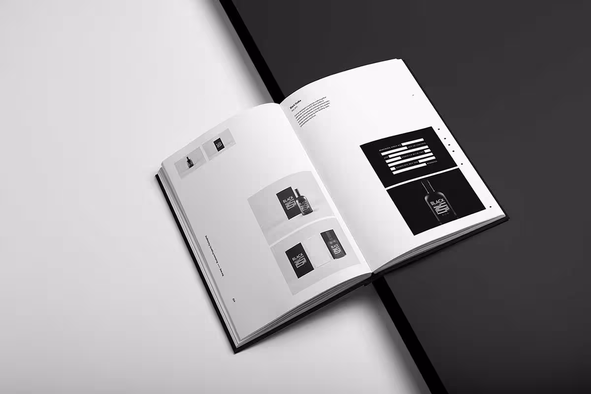

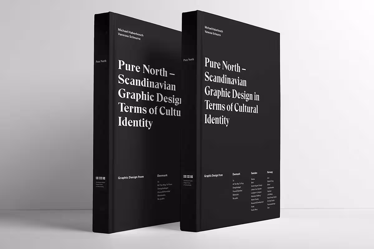
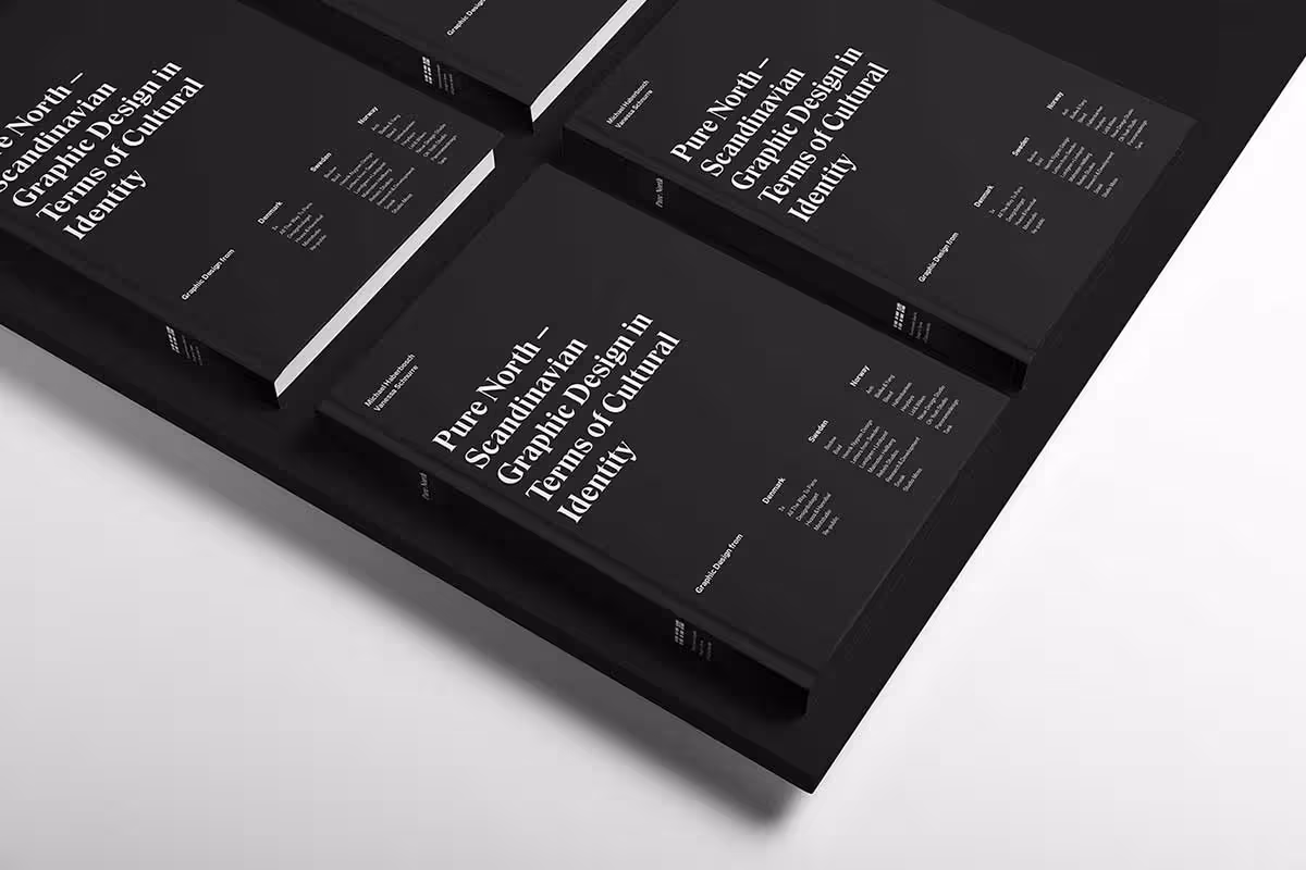

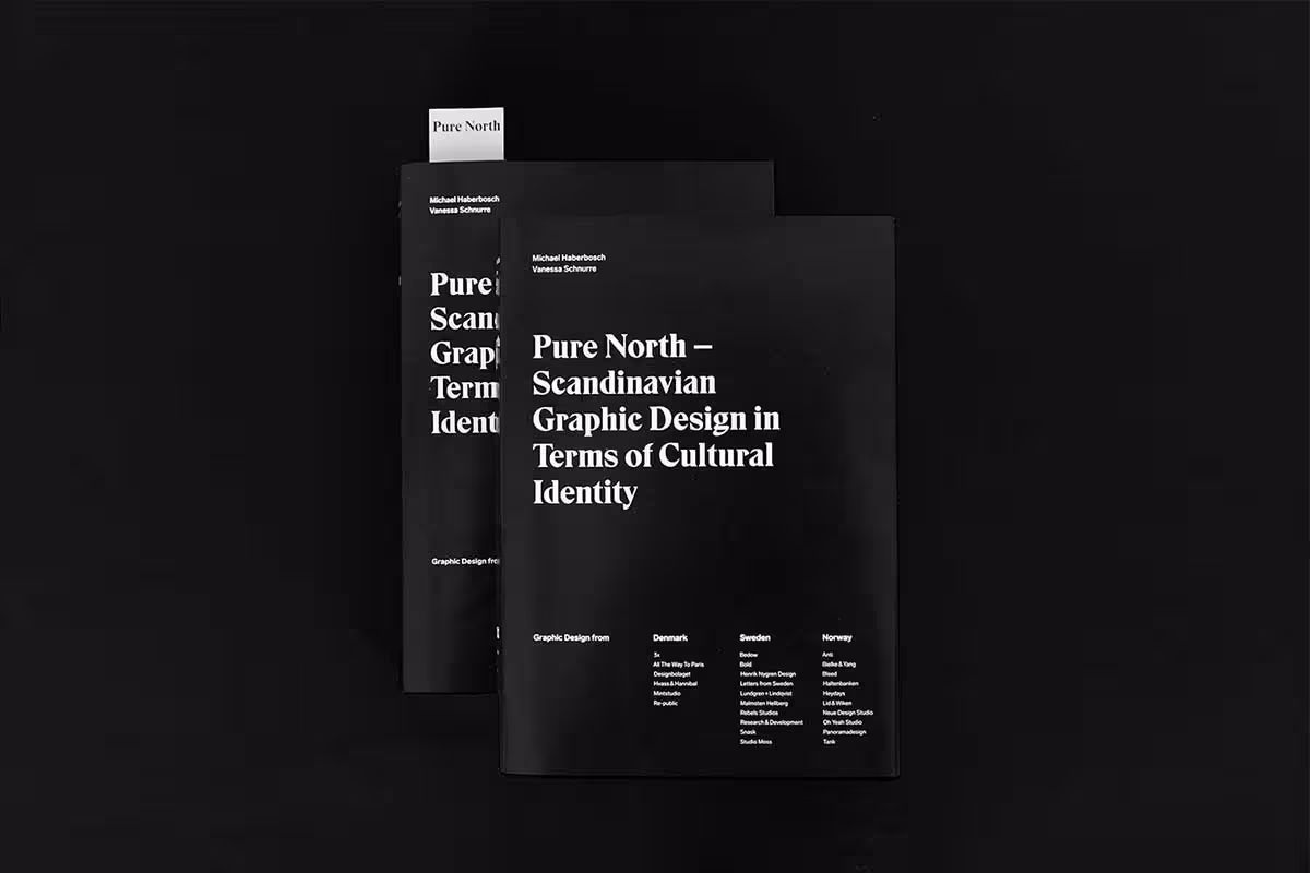
Created by Michael Haberbosch and Vanessa Schnurre, this project started as a thesis for their masters at the University. To create this masterwork, the duo went on a road trip through Scandinavia visiting close to 20 studios to gather first-hand information about brand identity, cultural influences, and inspiration through a series of interviews. With a noble aim of showcasing Scandinavian graphic design, the project garnered attention that propelled the duo into the limelight and even a speaking gig at the Muthesius University.
The covers are minimalistic and yet very striking. With a black cover and bold white text, the design brings home the simplicity of Scandinavian design sensibilities that you also find in brands like IKEA. The contrast is sharp, the typography is bold, and there is nothing that does not need to be there.
2. MY OCD Book Design
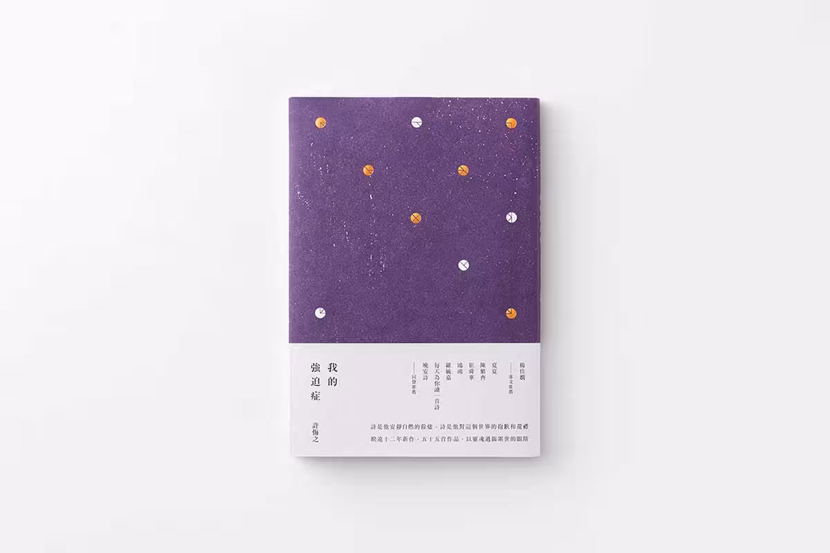
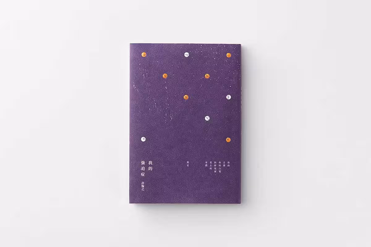
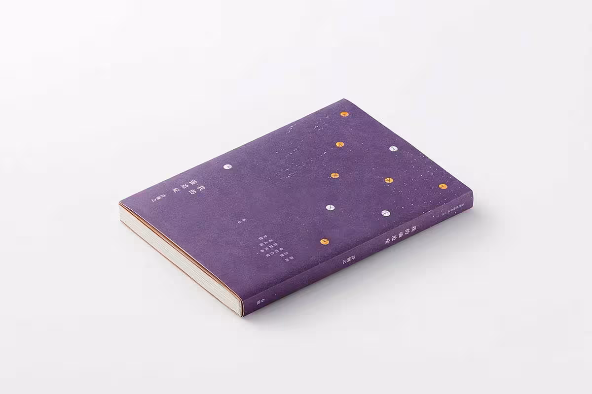
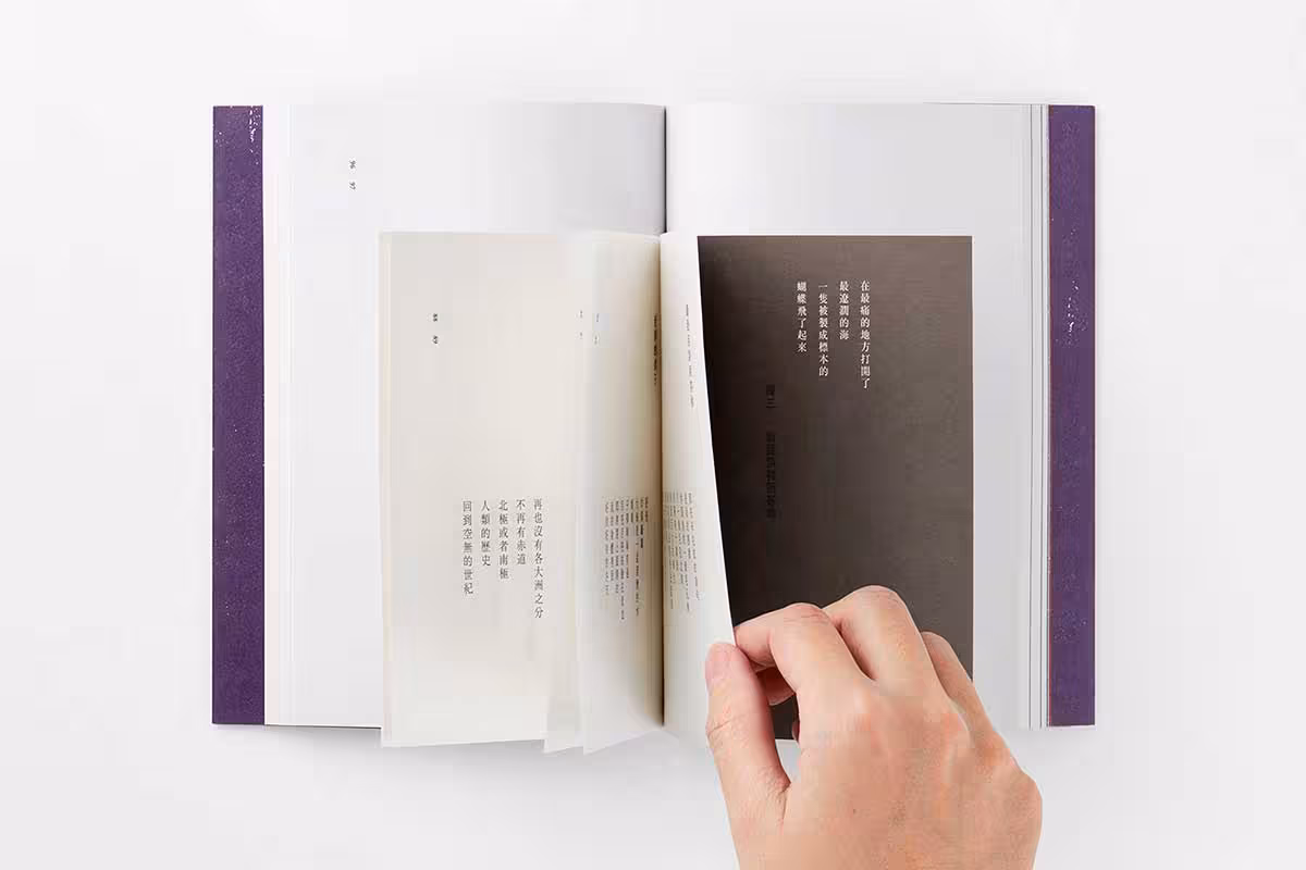
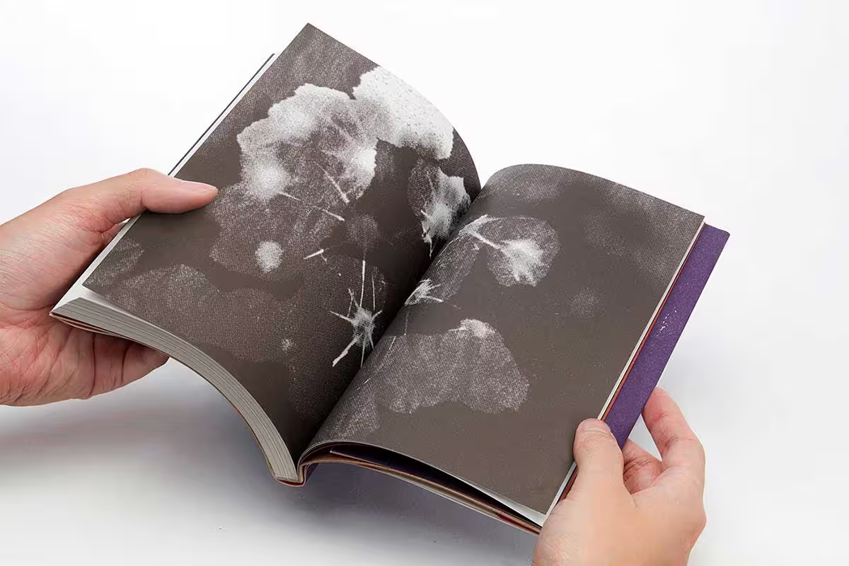
This is an interesting book design by Chia-Lin Wu which marries the traditional with the modern in terms of style, layout, typography, and photography. The book is about obsessive-compulsive disorder, told through poetry and narrative.
The cover shows what appears to be paint-drops along with precisely placed buttons of color. The purple and the texture of the cover add depth and heaviness. Inside the book, the layout, the photos, and the flow are so chaotic, it is an irony that a book about OCD should feel this uncontrolled. The contrast between the cover’s simplicity and the interior’s disorder is the design’s most thoughtful gesture.
3. The Letters of Vincent Van Gogh
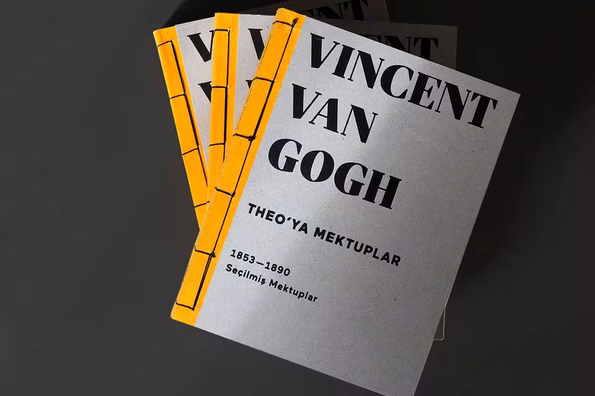
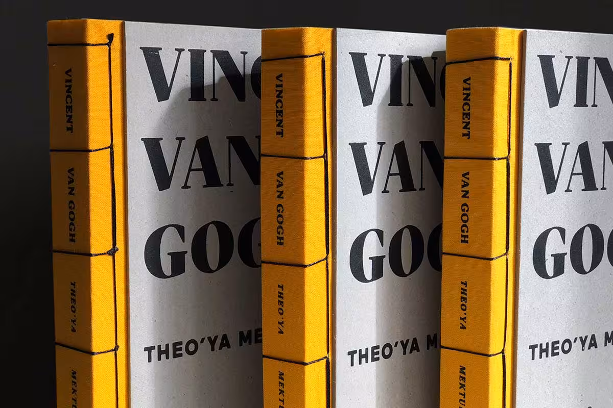
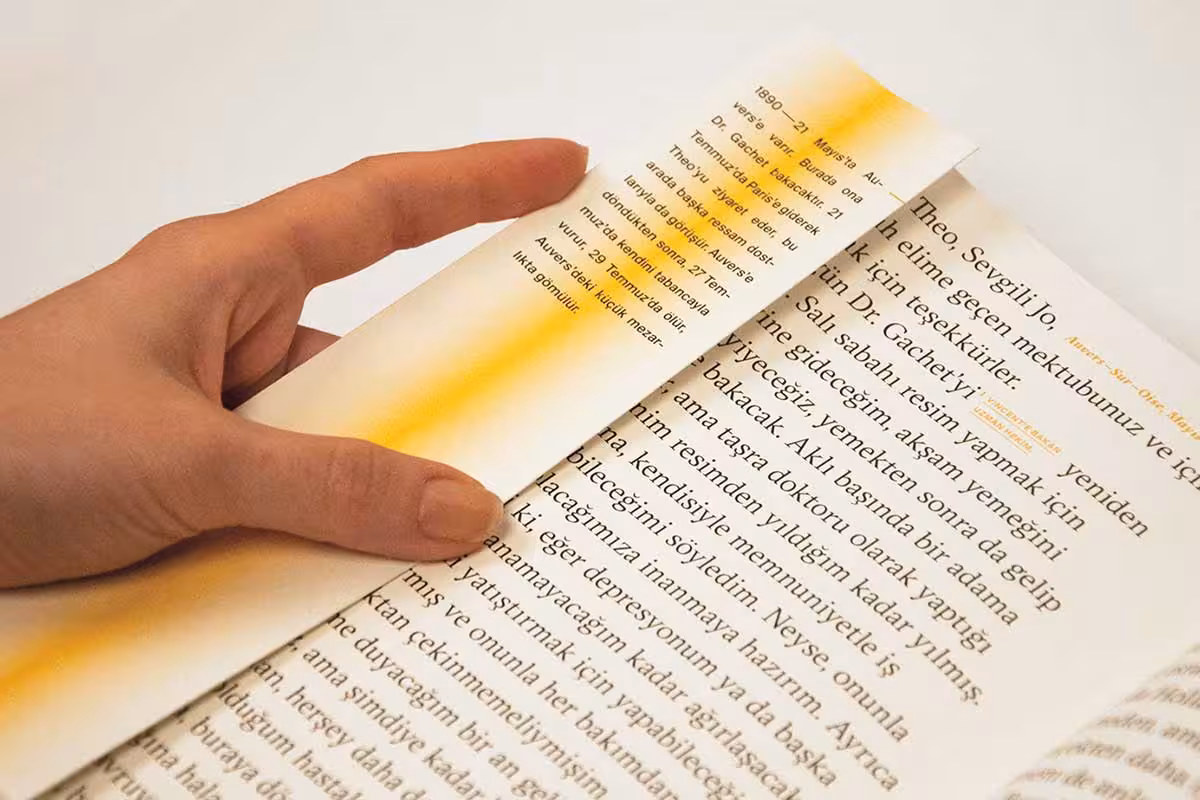


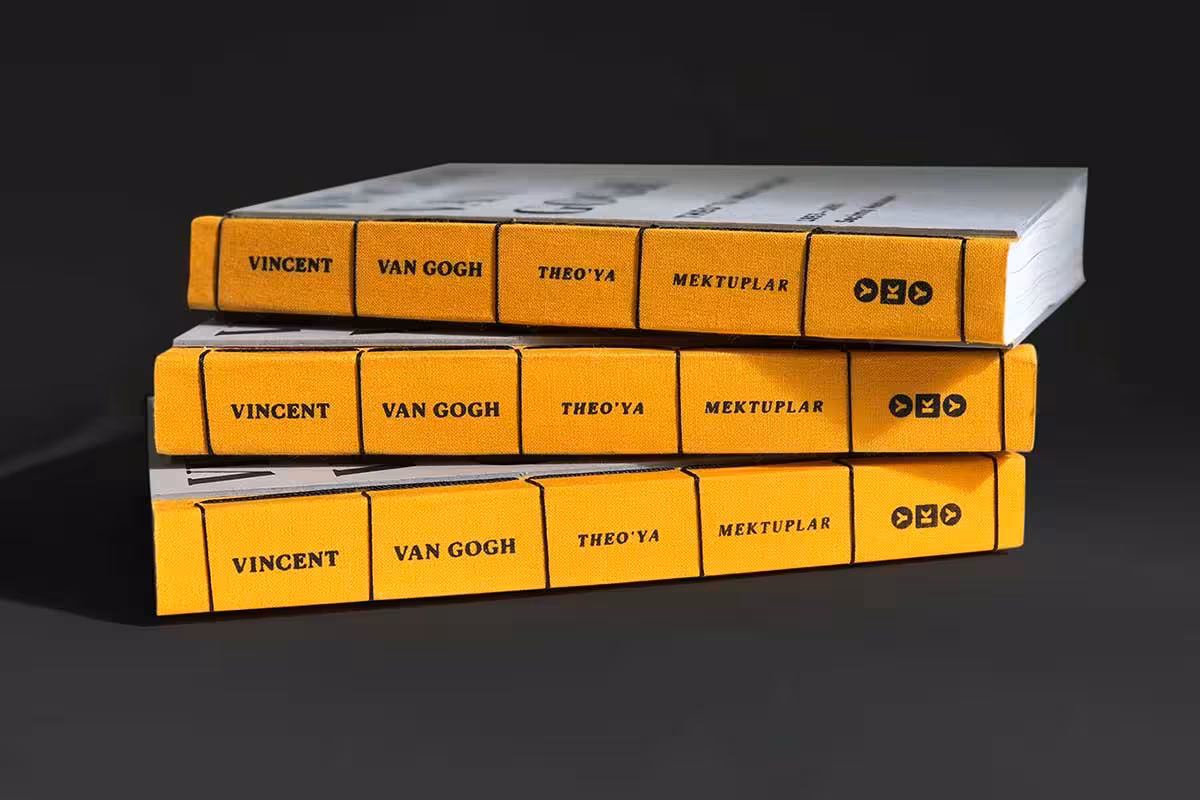
This beautiful and quirky book design was created by Gizem Kara as a project for the Senior Year Graduation at Mimar Sinan Fine Arts University. “The Letters of Vincent Van Gogh (Letters to Theo)” is a short Turkish edition designed within the only inscribed source project about Van Gogh’s life, originally created from 903 letters by Van Gogh Museum.
The cover is simple and artisanal with old world thread binding showing. The threading on the side divides the book name and author name elegantly. With a yellow and black color palette, the book has a very earthy feel, almost like it was printed during the actual time period of Van Gogh. One of the best details is a hidden compartment among the pages with a hidden stamp, perhaps from one of the original letters of the great artist. Period-appropriate aesthetics combined with thoughtful hidden details make this one of the most charming designs in the collection.
4. I Write, You Stay – Expectations of a Heart
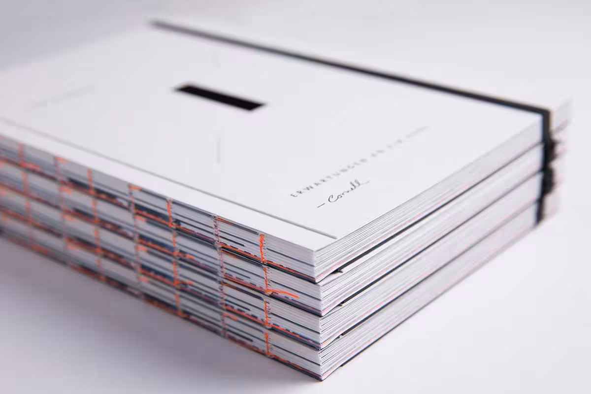
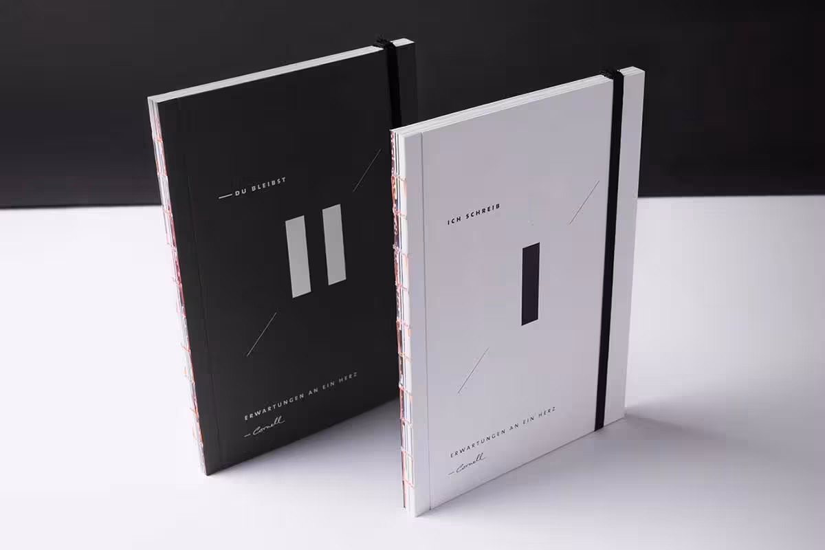
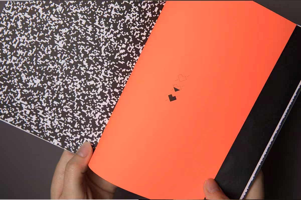
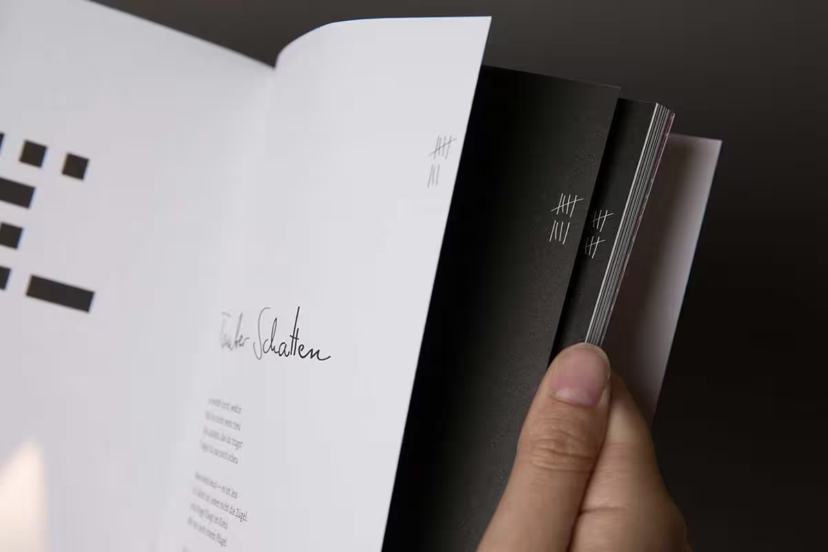

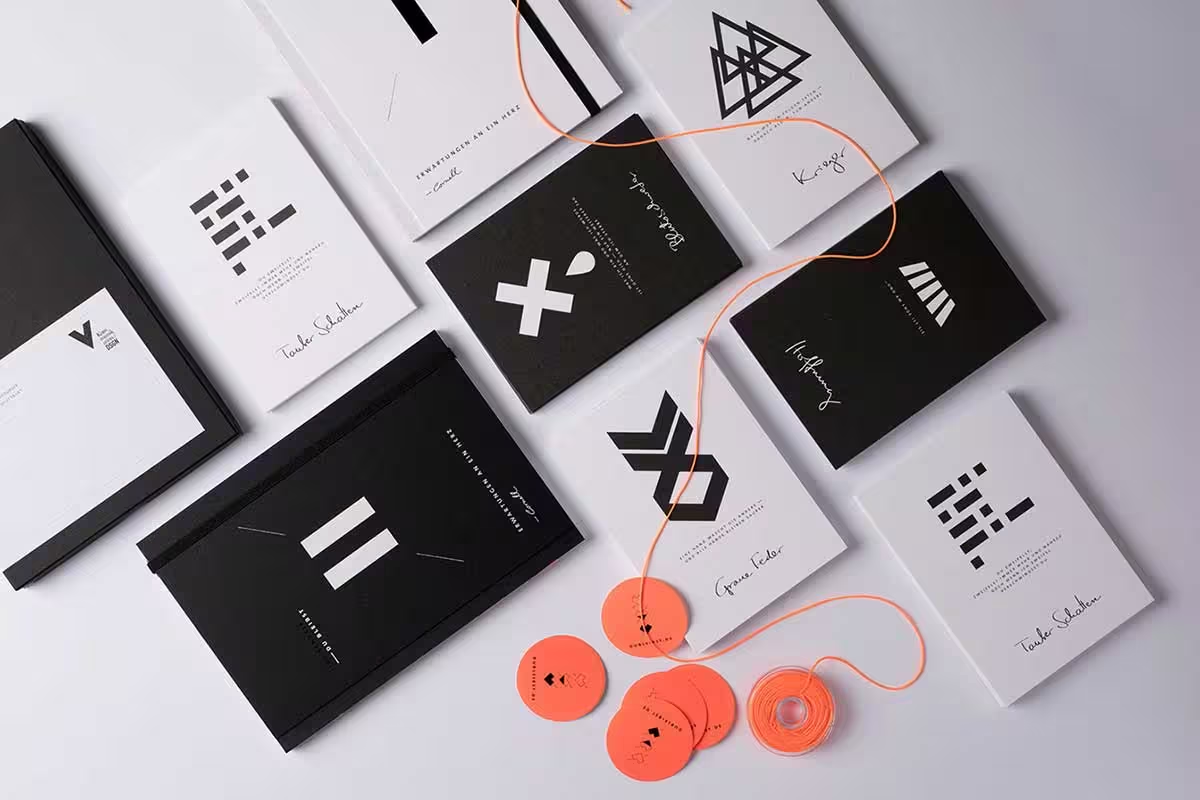
“I Write – You Stay. Expectations of a Heart” was conceived as a visually lyrical oeuvre by VISEE Design that reflects the texts of the poet Cornell in terms of materials, colors, forms, and contrasts. In order to blend poetry and design, this book can be read in two directions.
The part “I Write” is kept in white; it begins in the present and introduces the makers and the programme with the words “Only if you say what you feel, then you say something”. The second, black part encourages interaction with the claim “You Stay”, visualizing this aspiration through neon colors complementing the black-and-white.
This is an interesting project that pushes the envelope in terms of a book’s interaction with the mind, not just the content but rather the physical dimension of the book itself. It is quite sublime in the way the cover design, the threading, and colors encourage the reader to explore the two distinct sections of the philosophy behind the content.
5. Hong Kong Institute of Architects Annual Awards 2016/17

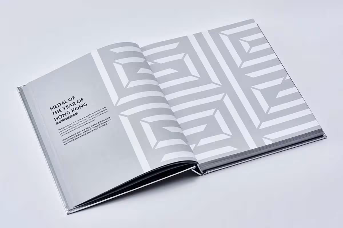
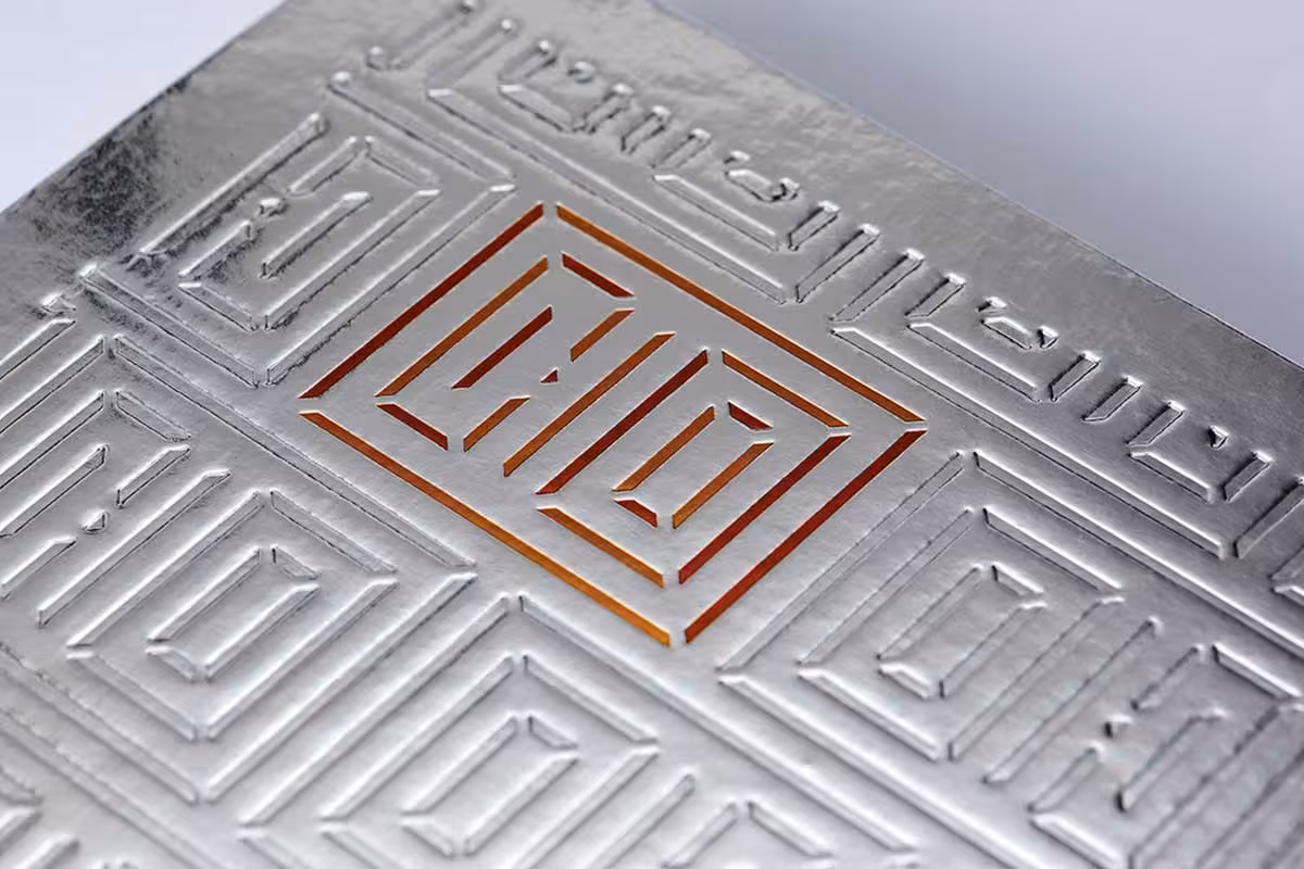


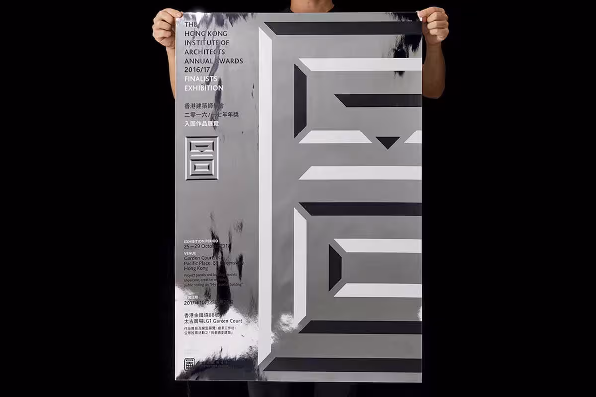
Created by Vision Plus for the Hong Kong Institute of Architects Annual Awards 2016/2017, this is a stunning example of minimalism meets the future. With a metallic sheen and plastic transparent box cover, the book would stand out anywhere and make people take notice. The premium materials signal quality before you open a single page.
The inner pages layout is probably a little standard and not too exciting, but we have to keep in mind this book was designed to celebrate the excellence of architects and hence has to be somewhat conservative. The futuristic minimalist exterior paired with professional restraint inside strikes the right balance for the audience.
6. The Pleasure of Beer
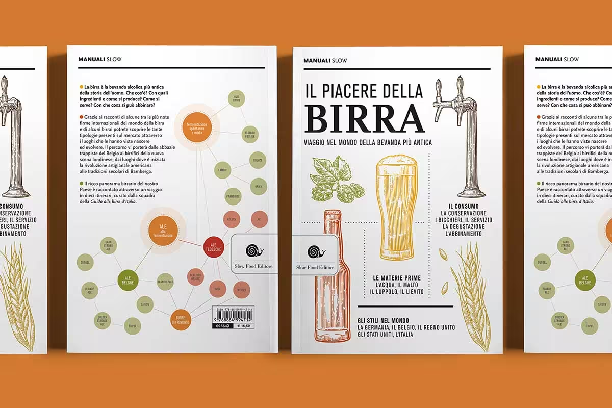
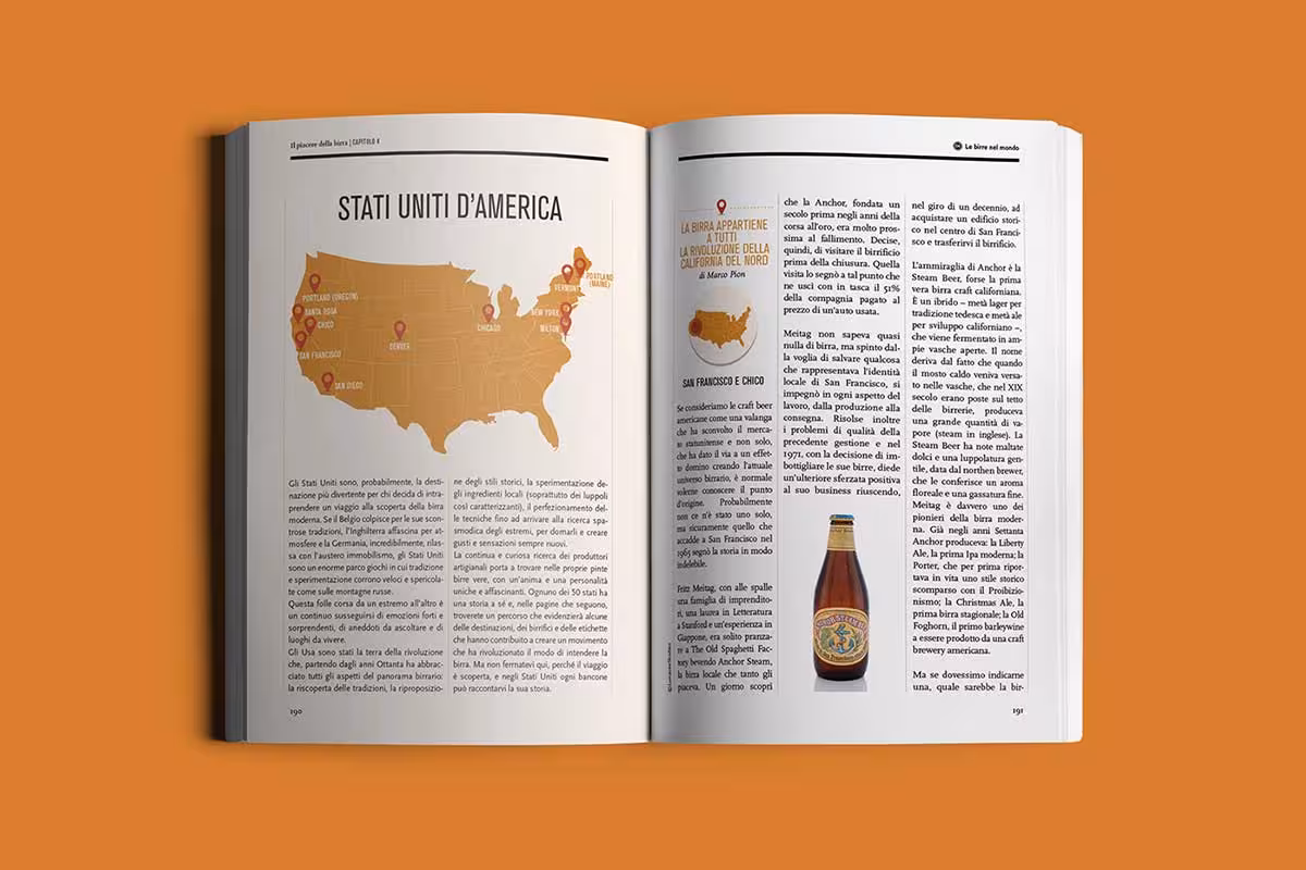
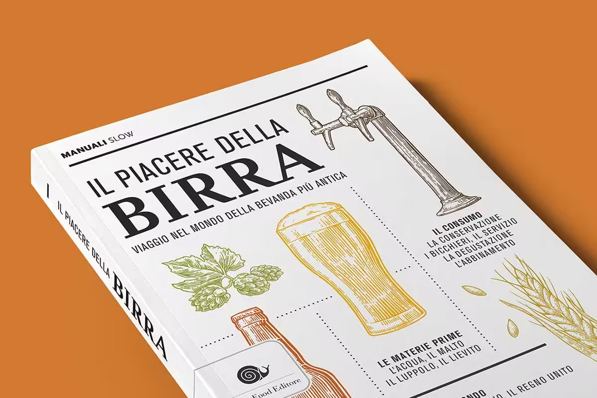
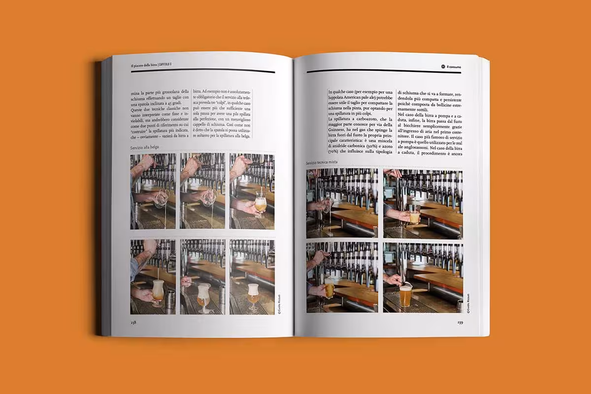
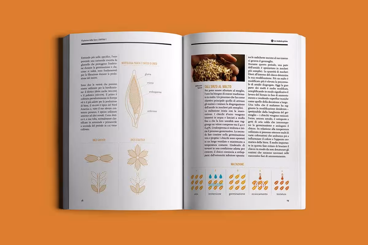
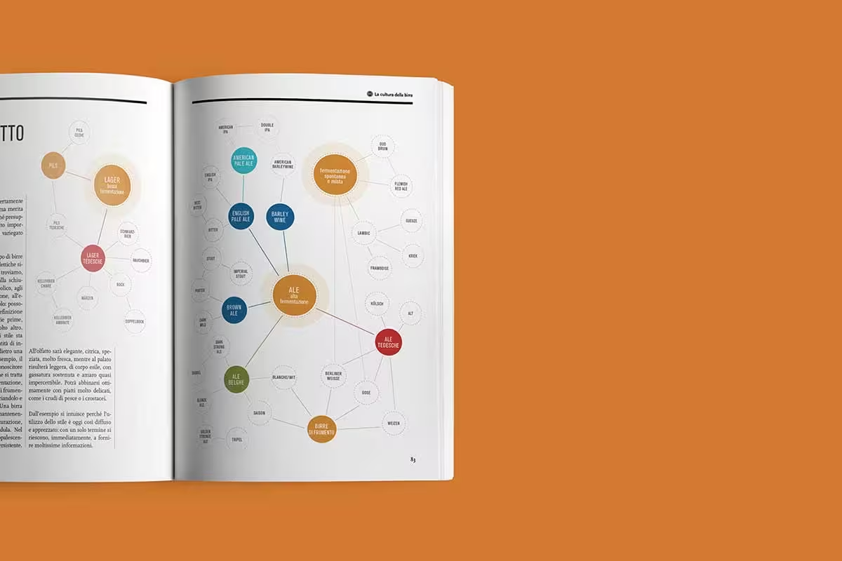
This book design by Studio Laucke Siebein is a beautiful example of how a cover can be both functional and beautiful. The cover features a die-cut window that reveals the beer inside, creating an immediate visual connection with the subject. The cut-out is not gimmick; it is an invitation. You see the product before you read a word about it, and the clean, modern aesthetic around the window lets it do all the talking.
7. Petite Passport Book Design
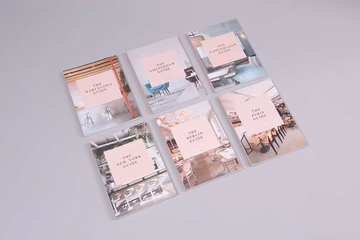
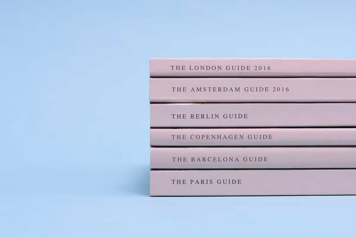
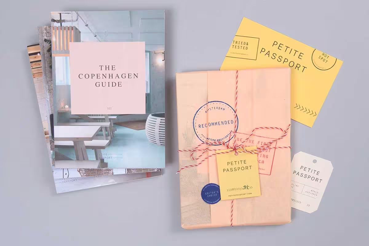
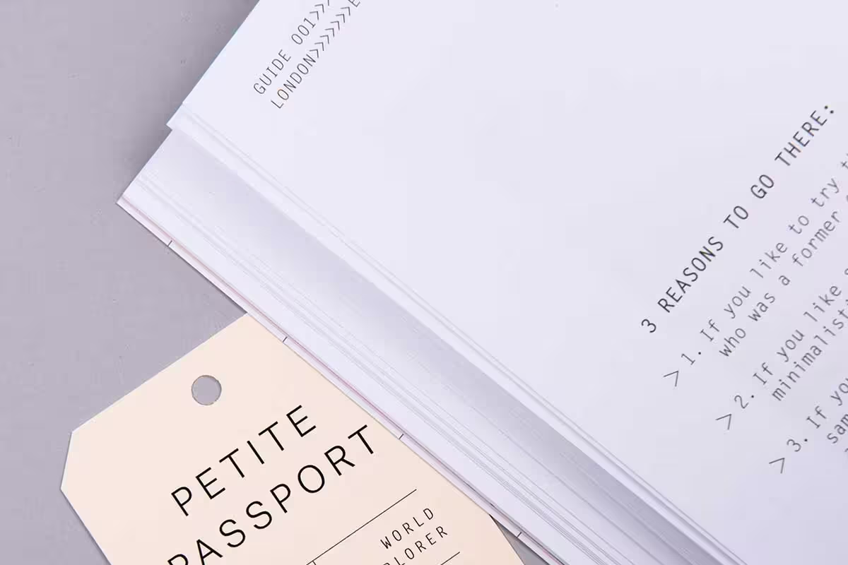
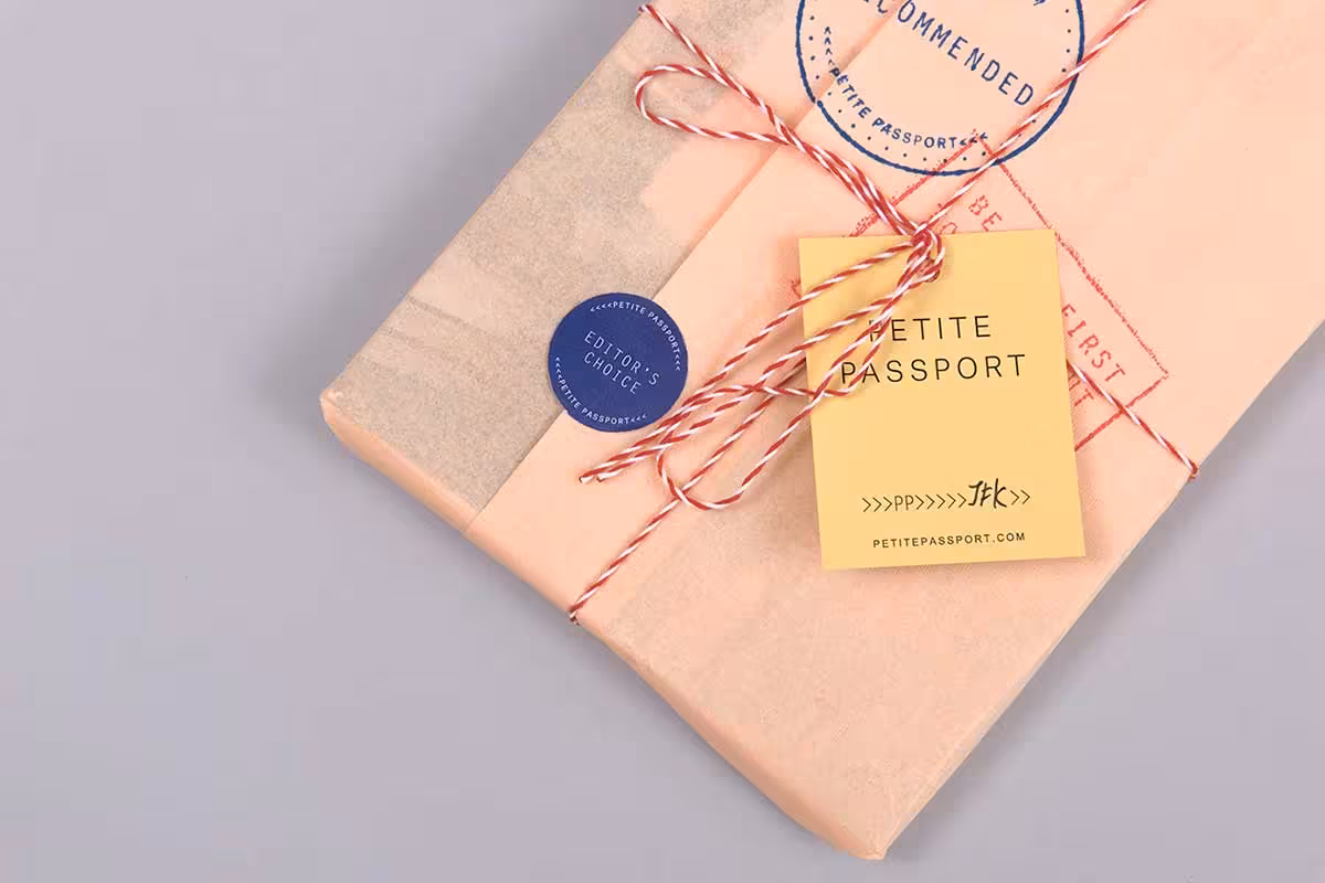

This travel guide uses a passport-inspired format, making it both functional and memorable. The design cleverly incorporates travel elements throughout, and the compact, portable format means you could actually take it with you. The concept works because the format itself tells you what the book is for before you read the title.
8. Da Vinci Ladies Portraits Book Design


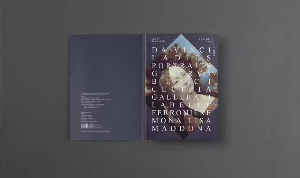
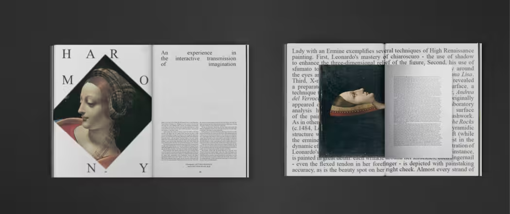
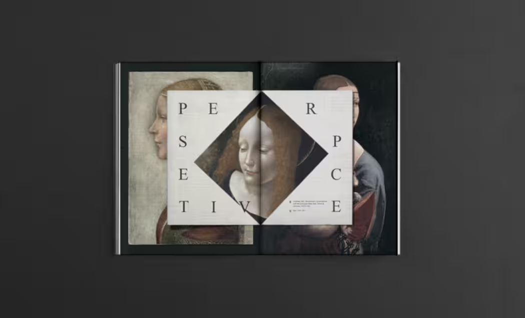
This art book pays homage to Leonardo da Vinci’s portraits with elegant typography and a sophisticated layout. The design reflects the timeless quality of the artwork without trying to compete with it. The restraint is the point: when the content is this strong, the design’s job is to step back and frame it beautifully.
9. Post-Foundational Political Theory Book Series


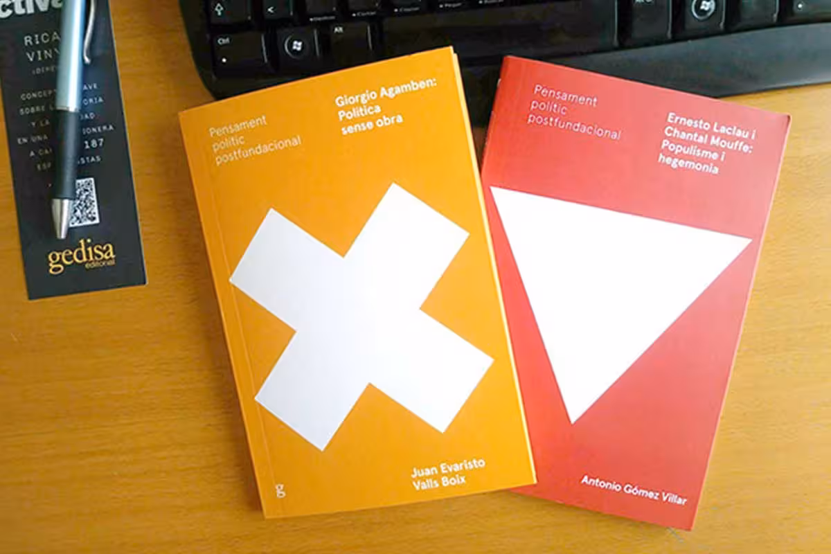
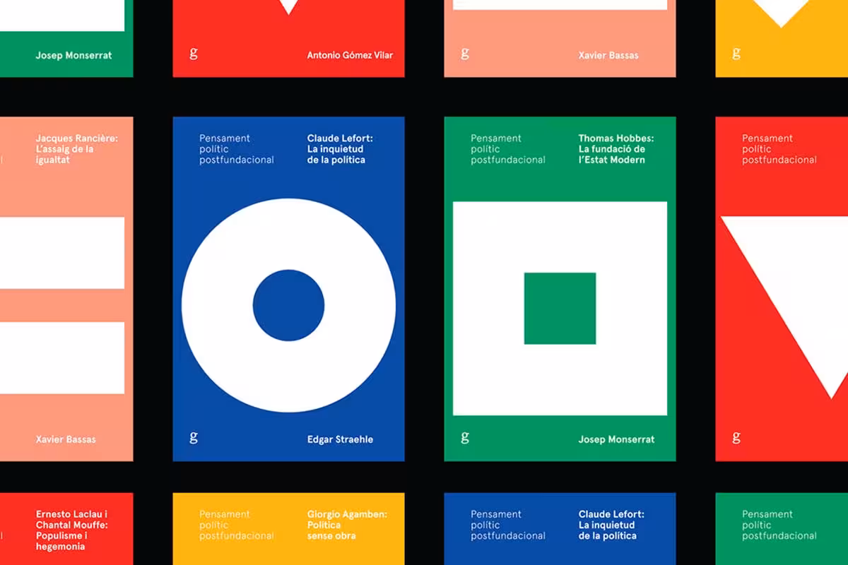
This academic book series uses a consistent design system across multiple volumes, creating cohesive brand recognition that lets readers identify any book in the series at a glance. Series consistency in academic publishing is rare and difficult. When it works this cleanly, with professional typography and a unified visual language across volumes, it elevates the entire collection.
10. UNI VERSE 2012 Book Design


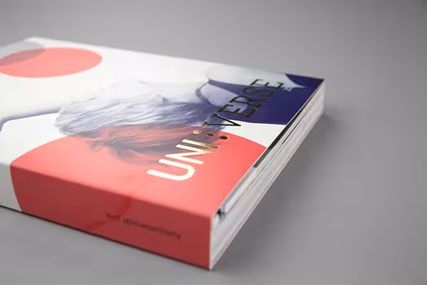
This design annual showcases innovative book design from 2012, and the cover itself is a work of art. There is a boldness to the creative treatment that makes it feel less like a reference volume and more like an artifact. It demonstrates exactly the kind of thinking it celebrates: design that takes risks and rewards the viewer for paying attention.
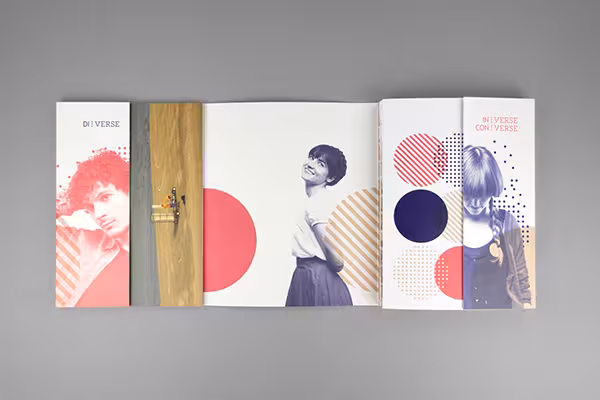
These ten designs share one thing: the physical form of the book itself does as much brand work as the content inside. Material choices, binding techniques, color palettes, die-cuts, and layout decisions all communicate something about the book before a single word is read. That is book branding at its best.

Mash Bonigala
Creative Director & Brand Strategist
With 25+ years of building brands all around the world, Mash brings a keen insight and strategic thought process to the science of brand building. He has created brand strategies and competitive positioning stories that translate into powerful and stunning visual identities for all sizes of companies.
Featured Work
See Our Work in Action
Real brands, real results. Explore how we've helped businesses transform their identity.

Client Love
What Our Clients Say
Don't just take our word for it. Hear from the brands we've worked with.

Gracienne Myers
Banana Vital
"If you are looking for a company to design your company’s identity or even rebrand your current brand, Spellbrand is the company that you would choose, they designed my company, Banana Vital’s logo, and provided me with 6 design to choose from which made it hard to choose because they were all very good. Just recently I hired them to rebrand Mechanical Bull Sales and again every logo was great and well thought out. I am very pleased with the work that Spellbrand has provided and I am looking for to continue working with them."

Joe Russell
VALENSOR
"Mash and his team were amazing. They were able to take our vision and produce a truly creative and unique branding package. What struck me most was their desire to make our company happy alongside ensuring our company has good branding. Mash was always willing to answer our questions and help us arrive at a decision. Overall, SpellBrand is not just creating company names and logos, they are creating character and soul for their clients' companies. I would recommend them to anyone looking to stand-out among their competitors. SpellBrand services are most definitely worth their weight in gold."
Related Services You Might Love
Based on what you just read, here are services that can help you achieve similar results for your brand.
Free Download
Brand Consistency Checklist
A 27-point checklist to audit your brand across every touchpoint. Used by our team on real client projects.
Success! Check your email for the download link.
Instant PDF download. We'll also send branding tips -- unsubscribe anytime.
Keep Reading
Related Articles

May 11, 2023
Brand Identity Designer – Why Your Business Needs One
What a brand identity designer does, how they differ from graphic designers, and why hiring one is an investment that pays for itself many times over.
Read More
Apr 20, 2023
Brand Identity System: The Six Elements That Make a Brand Unforgettable
Read MoreApr 1, 2026
The $100K Brand vs. the $5K Brand: What You're Actually Paying For
A line-by-line breakdown of what separates a $5K brand from a $100K brand. After 26 years of pricing branding projects, here's the honest truth about where the money goes and whether it's worth it.
Read More