Spellbrand Blog
Brand Collateral Design: How to Build a Cohesive System That Reinforces Your Brand at Every Touchpoint

Your brand identity lives in a design file until collateral carries it into the world.
A logo on a screen is a concept. A logo on a business card handed to a prospect, on packaging unboxed by a customer, on a presentation deck in a boardroom, on signage seen from across the street, that is a brand doing work. That is a brand building recognition, earning trust, and creating the kind of consistent experience that turns first-time buyers into lifelong advocates.
After designing brand collateral systems for 2000+ brands across 50+ countries, I have seen the same pattern: companies that treat collateral as an afterthought, producing materials piecemeal without a system, end up with a brand that looks like it was designed by five different people on five different days. Companies that treat collateral as a strategic system build brands that feel inevitable. Every piece reinforces every other piece, and the cumulative effect is a level of brand trust that no single asset could create alone.
What brand collateral actually is
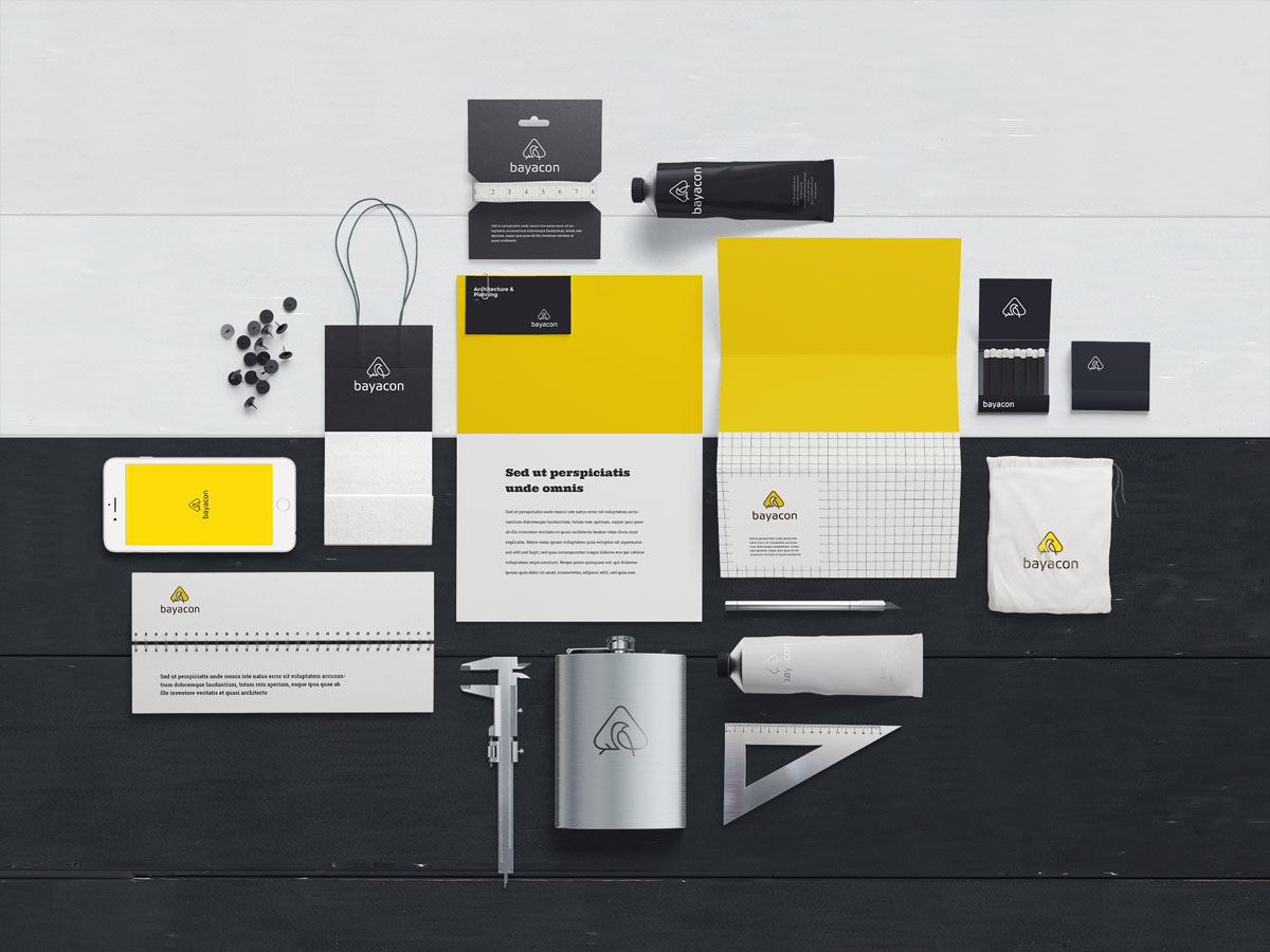
Brand collateral is every physical and digital asset that carries your brand identity into customer interactions. It is the bridge between your brand identity design and the real world.
Most companies get this wrong in one of two ways. The piecemeal approach designs each piece in isolation: a business card here, a brochure there, social media templates cobbled together in Canva. The result is a brand that looks fragmented, like a person wearing a suit jacket with sweatpants. The template approach buys a pre-made brand kit and slaps a logo on everything. Technically consistent but generic, with nothing that communicates what makes this brand different.
The correct approach is systems thinking. Every piece of collateral is part of an interconnected system where visual elements, messaging hierarchy, material quality, and design patterns work together according to clear rules defined in your brand guidelines.
The collateral hierarchy
Not all collateral is created equal. Different materials serve different strategic functions, and designing them in the right order ensures that foundational decisions inform everything that follows.
Foundation collateral
These materials establish the core visual system and are designed first because they set the rules.
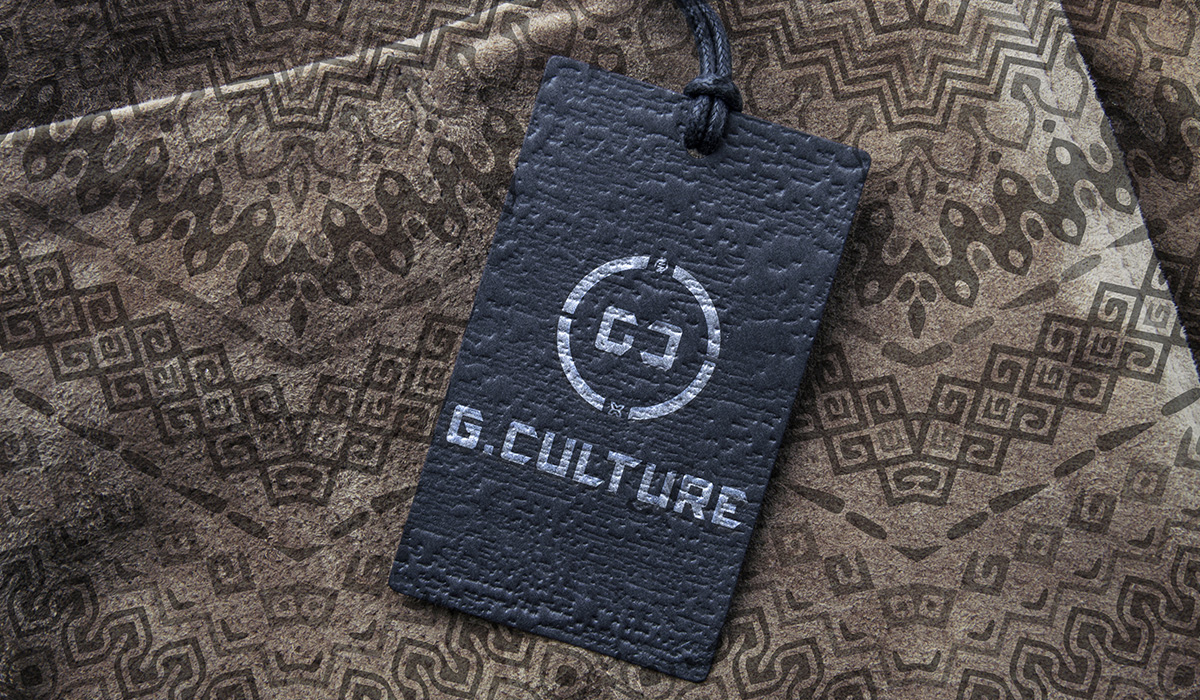
Business cards remain the most exchanged brand artifact in professional settings. A card is not just contact information on stock. It is a physical object that communicates your quality standard, personality, and attention to detail through weight, texture, finish, typography, and spatial design. When someone holds your card, they hold a physical manifestation of your brand promise.
Letterhead and stationery carry your visual identity on every official communication: proposals, contracts, invoices, letters. Consistency here signals organizational professionalism. Email signatures are the most overlooked piece of foundation collateral. Your team sends hundreds of emails daily, and each is a brand touchpoint. Standardized signatures with consistent formatting and properly sized logos turn every email into a brand impression.
Presentation templates cover sales decks, keynotes, and investor pitches, all high-stakes brand moments. Templates that enforce your visual language, including typography scale, color usage, image treatment, and layout grids, ensure every presentation looks like it came from the same brand regardless of who built the deck.
Customer-facing collateral
For product brands, packaging is often the most powerful piece you will ever create. It is the one touchpoint where you have complete control over the sensory experience. Great packaging design does not just protect the product. It creates an experience that reinforces positioning and gives customers a reason to share.
Brochures and sell sheets communicate your value proposition in detail, balancing information density with visual breathing room. The messaging hierarchy must be clear: what do they read first, second, third? Proposals and pitch documents are closing materials, and their design quality must match the value of what you are selling. A six-figure proposal in a plain Word document signals a disconnect between promise and presentation. Signage and environmental design, from storefronts to trade shows, shapes how people experience your brand in physical space through scale, materials, lighting, and placement that all shape brand perception.
Digital collateral
Social media templates should be a system, not a single template, but a family of related formats for posts, stories, carousels, and covers that maintain visual consistency while allowing flexibility. Digital ad templates for display, social, and retargeting need to be instantly recognizable at small sizes and short exposure times. Strong brand expression means a customer should know it is your brand before reading the text.
Email templates for newsletters, promotions, transactions, and onboarding each serve different functions but must feel like the same brand. Document templates for reports, whitepapers, case studies, and one-pagers are often downloaded and shared beyond your direct audience, working as brand ambassadors in contexts you cannot control.
Internal collateral
The brand guidelines document is the master reference governing everything: logo usage, color specifications, typography scales, image direction, tone of voice, dos and don’ts. Without it, consistency degrades the moment anyone other than the original designer touches the brand. Onboarding materials immerse new team members in the brand from day one. Internal communications templates for memos, presentations, and meeting agendas reinforce the brand internally, which makes it far easier to maintain externally.
Five principles of effective collateral design
Systematic consistency
Every piece of collateral must feel like it belongs to the same family. This does not mean every piece looks identical. It means every piece follows the same underlying rules: color ratios (a 60-20-20 split of primary, secondary, and accent creates a consistent feel across formats), typography scale (a defined hierarchy of sizes and weights that applies everywhere), spatial rhythm (consistent margins, padding, and white space ratios), and image treatment (a defined approach to photography style, color grading, cropping, and subject matter).
Format-appropriate design
Consistency does not mean ignoring context. A LinkedIn post is not a billboard. A business card is not a brochure. Each format has unique constraints of size, viewing distance, attention span, and interaction model, and the design must respect them. The logo lockup that works on letterhead may need simplifying for a social avatar. The color palette that pops on screen may need adjustment for print on uncoated stock. Every piece must be both unmistakably on-brand and optimized for its specific format. If achieving consistency requires sacrificing usability, the system needs a format-specific variation, not a forced fit.
Quality signals intent
The physical and perceived quality of your collateral communicates your brand’s standards before anyone reads a word. A heavy, textured business card communicates a different standard than a thin one from an online printer. A proposal in a custom-designed PDF communicates differently than one in a default Word template.
This does not mean everything must be expensive. It means quality must be intentional and aligned with your brand positioning. A startup positioning itself as premium cannot distribute collateral that feels budget. A brand positioning itself as accessible should not produce collateral that feels intimidatingly high-end.
Messaging hierarchy is design
Every piece of collateral communicates a message, and the design determines the order in which that message is received. This is information architecture applied to brand materials. On every piece, consider what the single most important thing to communicate is, what the viewer should notice first, what the call to action is, and what can be removed without losing the core message. The best collateral communicates clearly in the first two seconds and rewards closer inspection. This requires a clear brand messaging framework for what to say and a design system for how to say it visually.
Scalability built in
A collateral system must work today and next year. It must work with five team members and fifty. Template systems rather than individual files ensure that non-designers can produce materials correctly. Modular components like headers, footers, and content blocks can be assembled in different combinations. Clear documentation prevents drift as new people join the team. And format expansion protocols provide enough direction to create collateral for a new format without starting from scratch.
Auditing your current system
If you already have collateral in the market, audit it before building new materials. Gather every piece currently in use. Lay everything out side by side and ask whether it all looks like it comes from the same brand. Score each piece on brand consistency (does it follow guidelines?), format effectiveness (does it work well in its context?), and quality alignment (does material quality match positioning?). Look for where the lowest scores cluster. Is it a consistency problem, a format problem, or a quality problem? Fix the highest-visibility, lowest-scoring items first. A bad business card you hand out daily is more urgent than a bad internal memo template.
Common mistakes
Designing in isolation is the most frequent. Every piece exists in relationship to every other piece. When you update your color palette on the website but not on your business cards, you create a brand inconsistency that erodes the brand experience.
Prioritizing aesthetics over function is the second. A brochure that wins design awards but fails to convey your value proposition has failed its primary job. Function first, then beauty in service of function.
Ignoring the handoff is the third. Most collateral is produced not by the original designer but by marketing coordinators, sales teams, and external vendors. If templates, guidelines, and asset libraries are not bulletproof, quality degrades rapidly.
Over-designing internal materials is the fourth. Meeting agendas do not need to be works of art. Redirect that time and budget to customer-facing touchpoints that drive revenue.
And forgetting digital-physical parity is the fifth. Most customer journeys cross between digital and physical touchpoints. If your digital presence feels modern and your print materials feel dated, the disconnect creates a trust gap we detail in our guide on brand trust architecture.
The design process
Start with strategy alignment. Confirm your brand positioning, identify your target audiences and which touchpoints matter most to them, define the quality standard that aligns with your positioning, and determine which touchpoints are highest priority.
Design the foundation pieces first: business card, letterhead, presentation template. These establish the rules for spacing, color ratios, typography application, and image treatment. Then extend the core system to customer-facing and digital collateral. Each new format tests and refines the system. When a format does not work with existing rules, adjust the rules rather than abandoning them.
Codify everything into brand guidelines that include not just specifications but rationale. Create production-ready templates with instructions, locked elements, and editable zones. Test them with actual team members, not designers, to confirm usability. Then distribute templates, asset libraries, and guidelines to everyone who produces brand materials, and train them on how to use the system.
Collateral is where strategy becomes reality
You can have the most brilliant brand strategy in the world. But if the collateral that carries your brand into the world is inconsistent, low-quality, or fragmented, none of that strategy reaches the customer intact.
Every piece of collateral is either building your brand equity or eroding it. There is no neutral. The brands that treat collateral as a system rather than a series of one-off projects build the kind of accumulated visual consistency that becomes a competitive moat.
If you need help building a brand collateral system, or if your current materials need alignment with a stronger brand identity, let’s talk about your project. See examples of our collateral systems across our portfolio, from luxury furniture brand identities to premium grooming brands to coffee startup branding.

Mash Bonigala
Creative Director & Brand Strategist
With 25+ years of building brands all around the world, Mash brings a keen insight and strategic thought process to the science of brand building. He has created brand strategies and competitive positioning stories that translate into powerful and stunning visual identities for all sizes of companies.
Featured Work
See Our Work in Action
Real brands, real results. Explore how we've helped businesses transform their identity.
Client Love
What Our Clients Say
Don't just take our word for it. Hear from the brands we've worked with.

Ernest Bannister
M.O.R.E
"My experience with the Spell brand team has been nothing short of excellent. From the beginning Mash and team made me feel very comfortable with the design process. I am extremely happy with the results of my design and look forward to working with Spellbrand; exclusively! I have told many family, friends and peers about the great work the Spellbrand team has done in creating my design. Thanks again for all your patience and professionalism; I look forward to working with you in the future."

Christian Nocera
Dapper Yankee
"Delighted to have used Spellbrand for our last project. The work was thorough and results excellent. For me it was such a pleasure to work with Mash who was able to keep up with all my last minute requests for small changes. Nothing was too much of a problem and I would have to say that its great to work with people who do actually put the customer needs first! One thing saying it, its another thing doing it – Thanks Mash!"
Related Services You Might Love
Based on what you just read, here are services that can help you achieve similar results for your brand.
Free Download
Brand Consistency Checklist
A 27-point checklist to audit your brand across every touchpoint. Used by our team on real client projects.
Success! Check your email for the download link.
Instant PDF download. We'll also send branding tips -- unsubscribe anytime.
Keep Reading
Related Articles

Apr 20, 2023
Brand Identity System: The Six Elements That Make a Brand Unforgettable
Read More
Jan 2, 2025
How to Align Brand Identity with Customer Perception
Your brand identity is what you create. Customer perception is what they experience. When these two things diverge, trust erodes. Here is how to bring them into alignment.
Read MoreApr 1, 2026
The $100K Brand vs. the $5K Brand: What You're Actually Paying For
A line-by-line breakdown of what separates a $5K brand from a $100K brand. After 26 years of pricing branding projects, here's the honest truth about where the money goes and whether it's worth it.
Read More