

Spellbrand Blog
How to Align Brand Identity with Customer Perception

Aligning your brand identity with customer perception is not just about creating a pretty logo or choosing catchy taglines. It is about crafting an emotional experience that resonates with your target audience and drives long-term loyalty.
Brand identity, the way your brand is perceived, is the sum of your visual and verbal elements working together to convey the essence of who you are.
Here is how to align your visual and verbal identity with customer expectations and emotions to build a brand that stands out and creates lasting connections.
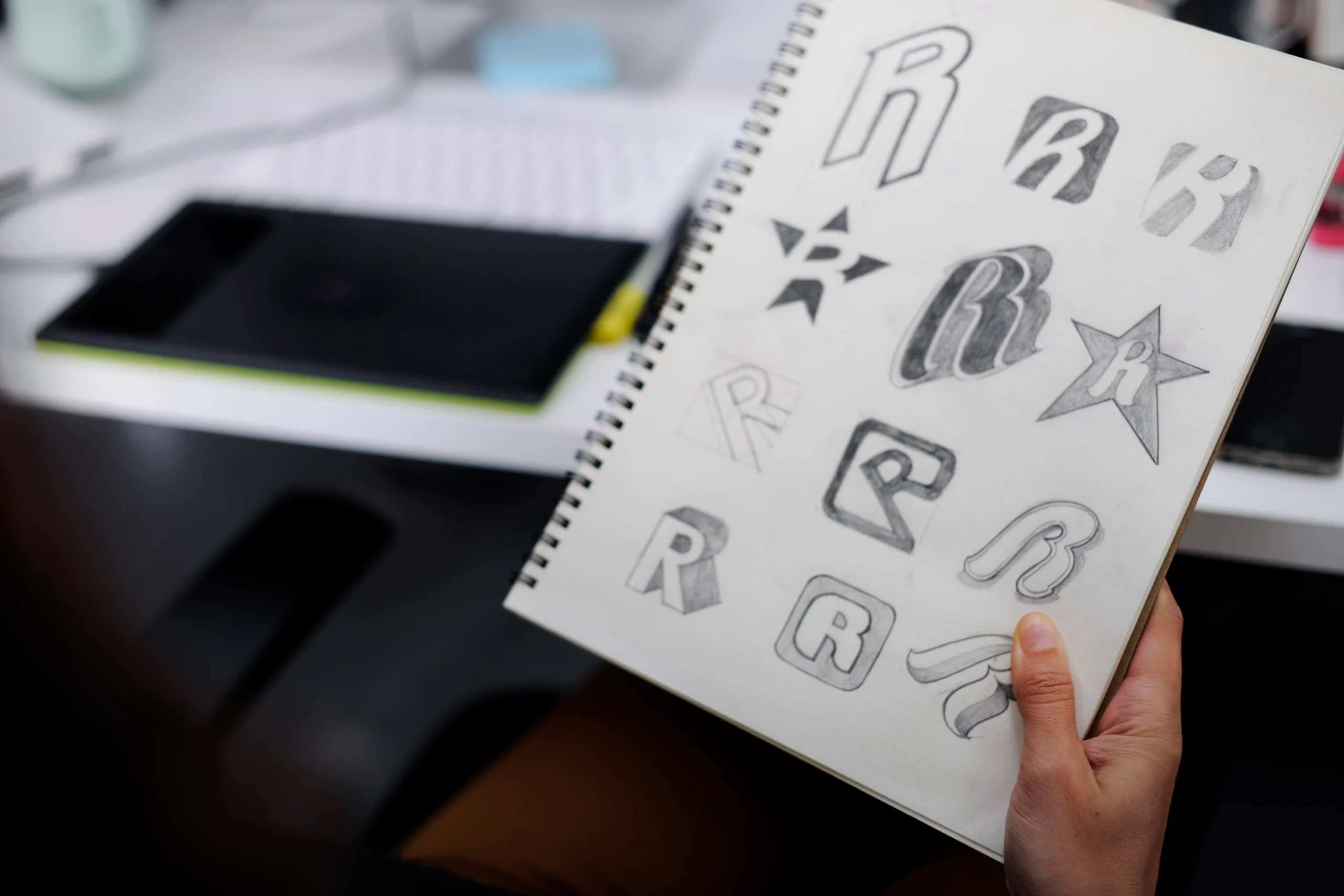
Logo: the face of your brand
Your logo is the most recognizable element of your brand. It is the visual shorthand for everything your brand stands for. To align with customer perception, your logo must evoke emotions and communicate your brand’s essence.
Logos act as symbols that carry meaning. They communicate complex ideas and emotions in simple visual forms. A well-designed logo does not just identify your brand. It invokes a feeling that customers associate with your values and personality. Color psychology plays into this directly: a red logo may convey passion, energy, or urgency, while a blue logo suggests trust, stability, and professionalism.
Simple logos are easier for customers to remember and recognize. Think about Nike, Apple, and McDonald’s. Their iconic logos distill brand identity into a clean, recognizable mark. And your logo must function across different mediums. A brand like Spotify uses a simple, adaptable design that is consistent whether it is on an app icon or a billboard.
Airbnb’s logo redesign in 2014 illustrates alignment at its best.


The new Bélo symbol was designed to reflect belonging, the feeling Airbnb wanted to evoke in customers. The logo’s simplicity and bold color symbolized connection, openness, and community, aligning perfectly with Airbnb’s redefined brand positioning. Use A/B testing to gather feedback from your target audience on how they perceive your logo, and focus on timelessness rather than trendy designs that feel outdated in a few years.
Color palettes: the psychology of perception
Color plays a vital role in shaping how customers feel about your brand. The right palette creates immediate emotional responses and reinforces brand messaging.
Each color triggers specific emotional responses. Yellow is associated with optimism and warmth, black communicates elegance and sophistication. But cultural context matters too: white may signify purity in some cultures but represents mourning in others. Brands operating globally need to understand these nuances.
Consistent use of color across all touchpoints, from website and social media to packaging, strengthens recognition. Coca-Cola’s consistent use of red reinforces its identity as an iconic, energetic brand. And color choices should align with the emotions you want customers to feel. A wellness brand may opt for calming greens and blues, while a tech brand may use vibrant orange or purple to signal innovation.
Starbucks demonstrates intentional color strategy.
 Their use of green is not just aesthetics. Green evokes calmness, sustainability, and growth, aligning with their commitment to environmental responsibility and their role as a welcoming “third place” between home and work.
Develop a brand style guide that defines your color palette with hex codes for digital and CMYK for print. Test emotional responses by showing your target audience different color variations and gauging reactions.


Typography: the subtle shaper of perception
Typography may seem simple, but it significantly impacts how people see your brand. The fonts you choose are not just about making words look good. They tell a story about your brand’s personality and values.
Different fonts create different impressions. Serif fonts like Times New Roman feel classic, reliable, and formal. Sans-serif fonts like Helvetica feel modern, clean, and approachable. Decorative fonts are bold and unique but should be used carefully to avoid overwhelming the message. Fonts, like colors, evoke emotional responses. A playful, rounded font makes your brand feel approachable, while a sharp, angular font suggests professionalism and authority. Coca-Cola’s cursive typography evokes nostalgia, comfort, and a sense of legacy, reinforcing its status as a timeless brand.
The font you use in your logo, website, or ads is often the first thing people see, shaping their first impression. And using the same typography across all brand materials, website, emails, and packaging, creates a unified look that makes your brand more recognizable.
When Google updated its logo with the simple Product Sans font, it gave the brand a fresh, modern look that fit its identity as a forward-thinking tech company.

Pick fonts that match your brand personality. If your brand is playful, go for modern, fun fonts. If it is more traditional, choose something classic and professional. And always test for readability, especially on mobile devices and across different formats.
Tone of voice: the emotional connector
Your brand’s tone of voice is the verbal counterpart to your visual identity. It is how your brand speaks to your audience and plays a major role in shaping perception. Unlike visual elements, which stay fairly constant, your tone can shift depending on context while maintaining an underlying consistency.
Your brand’s personality comes through in words via your tone. Whether quirky, professional, or friendly, it should resonate with your audience’s emotions and expectations. A consistent tone across all platforms creates familiarity and trust. Over time, customers begin to recognize and respond to your unique voice.
Slack demonstrates tone alignment well. They use a conversational and approachable tone that makes technical collaboration less intimidating. Slack’s playful voice suits its mission to make communication more accessible and enjoyable, differentiating it from more formal competitors like Microsoft Teams.
Your tone of voice should reflect how your audience wants to be spoken to. A young, dynamic audience might prefer casual, playful language, while a B2B audience might expect a more formal, authoritative tone. Adapt your tone to the platform: social media posts can be more informal and engaging, while whitepapers should maintain a professional tone.
Messaging: crafting a story that resonates
Messaging is the narrative that carries your brand’s voice across different platforms and touchpoints. It is how you articulate your core values, your value proposition, and why customers should care. Effective messaging is not just about what you say but how you say it.
Every communication piece, whether a tweet or a product description, should reinforce the same brand story. If your messaging is inconsistent, customers feel disconnected or confused about what your brand stands for. And today’s consumers engage with brands that are authentic. Messaging needs to move beyond product features to focus on how your brand fits into the customer’s life.
Apple tells a consistent story of innovation, simplicity, and empowerment. Whether launching a new product or promoting the brand itself, Apple’s messaging does not focus on features. It focuses on the emotional experience its products enable: creating, learning, or connecting with others.
Define three to five core messaging pillars that consistently represent your brand’s value, addressing not only what you offer but why it matters. And humanize your brand. Customers do not want to be talked at. They want to feel engaged. Whether through storytelling, customer testimonials, or brand anecdotes, making your messaging more human makes your brand more trustworthy.
Alignment creates lasting success
Every element of your visual and verbal identity, from typography to messaging, should work together to build a lasting relationship with your customers.
When your brand identity truly resonates with how your audience sees and feels about your brand, it builds trust, loyalty, and a connection beyond transactions. A consistent, well-aligned brand identity creates not just short-term engagement but long-term success.

Mash Bonigala
Creative Director & Brand Strategist
With 25+ years of building brands all around the world, Mash brings a keen insight and strategic thought process to the science of brand building. He has created brand strategies and competitive positioning stories that translate into powerful and stunning visual identities for all sizes of companies.
Featured Work
See Our Work in Action
Real brands, real results. Explore how we've helped businesses transform their identity.



Client Love
What Our Clients Say
Don't just take our word for it. Hear from the brands we've worked with.

Christian Nocera
Dapper Yankee
"Delighted to have used Spellbrand for our last project. The work was thorough and results excellent. For me it was such a pleasure to work with Mash who was able to keep up with all my last minute requests for small changes. Nothing was too much of a problem and I would have to say that its great to work with people who do actually put the customer needs first! One thing saying it, its another thing doing it – Thanks Mash!"

Tom McGee
PD Campus
"We tried several designers to design our logo and could not find the one that fit our company. After a few years of searching for a good branding company, I found Spellbrand through a random search. Spellbrand was sensational! They took the time to listen to our story and created a few designs that spoke to our team and what we do. We've never had a designer do that. We not only received a great logo, but we now have a brand we are all proud to wear! Thank you!"
Related Services You Might Love
Based on what you just read, here are services that can help you achieve similar results for your brand.
Free Download
Brand Consistency Checklist
A 27-point checklist to audit your brand across every touchpoint. Used by our team on real client projects.
Success! Check your email for the download link.
Instant PDF download. We'll also send branding tips -- unsubscribe anytime.
Keep Reading
Related Articles

Feb 19, 2026
How to Conduct a Brand Perception Audit: Measure the Gap Between Identity and Reality
How to conduct a brand perception audit that reveals the gap between how you see your brand and how customers actually experience it. Methodology with survey templates, analysis frameworks, and next steps.
Read More
Oct 22, 2025
What is Brand Identity? Complete Definition & Framework
What brand identity actually means, the elements that make it up, and a practical framework for building one that drives business results.
Read More
Apr 20, 2023