Spellbrand Blog
Top 10 Neon Logos
Looking for a custom logo?
Get a professional, one-of-a-kind logo designed by our award-winning team.
Looking for a custom logo design?
Our professional designers create unique, memorable logos tailored to your brand.
See Our Logo Design Services →Neon logos used to be popular due to their resemblance to the most commonly used signs of their times. However, they went out of mode and the style was seldom seen again until very recently. We believe that this former fad is ripe for revival, and the following ten logo designs are a good illustration of why.
Gingerboy Neon Logo Design
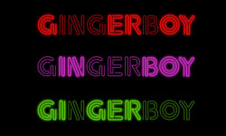
This logo design uses a very traditional neon sign structure, with the company’s name formed out of bright, tubular letters that are formed out of several lines. It should be noted that the company name is shown three times in different colors, which is common in the neon signs that it copies. Because different colors are used and different words are emphasized, the results are anything but boring and repetitive. This logo is definitely retro but retains a modern edge that will appeal to contemporary customers.
The Strokes Neon Logo Design
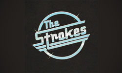
This band’s logo design is definitely retro, using a style that goes back to the classic days of rock and roll. The circle is friendly and also creates a harmonic and balanced image. The lettering is formed so that several long lines bisect the circle, giving a little edge that is appropriate for the genre while also creating a sense of movement. Few rock and roll bands in modern times use a retro logo such as this, which helps The Strokes differentiate their brand from the many others out there. This is a huge advantage in a market with many, many choices.
Abduzeedo Logo Design
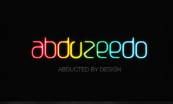
This logo design is used by a popular design blog. Although the neon tubes are not as visible here are they have been in some of our other examples, the glowing bright colors and rounded shapes definitely are reminiscent of a neon sign. In this case, many different colors are used to give a creative and artistic image. In this case, neon is flashy and friendly at the same time, a winning combination for any organization involved with design.
Quiksilver Neon Logo Design
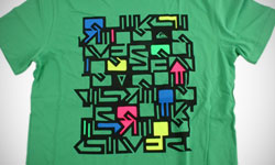
This alternate logo design has been used by popular surfing brand Quiksilver on apparel, sponsorship graphics, and even in some communications. The retro appeal is easy to see, although this neon logo is a little different from the classic ones. First, the tubes here are black, with the bright coloring filling in carefully chosen spaces. Although no neon light could function this way, the effect is nonetheless decidedly neon and appropriate for any company looking to get back to its roots.
Texas Roadhouse Logo Design
Roadhouses traditionally had bright neon signs to invite and entice hungry travelers on nearby highways, but Texas Roadhouse has decided to maintain their connection to the past by continuing to use a neon logo. In this case, a shape of the state of Texas refers to the name and origin of this restaurant, while warm colors create an inviting feeling and also attract the eye of a weary driver. This logo may be a classic, but it maintains its power in modern times.
Serial Lover Neon Logo Design
This Neon logo design was created for a movie that was released about ten years ago. The use of neon, in this case, refers to a somewhat tawdry plot, as hinted at by the name. Because the main character and the target audience were women, the use of hot pink was appropriate. The many swirls and the unconventional way in which the letters are connected gives a slightly artsy image that is more interesting and edgy than the average neon sign.
Car Tunes Logo Design
Because people who buy super-amped stereo systems tend toward the bright and flashy, the use of a neon logo for stereo system seller Car Tunes is more than appropriate. In this case, the logo is jagged and modern while angled to create a sense of movement. The flames are commonly seen in souped-up cars, so they are a good choice here, as is the outlining that gives extra emphasis to the image. Blue creates a cool, calm feeling that is decidedly neon while also modern.
8. London 2012 Olympics Logo Design
Whether this is one of the best neon logos or one of the worst is a matter of debate, but this neon logo has certainly fulfilled its purpose in getting people talking about the 2012 London Olympics before the Vancouver closing ceremonies have even begun. Instead of smooth, tubular wording, the font is ultra-jagged and even jarring. However, the neon influences are easy to see in the extremely vivid colors and the retro, eighties design. This logo design clearly hails back to the British pop art movement of several decades ago, which is relevant to the city and representative of its history.
Super Bowl Logo Design
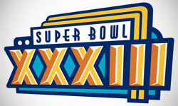
This Miami-based Super Bowl needed a logo design that was distinctly Miami, and this marquee-like design was just the answer. Bright colors reminiscent of the ocean and sun tie into the area, while the bold writing gives this important sporting event the weight that it deserves. Art deco influences abound, both in the neon itself and the way the logo design is angled to give it a sense of movement. This neon logo design is distinctly Miami while also grandiose enough for the Super Bowl.
B&B Neon Logo Design
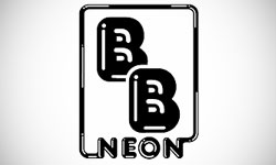
This logo design is unique as it is one of the few neon logos that has no color whatsoever. The tubular shape combined with the use of light to infer shape gives a definite neon image even without color. The result is plain but memorable, without the busy-ness that often results from neon. Because this business actually makes neon signs, a neon logo is highly appropriate.
As you can see, there are many ways of approaching a neon logo design. The versatility of this genre is just one of its benefits, with a close second being the fact that the style is little used in modern logo design. Although neon logo designs only work well for a select number of companies, they can be very effective when all conditions are right due to their inherent uniqueness and retro feeling.

Mash Bonigala
Creative Director & Brand Strategist
With 25+ years of building brands all around the world, Mash brings a keen insight and strategic thought process to the science of brand building. He has created brand strategies and competitive positioning stories that translate into powerful and stunning visual identities for all sizes of companies.
Featured Work
See Our Work in Action
Real brands, real results. Explore how we've helped businesses transform their identity.
Client Love
What Our Clients Say
Don't just take our word for it. Hear from the brands we've worked with.
Josh Amburn
Lakefront Docks and Lifts
"I came into this project expecting to get the best logo for our brand. That’s exactly what I received. The team at SpellBrand used the descriptions of what we do along with a color palette of our site to design three amazing concepts. Once we decided on what worked best for our needs, they worked diligently to perfect the design. Their use of their project management software makes the collaboration painless. Great work team! We’ll see you on the next project! Josh"
Steve Turner
Turn2Coaching
"Delighted to have used Spellbrand for our last project. The work was thorough and results excellent. For me it was such a pleasure to work with Mash who was able to keep up with all my last minute requests for small changes. Nothing was too much of a problem and I would have to say that its great to work with people who do actually put the customer needs first! One thing saying it, its another thing doing it – Thanks Mash!"
Related Services You Might Love
Based on what you just read, here are services that can help you achieve similar results for your brand.
Free Download
Brand Consistency Checklist
A 27-point checklist to audit your brand across every touchpoint. Used by our team on real client projects.
Success! Check your email for the download link.
Instant PDF download. We'll also send branding tips -- unsubscribe anytime.
Keep Reading
Related Articles
Nov 17, 2025
Top 10 Simple Logos (Yet Effective Logos)
Discover the top 10 simple logos (yet effective logos) logos. Expert analysis of iconic logo designs, their history, and what makes them memorable.
Read MoreNov 17, 2025
Top 10 American University & College Logos
Discover the top 10 american university & college logos logos. Expert analysis of iconic logo designs, their history, and what makes them memorable.
Read MoreNov 17, 2025
Top 10 Car Company Logos
Discover the top 10 car company logos logos. Expert analysis of iconic logo designs, their history, and what makes them memorable.
Read More

