


The Challenge
Balance Playful Character With Luxury Positioning
The founder’s vision was precise: a shark mascot that feels powerful and sleek rather than cartoonish or juvenile. The brand targets the luxury segment with premium pricing, so every design element needed to communicate exclusivity. But it also needed personality — something that would make men smile when they reached for their styling clay.
“We like what you did with Dapper Yankee. We want a shark who is ‘neat’ and ‘cool,’ maybe even wears a suit and sunglasses. But we wouldn’t want a full-on mascot that is overly playful, as the brand aims at a high-end, premium quality and pricing segment.”
Shark Theme Without Gimmicks
Powerful and sleek, never cartoonish — genuine personality without sacrificing premium appeal
Complete Ecosystem
Logo, monogram, pattern, packaging across five product formats, and environmental signage
Premium Market Positioning
Every element must justify luxury pricing and sit comfortably next to high-end fashion houses
Middle East Market Fit
Global appeal rooted in Dubai’s luxury culture for the region’s growing male self-care audience
Secondary Mark
The TNS Monogram
Every premium brand needs a secondary mark that works where the full logo cannot. For The Neat Shark, we hand-crafted a TNS monogram that interweaves the three letters into a single ornate emblem — enclosed in a circular frame with gold detailing that carries the same DNA as the primary crest.
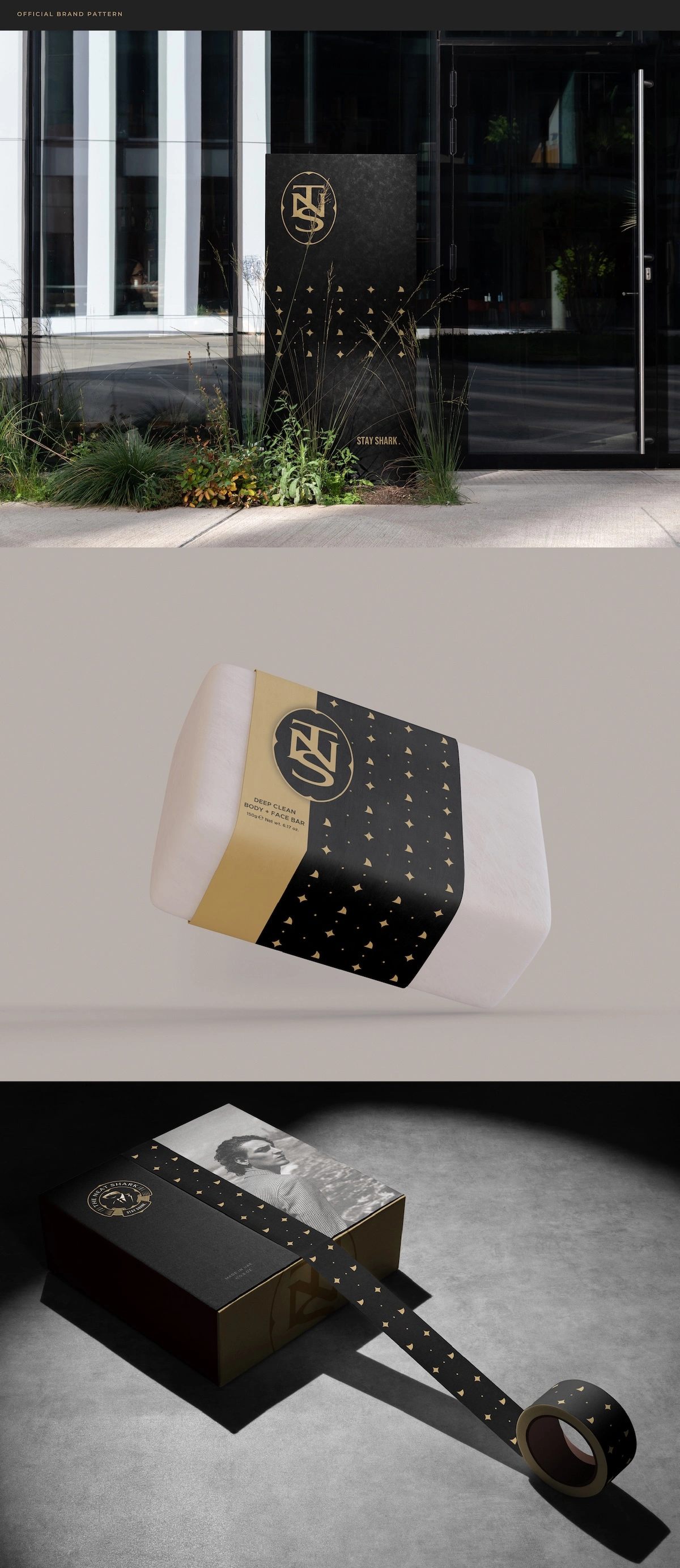
The monogram appears across the entire brand ecosystem: on product lids and caps, on packaging seals, on storefront signage, and woven into the repeating diamond pattern that ties everything together.
The TNS monogram works as both a quality seal and a recognizable brand shorthand — sophisticated enough for a perfume bottle, bold enough for a building facade.
Hero Product
Shark Mold Styling Clay
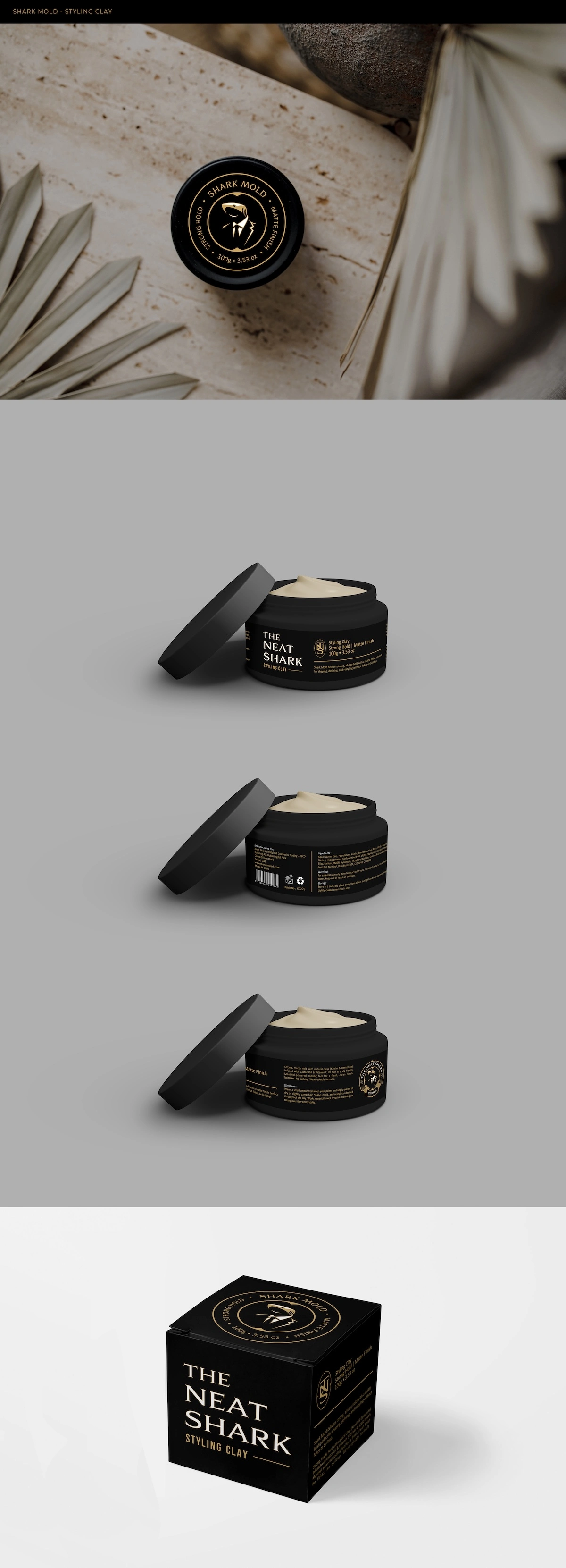
The brand’s flagship product needed packaging that would command attention on shelves and in e-commerce photography alike. We designed a matte black jar with the shark crest prominently featured on the lid, surrounded by the product name in a refined arc with “Strong Hold” and “Matte Finish” integrated into the seal.
The jar body carries the full brand name in a structured typographic layout — all rendered in gold type on black. The accompanying product box extends the palette with elegant gold letterforms and the shark crest anchoring the design.
01 Lid Design — shark crest centrepiece, recognizable from above
02 Label Hierarchy — brand, product, benefits, and regulatory info
03 Box Packaging — retail-ready with gold typography
Adapting the System
Shark Dust Styling Powder
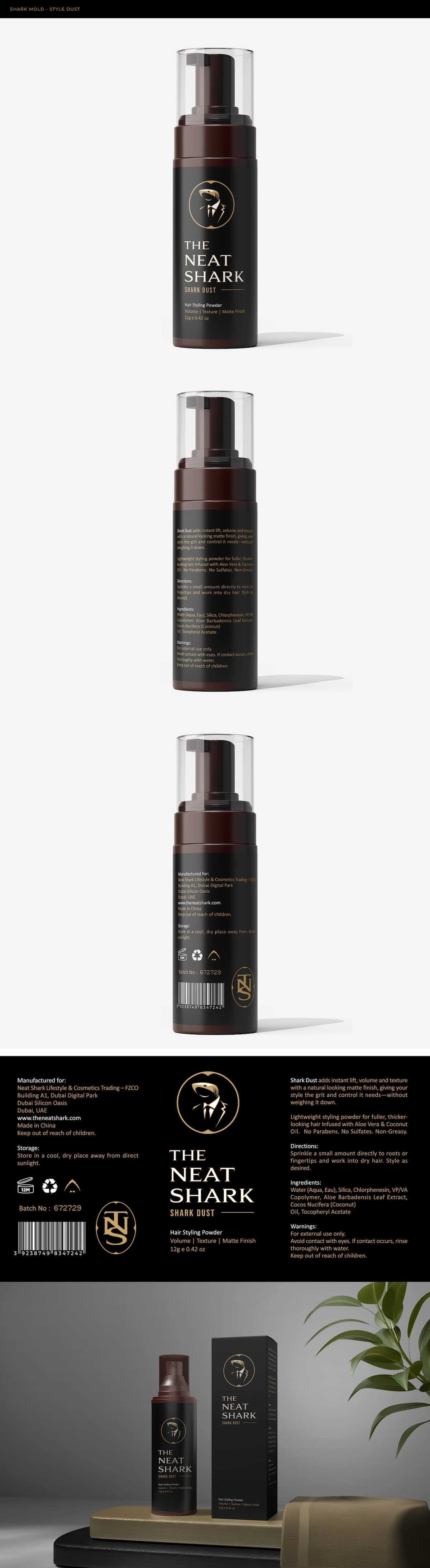
A completely different form factor — a cylindrical pump bottle — while maintaining absolute visual cohesion with the Styling Clay. We adapted the brand system to a tall, dark bottle format with the TNS monogram prominently displayed alongside the brand name in a vertical stack.
◆ The same gold-on-black palette, the same typographic hierarchy, the same crest placement — whether it’s a wide jar or a tall bottle, the brand is immediately recognizable.
Full regulatory compliance — ingredients, directions, batch information — is integrated without compromising the luxurious aesthetic.
Premium Gift Experience
The Wave Tamer Signature Kit
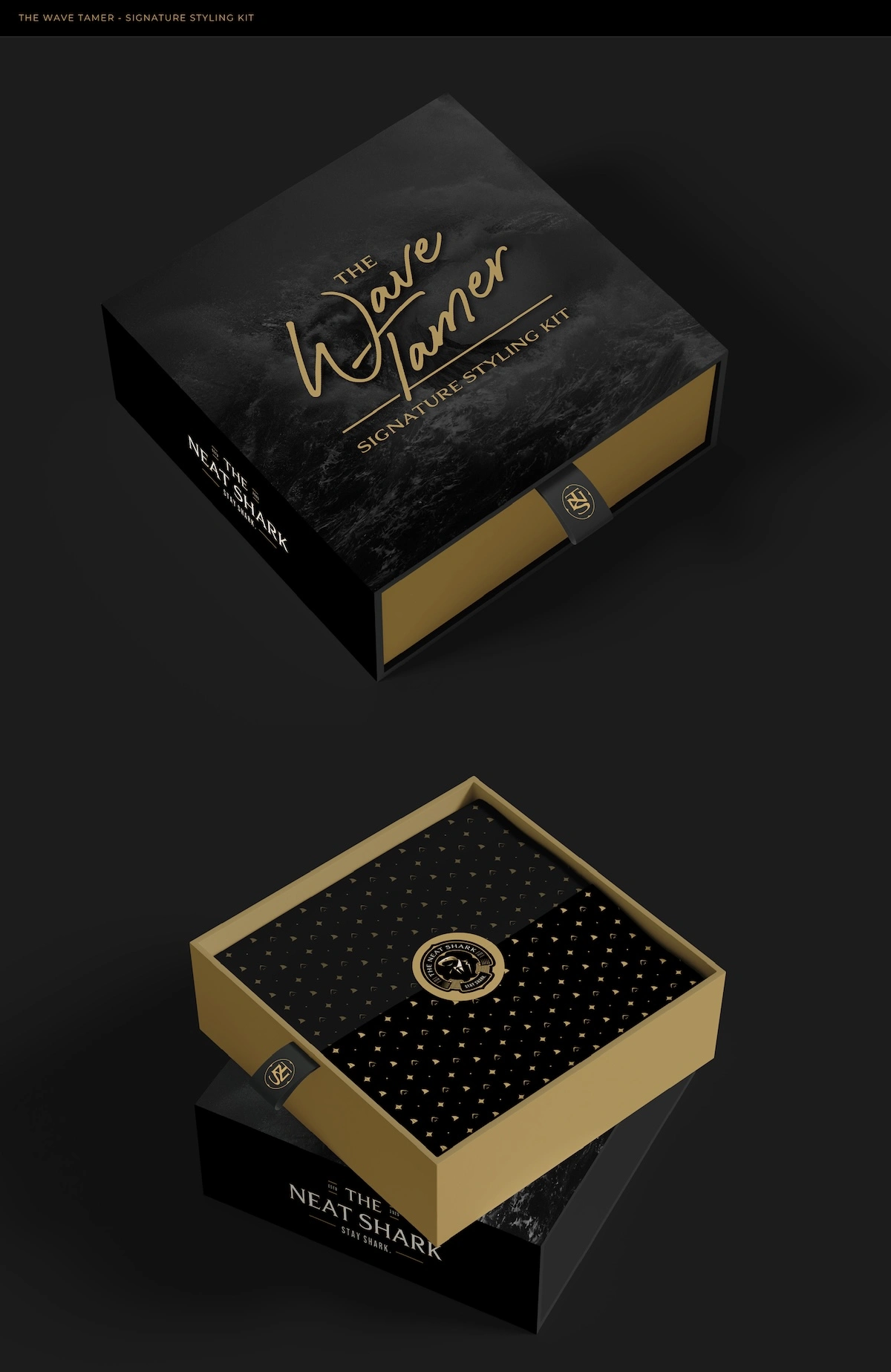
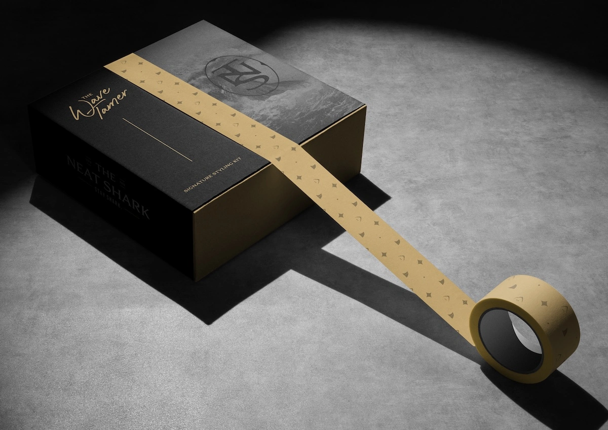
For the premium gift set, we created a magnetic-close box that elevates the unboxing experience into a ritual. The lid features a dramatic ocean wave photograph overlaid with the product name in a flowing, hand-drawn script that contrasts beautifully with the structured typography elsewhere in the brand system.
Opening the box reveals the interior lined with the signature brand pattern — gold diamond shapes scattered across black — with the shark crest centered as a seal of quality. The gold edges catch light and immediately communicate premium.
Brand Pattern
The Diamond Scatter
A signature brand pattern featuring small gold diamond shapes and dots scattered across a black field. Subtle enough to serve as a background texture, yet distinctive enough to be immediately recognizable as The Neat Shark.
The Deep Clean Body & Face Bar showcases how the pattern works in practice: the soap wrapper uses the diamond scatter as the primary visual element with the TNS monogram and a gold band creating a belly-band effect — proving the identity works far beyond hair care.
Ready to Build Your Brand?
From concept to shelf-ready packaging, we create brand identities that command premium pricing and build loyal followings.
Start Your Brand Journey →